
Nature Photographers Network
This is the preserved archive of the original Nature Photographers Network. The community continues at naturephotographers.network.
Borrowdale Mono
‹ PreviousLandscape GalleryNext ›

Borrowdale Mono

by Gary McGhee

Gallery: LandscapePosted May 18, 2015606 views16 comments

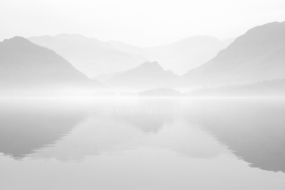
An older photo of mine taken up at Derwentwater looking down towards Borrowdale in the English Lake District.

I hardly ever convert my photo's to b&w so your feedback on the conversion would be nice.

Thanks, Gary.

D700, 50-135mm Ais, 1/30 sec, F/11, iso 200.

Comments

16 comments
Comment posted by Aaron Feinberg on May 19, 2015 at 5:55 AM

Very cool.  Dig the low contrast vibe here.


aF

Registered on October 26, 2009, 399 Posts, 2789 Comments
Comment posted by Ian Wolfenden on May 19, 2015 at 6:41 AM

There seems to me just enough variation in tone to make this a very appealing image, Gary.  I like the idea of something approaching high key to suggest the mood of the scene.

Registered on May 18, 2007, 1108 Posts, 7647 Comments
Comment posted by Ian Cameron on May 19, 2015 at 7:42 AM

Love it Gary including your choice of border to keep it ligt and airy very beautiful high key symmetry.  It would make a most soothing and relaxing print.

Registered on August 6, 2004, 1125 Posts, 3318 Comments
Comment posted by Nick Bristol on May 19, 2015 at 10:01 AM

Gary, I like what you did here with the b&w conversion. The low contrast does work very nice and I agree with Ian that this would probably make a very cool print. Nice composition here too.

Nick Bristol                                                                                                                                                                             Lone Rock, WI

Registered on February 1, 2004, 752 Posts, 14140 Comments
Comment posted by Roel Wijtmans on May 19, 2015 at 10:35 AM

Very nice high key shot! This works very well in B+W, and the gentle ripples in the reflection are a great detail. No nits for me.

Registered on September 30, 2012, 116 Posts, 2257 Comments
Comment posted by Rick Turner on May 19, 2015 at 11:26 AM

I would bump the black point some.

Registered on February 18, 2012, 534 Posts, 2755 Comments
Comment posted by D.A. Edwards on May 19, 2015 at 7:19 PM

Simple, symmetrical work of photographic art, Gary. No nits from me, I like it just as is, including the matching frame.

Registered on October 8, 2014, 226 Posts, 1187 Comments
Comment posted by Jean C Cajolet on May 19, 2015 at 7:59 PM

I like it at is, a beautiful artistic photographs, the fog is just enough transparent to see the mountains and the reflection in the water. That would make a very nice print.

Registered on April 28, 2014, 53 Posts, 532 Comments
Comment posted by Eva McDermott on May 19, 2015 at 10:19 PM

Very beautiful image Gary.  The high key presentation / fog is very captivating. 

Registered on January 4, 2009, 1015 Posts, 13229 Comments
Comment posted by Navin Sarma on May 21, 2015 at 11:30 AM

Very nice... love the misty look here Gary. I could even see you going further with the high key look so that the lightest mountains are nothing but a hint. But beautiful as is.

Registered on July 17, 2011, 233 Posts, 1373 Comments
Comment posted by Tony Kuyper on May 21, 2015 at 1:36 PM

Has the feel of a fine silver print.  This really works nicely.
 

Registered on November 1, 2003, 364 Posts, 22328 Comments
Comment posted by gary phillips on May 21, 2015 at 9:09 PM

Very different and very nice, Gary.  Love the low contrast look.

Registered on October 24, 2013, 185 Posts, 4136 Comments
Comment posted by Gary McGhee on May 22, 2015 at 6:15 AM

Thanks for the feedback everyone.

Cheers, Gary.

Registered on April 15, 2010, 142 Posts, 2416 Comments
Comment posted by Alberto Patiño on May 22, 2015 at 1:24 PM

Depending on what you are trying to accomplish, you might either bring the contrast up a bit or leave it as it is. The higher contrast would turn it into more of a "documentary" image, but this version has an artistic feel which would then be partly lost. I would leave it as it is !!!cool

Registered on December 2, 2014, 278 Posts, 1736 Comments
Comment posted by Harley Goldman on May 25, 2015 at 11:38 AM

Excellent dreamy presentation. I really like this image. Beautiful.

Registered on November 19, 2003, 586 Posts, 11271 Comments
Comment posted by Lucy Aron on August 31, 2015 at 11:36 PM

Beautiful subtle b & w.  Agree with Rick my eye wants the slightest more hint of black to give a suggestion of more dimension.

Registered on February 25, 2011, 189 Posts, 1160 Comments