
by D.A. Edwards
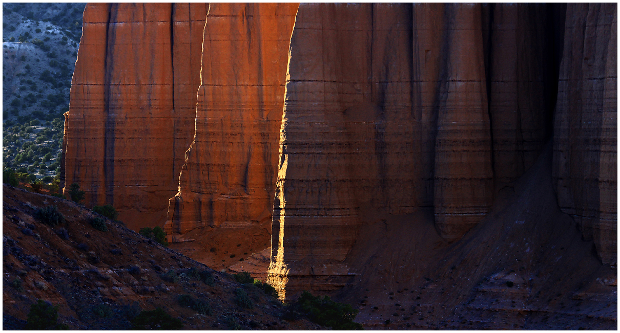
Dragging my throbbing toe on a short backpack to a ridge overlooking the Monoliths in the Cathedral Valley of Capitol Reef NP, we had this view of the largest monolith at sunset. I liked the contrast between the bright sunlit edges, the reflected sunlight and the dark recess on the right. The interplay of horizontal and vertical lines was also cool. Comments always welcome!
Comments
13 commentsI like it a lot. Three edges, three different ligts and contrast. Very nice composition, I can almost see 3D rendition with those horizontal lines I could think that it's serie of Lego blocks one over the other. Beautiful!
Gorgeous light, Dave, and the repeated fins are a strong composition element. I might just move the center fin a bit to the right, cropping some of the dark material on the right, but works also as is. Nicely done!
P.S., how was the Fremont River crossing? We've done it a number of times with an Explorer, no problems, but we now have an Outback, which is a bit lower (not much, though). We might head out there later this summer.....
When I first looked at this I thought it was another fine Harley Utah image. This is a great image. The light is sweet but I really like that you didn't create the more obvious composition of the left 2/3 of the image. The darker right half I feel adds a lot and makes the overall composition more interesting. Nice job.
I absolutely agree with you, the interplay of lines, shadows and patterns is really nice. Especially the light ridges separating the different pillars is great. I think it is a bit heavy on the right side, so maybe crop it at the darkest point on the right side? That way the gradient through the photo is more effective for me. Minor nit though, this is well seen and shot!
Dave, This is an excellent image and I'm really enjoying it. I very much like the comp as it is and just love the light. Those highlighted edges do something special here. The larger version looks especially nice and you have some wonderful colors as well. Very nice work on this!
Nick Bristol Lone Rock, WI
Real nice, Dave!!! I would be inclined to go along with Roel's suggestion. To my eye, the crop really brings attention to the star of the show, the light highlights on the fins. But it works nicely as is. I also think it works pulling down the blue saturation a big chunk and works as is. Either one is equally pleasing to my eye. Very well done, Dave.
The light and processing here looks lovely. Not quite sure how I feel about the comp right now. As the right 1/2 is very dark/weighted, but there is detail there just not sure if flows properly. Well seen there to get those fins :)
aF
Hi Dave, really liking the strong shape you isolated here. I could see some brightening of the mid-highs on the right side to help with light direction, since it takes up such a large portion of the frame. Unique shot from my perspective. Nicely done!
Appreciate the comments everyone. I figured that some would feel this is a bit right heavy and I considered cropping enough to put the brightest fin highlight dead center so that there was a pure light/dark 50/50 split. As I said I like that dark recess so that crop might put it too close to the right frame edge. I'll try fooling around with it a bit and try to get a re-post done.
BTW, I did re-post a more monochrome take of my previous image, the Muddy Chocolate Shavings, that some had suggested. Please take a look.
You've got an excellent comp and some very pleasing light here. The shadows feel a bit dark and heavy, but it looks like you've got some detail there that could be developed out.
Here's a re-post with a bit of a crop from the right edge to center the brightest fin edge and some brightening of the right half wall. I do think that I prefer the original darkness though. I see it as negative space that makes the illumination on the left side more impactful, but that's just me. YMMV.
Unique and intrigueing comp, Dave. I like what you have here and I'm going to be a little contraian and suggest a crop from the left. I think cropping out the desert on the right really highlights the light on the fins. With that crop, bringing up the shadows on the right would be important. Regardless of the direction you end up taking, this is very nice.
Very pleasing and unique take on this part of the land. I love the highlighted vertical edges juxtaposed with the horizontal strata of the rocks. I might consider a crop from the right, about 1/4 of the way in since it is so dark on that side of the image. Hope your toe is better but it was worth it!