Gallery: LandscapePosted May 20, 2015148 views7 comments
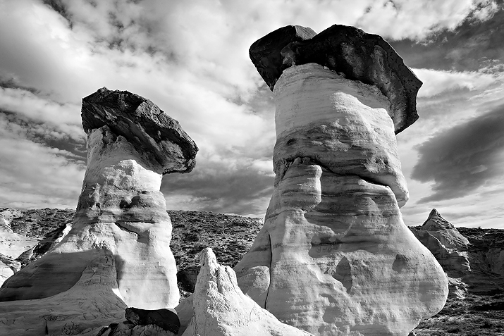
Another from my recent desert trip in my home state of Utah. C&C welcome and thanks for looking!
Comments
7 comments
Comment posted by Roel Wijtmans on May 20, 2015 at 11:03 AM
These hoodoos are so fascinating, really cool stuff! The crack in the the middle of the right one looks like the top part might start sliding off at any point. I like your comp and the dynamic range, but I also wonder what the color version would look like. The contrast difference between the light parts of the hoodoos and the sky is not that large, but they probably have different colors, so my assumption is that the color version might separate the hoodoos a bit better from the sky, which would make them stand out a bit more. But it's a nice B+W anyway, I am just very much a color guy after all, hehe.
Registered on September 30, 2012, 116 Posts, 2257 Comments
Comment posted by Patricia Brundage on May 20, 2015 at 12:06 PM
My first impression was "Too bad the sky wasn't darker." The tonal range between the hoodoos and the clouds behind is so close that the depth of field isn't there. I too would like to see the color version for comparison.
Registered on March 23, 2006, 1111 Posts, 6531 Comments
Comment posted by Tom Falley on May 20, 2015 at 12:51 PM
Very interesting seeing! Always glad to have more monochrome here. I presume the hoodos are yellow to a bit of red? That makes for an issue in conversion to darken the sky lightens the rock, giving less texture than might be possible. There are several ways to work around this, some experimentation could be worthwhile.
Thanks for sharing: Regards. Tom
Registered on November 21, 2014, 189 Posts, 454 Comments
Comment posted by D.A. Edwards on May 21, 2015 at 12:26 PM
A very attractive comp, Jeff, that really exemplifies your image title. I personally don't have a problem with the tonal contrast between the hoodoos and the sky; they stand out just fine to me. Although it's hard to tell at this size the extent of the problem, I might try and deal with the bit of haloing on the hoodoos, particularly on the right one.
Registered on October 8, 2014, 226 Posts, 1187 Comments
Comment posted by Tony Kuyper on May 21, 2015 at 1:44 PM
I like the comp and B&W presentation. If just feels a bit harsh contrast-wise. Could maybe see bringing down some of the brighter tones a bit as it looks like there is still texture in there that could be brought out.
Registered on November 1, 2003, 364 Posts, 22328 Comments
Comment posted by gary phillips on May 21, 2015 at 10:00 PM
Nice take on these hoodoos, Jeff. I like the b/w presentation here and I think Tony's suggestions are worth the effort. They are truly the Lords overlooking thier domain.
Registered on October 24, 2013, 185 Posts, 4136 Comments
Comment posted by Mark Seawell on May 26, 2015 at 11:14 AM
Awesome capture Jeff! I recently moved to Utah from being posted overseas and I want to make it down to this area. Love your PP on this image BTW!
Mark
Registered on December 5, 2011, 197 Posts, 237 Comments

Comments
7 commentsThese hoodoos are so fascinating, really cool stuff! The crack in the the middle of the right one looks like the top part might start sliding off at any point. I like your comp and the dynamic range, but I also wonder what the color version would look like. The contrast difference between the light parts of the hoodoos and the sky is not that large, but they probably have different colors, so my assumption is that the color version might separate the hoodoos a bit better from the sky, which would make them stand out a bit more. But it's a nice B+W anyway, I am just very much a color guy after all, hehe.
My first impression was "Too bad the sky wasn't darker." The tonal range between the hoodoos and the clouds behind is so close that the depth of field isn't there. I too would like to see the color version for comparison.
Very interesting seeing! Always glad to have more monochrome here. I presume the hoodos are yellow to a bit of red? That makes for an issue in conversion to darken the sky lightens the rock, giving less texture than might be possible. There are several ways to work around this, some experimentation could be worthwhile.
Thanks for sharing: Regards. Tom
A very attractive comp, Jeff, that really exemplifies your image title. I personally don't have a problem with the tonal contrast between the hoodoos and the sky; they stand out just fine to me. Although it's hard to tell at this size the extent of the problem, I might try and deal with the bit of haloing on the hoodoos, particularly on the right one.
I like the comp and B&W presentation. If just feels a bit harsh contrast-wise. Could maybe see bringing down some of the brighter tones a bit as it looks like there is still texture in there that could be brought out.
Nice take on these hoodoos, Jeff. I like the b/w presentation here and I think Tony's suggestions are worth the effort. They are truly the Lords overlooking thier domain.
Awesome capture Jeff! I recently moved to Utah from being posted overseas and I want to make it down to this area. Love your PP on this image BTW!
Mark