Gallery: LandscapePosted July 7, 2015218 views13 comments
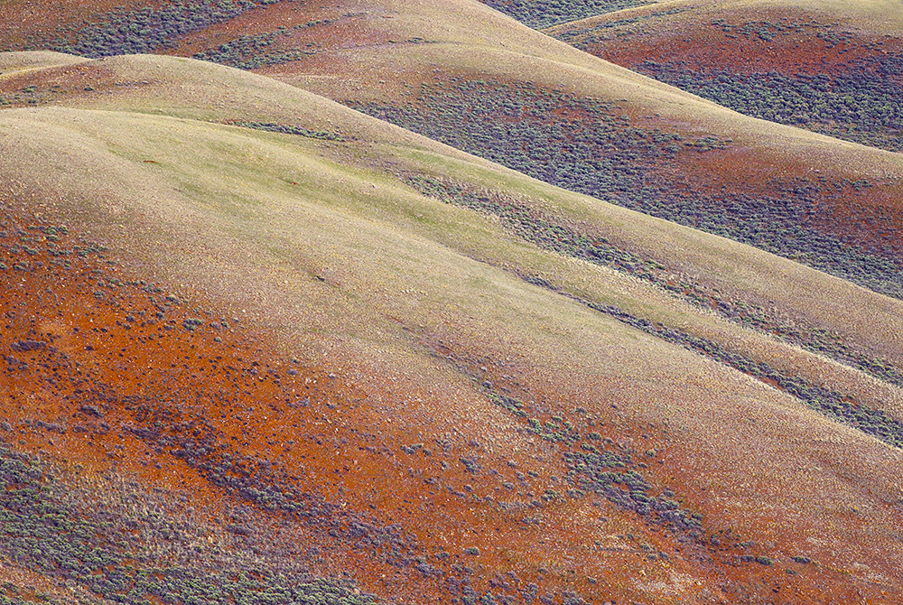
From somewhere in southern Utah last May. I "juiced up" the sat and vibrance a bit.
7D II 100-400 @241
Comments
13 comments
Comment posted by Ronald Murphy on July 7, 2015 at 6:03 PM
I like this a lot, but I may be feeling I want to see more of those cut-off hills at the top. Beautiful colors.
Registered on March 13, 2012, 279 Posts, 975 Comments
Comment posted by Preston Birdwell on July 7, 2015 at 8:41 PM
I agree with Ronald: I'd like to see the tops of the hills. Also, while I like the light, I think the mids could be brought down just a bit for a tad more contrast--not a lot, though. I like the colors and the textures very much.
--P
Registered on November 1, 2003, 471 Posts, 5188 Comments
Comment posted by Sairam Sundaresan on July 7, 2015 at 8:58 PM
Really love the pastel colors and textures in this image. masterful!
Registered on March 14, 2013, 100 Posts, 643 Comments
Comment posted by gary phillips on July 7, 2015 at 11:56 PM
This is pretty cool, Bill. At first I thought these were clay hills, but after closer inspection I can see they are not. I like the open feel and the pattern and color of the sage and the light is very nice.
Registered on October 24, 2013, 185 Posts, 4136 Comments
Comment posted by Harley Goldman on July 8, 2015 at 1:21 AM
Quite the shapes and colors. I would agree with above that it feels a bit cutoff at the top.
Registered on November 19, 2003, 586 Posts, 11271 Comments
Comment posted by Stephen Stanton on July 8, 2015 at 5:50 AM
Like what you have done with the colors and textures here, some beautiful tones, the diagonal lines hold my interest, would also like a bit more of the rolling mounds as a repetitive shape in this image.
Registered on March 1, 2015, 54 Posts, 453 Comments
Comment posted by Roel Wijtmans on July 8, 2015 at 3:27 PM
Those colors are very nice, and this makes the landscape look a bit dreamy. Very sweet! I agree with Preston's suggestion about the midtones.
Registered on September 30, 2012, 116 Posts, 2257 Comments
Comment posted by R.Bill Moser on July 8, 2015 at 5:51 PM
I love it as presented but on the other hand I agree with others that it feels a bit cut off at the top. Beautiful pastel colors and I love the open feel.
Registered on January 29, 2010, 285 Posts, 4281 Comments
Comment posted by D.A. Edwards on July 8, 2015 at 11:45 PM
Really special, Bill. I see the point about the top edge but we have no idea what complications may have been introduced by showing more. The colors are outstanding, great work.
Registered on October 8, 2014, 226 Posts, 1187 Comments
Comment posted by Paul Breitkreuz on July 9, 2015 at 12:14 AM
I like somewhere in southern Utah too....
not sure about any change here, it looks pretty good on my monitor, Bill.
Registered on February 25, 2006, 525 Posts, 8448 Comments
Comment posted by Ryan Shain on July 10, 2015 at 3:12 AM
Hi Bill,
This image looks uber cool with the colors, and flow of the hills. I dig this as presented, and the textures look great.
Registered on February 20, 2007, 226 Posts, 4571 Comments
Comment posted by John Williams on July 11, 2015 at 1:36 AM
Lovely palette and lines Bill. The cut-off top doesn't bug me much personally.
Registered on September 6, 2007, 221 Posts, 5985 Comments
Comment posted by Jean C Cajolet on July 19, 2015 at 8:15 PM
Very nice colors and textures. I agree with the others about the cut-off hills. I like it.
Registered on April 28, 2014, 53 Posts, 532 Comments

Comments
13 commentsI like this a lot, but I may be feeling I want to see more of those cut-off hills at the top. Beautiful colors.
I agree with Ronald: I'd like to see the tops of the hills. Also, while I like the light, I think the mids could be brought down just a bit for a tad more contrast--not a lot, though. I like the colors and the textures very much.
--P
Really love the pastel colors and textures in this image. masterful!
This is pretty cool, Bill. At first I thought these were clay hills, but after closer inspection I can see they are not. I like the open feel and the pattern and color of the sage and the light is very nice.
Quite the shapes and colors. I would agree with above that it feels a bit cutoff at the top.
Like what you have done with the colors and textures here, some beautiful tones, the diagonal lines hold my interest, would also like a bit more of the rolling mounds as a repetitive shape in this image.
Those colors are very nice, and this makes the landscape look a bit dreamy. Very sweet! I agree with Preston's suggestion about the midtones.
I love it as presented but on the other hand I agree with others that it feels a bit cut off at the top. Beautiful pastel colors and I love the open feel.
Really special, Bill. I see the point about the top edge but we have no idea what complications may have been introduced by showing more. The colors are outstanding, great work.
I like somewhere in southern Utah too....
not sure about any change here, it looks pretty good on my monitor, Bill.
Hi Bill,
This image looks uber cool with the colors, and flow of the hills. I dig this as presented, and the textures look great.
Lovely palette and lines Bill. The cut-off top doesn't bug me much personally.
Very nice colors and textures. I agree with the others about the cut-off hills. I like it.