Gallery: Man & NaturePosted February 10, 20051,456 views8 comments
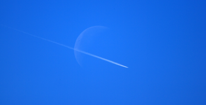
This was taken midday, so the moon had little detail, but I liked the simplicity of the image. What do you think?
Canon EOS1DS w/ 100-400 @400 + 2x TC
Comments
8 comments
Comment posted by Hank Pennington on February 10, 2005 at 9:41 PM
Hey Rand,
This appeals greatly to my taste for stark simplicity in some photos. In some ways it feels almost like a simple logo, perhaps even reminiscent of NASA's. Due to the angle of the contrail, there's almost a "saturn" feel to it as well. It would be interesting to play with the general shapes- converting to BW; twisting the Levels way out of whack; pushing brightness and contrast; whatever. It looks like fun to play with.
Nicely done!
Registered on November 1, 2003, 226 Posts, 1532 Comments
Comment posted by Kent Staubus on February 10, 2005 at 11:26 PM
Very cool shot. I like the colors and the simplicity. You had a great eye to catch this, I think.
Kent in SD
Registered on November 11, 2003, 121 Posts, 2098 Comments
Comment posted by Nathan Buck on February 11, 2005 at 11:47 AM
I agree that catching this shot shows some real vision Rand. Nicely done. The lack of detail in the moon helps you out here I think. Very cool.
Nathan
Registered on November 1, 2003, 1101 Posts, 13589 Comments
Comment posted by Curtis Knight on February 11, 2005 at 2:12 PM
wow, that's just plain cool... well seen and captured!
Registered on October 28, 2004, 53 Posts, 468 Comments
Comment posted by beth summer on February 13, 2005 at 2:40 PM
Excellent eye!!! B&W would also be neat.
Registered on November 1, 2003, 437 Posts, 5220 Comments
Comment posted by Richard Daley on February 14, 2005 at 11:19 PM
Surreal!! Any more detail in the moon and the mood would be lost. I agree with some other comments, I'd like to play with this in PS. There is a lot of potential for some interesting results. However, GREAT as it is.
Richard F. Daley
Registered on January 26, 2005, 23 Posts, 38 Comments
Comment posted by Dan Ouellette on March 2, 2005 at 7:45 PM
Rand,
Nice work. I scrolled back and forth looking at your photo. I'm too much of an amateur photogrpaher to technically comment on your photo. But, I found it very interesting, eye catching, and enjoyable.
Thanks for sharing.
Registered on December 29, 2004, 5 Posts, 19 Comments
Comment posted by David Taylor on May 11, 2006 at 5:56 AM
Less is more! Excellent observation and well executed.
Registered on April 24, 2006, 101 Posts, 837 Comments

Comments
8 commentsThis appeals greatly to my taste for stark simplicity in some photos. In some ways it feels almost like a simple logo, perhaps even reminiscent of NASA's. Due to the angle of the contrail, there's almost a "saturn" feel to it as well. It would be interesting to play with the general shapes- converting to BW; twisting the Levels way out of whack; pushing brightness and contrast; whatever. It looks like fun to play with.
Nicely done!
Kent in SD
Nathan
Richard F. Daley
Nice work. I scrolled back and forth looking at your photo. I'm too much of an amateur photogrpaher to technically comment on your photo. But, I found it very interesting, eye catching, and enjoyable.
Thanks for sharing.