
Hi All,
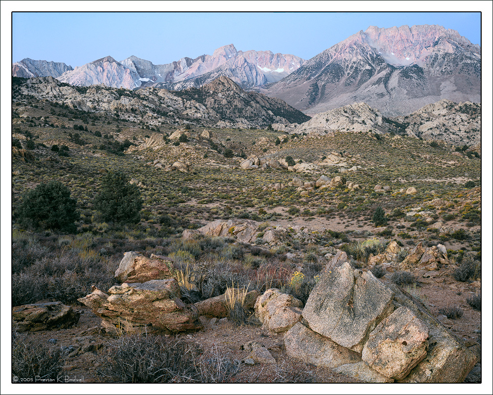
I re-scanned the chrome and re-worked the image in CS6.
The odd cast in the original post was due to a missed step in adjusting the color before the scan. Removing color casts from scans can often be a nightmare. I think this version is very close to the original chrome.
I cropped a a small amount from the right side, and applied a gradient mask layer to the sky and background mountains.
Tachihara 4x5
Astia 100
Fujinon 180mm
TK's masks
I am very interested in what you think of this version, and please see the large version. Thanks!
--P
Comments
10 commentsAh, what a difference! Sweet little east side scene. The image does a fine job of putting me there.
This looks much better, lovely natural muted colors....
Much better on all my monitors!
This looks fine - well balanced even with all of the compositional details in it. I think it good use a boost in vibrance or sat. without approaching over the top. Just looks a little subdued on my monitor. Beautiful view.
A nice honest scene IMHO. Rarely do I see a flat blue sky in an image that helps overall, here it seems to do just that- subtly directing tthe viewer down into the mountains and boulders.
Preston, the larger version is excellent and brings us right into the scene near the Buttermilk area of the sierras. I think the small cluster of rocks and plants in the lower FG really breaks up the open large middle ground and holds the viewer leading right up to the peaks of the sierras. You did not mention as the light is soft whether this was sunrise or sunset, just a curiosity thing on my part. A very solid image from this area.
Thanks for your comments, everyone.
Paul, this was a sunrise in October. It was a 15 second exposure, so I was really lucky there was not a breath of wind.
--P
Looks just about right to my eye Preston. I like that there is still that hint of magenta light on the mountains which I think could be boosted a bit to emphasize the sunrise.
Love this scene. Reminds me of the old sierra calendar images I used to collect. I like that it allows the land to speak for itself and does not have any special angles to make the scene throw itself at you. My only suggestion is a personal one - I would like the rock in the LRC to not be cut off at the base but to show it's outline completely.
Hi Preston,
I am late, but let me tell you that after I took another of my (unfortunately many) breaks from NPN, your image made me log in and comment. The comp. is perfect, everything flows and is so well arranged. There's still some color cast, but nothing that looks off or unnatural.
Regards
Dietrich