Gallery: LandscapePosted August 31, 2015145 views7 comments
Thanks for looking and leaving a comment
Comments
7 comments
Comment posted by Preston Birdwell on August 31, 2015 at 5:56 PM
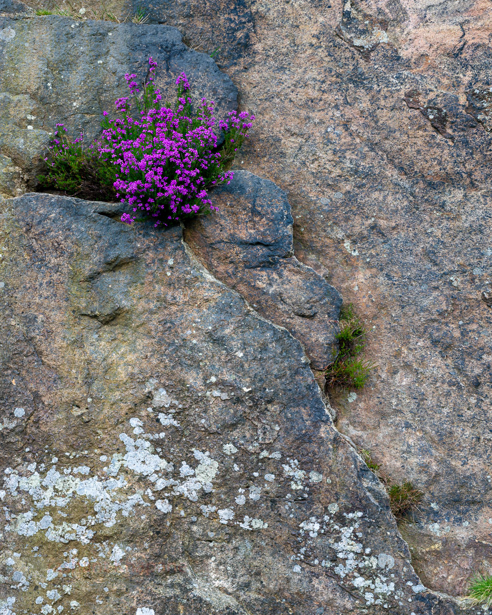
I like all the detail, the flower bunch and the nice shapes of the rocks. I wondering if you cropped this from the bottom along a line midway between the the two plants in the lower right. The small plant right in the cornoer grabs my eye, and there is, to me too much relatively empty space below the the large clump of lichen. You might also consider burning down the redish rock in the upper right corner. The color looks very nice, Prashant.
--P
Registered on November 1, 2003, 471 Posts, 5188 Comments
Comment posted by gary phillips on August 31, 2015 at 9:37 PM
The large version is very nice. I agree with Preston about cropping some off the bottom. The main show sort of gets lost a bit with the Lichen competing for space. The color and detail are marvelous.
Registered on October 24, 2013, 185 Posts, 4136 Comments
Comment posted by Igor Doncov on September 1, 2015 at 1:06 AM
I like this very much Prashant. This is my kind of image. I agree with Preston's comment. I would also have chosen a frame with a black tone or white tone to make the image stand out more. You can see that when you click on the larger image. Lovely image, especially the upper half of it.
Registered on November 22, 2014, 189 Posts, 2733 Comments
Comment posted by Brian Schrayer on September 3, 2015 at 11:35 PM
Very nice comp, Prashant. I like the contrasting elements - both in terms of color and texture - of the flowers against the rocks. Nicely composed with great detail throughout.
Registered on May 28, 2004, 114 Posts, 2890 Comments
Comment posted by Nick Bristol on September 6, 2015 at 6:49 PM
Prashant, I like this image very much. The subject works great and the color, textures and detail are all wonderful. I agree with the crop suggestion of the bottom and also think just a little off the top (down to the rock edge on the left) would work quite nice, but not a big deal either way. I looked at this for quite awhile and with doing the crop it truely looks like a fine art print to my eye. Very nice work on this! Cheers!
Nick Bristol Lone Rock, WI.
Registered on February 1, 2004, 752 Posts, 14140 Comments
Comment posted by Bill Chambers on September 7, 2015 at 1:05 AM
Well, I'm going to be the lone voice in the wilderness here in the composition discussion. I like this very much as presented. To me, the composition is very well thought out and successfully captured. The light colored lichen really offsets and balances the gorgeous color of the flowers and I like how the opposing diagonals enter/exit the upper left/lower right in idential fashion, which would disappear if cropped. The texture is wonderful, and the more subtle color pallette makes my mouth water. Prashant, in my mind, this is as good as it gets!
Registered on April 10, 2005, 753 Posts, 21216 Comments
Comment posted by Prashant Khapane on September 12, 2015 at 4:21 PM
Thanks for all the feedback. It is very valuable. Thanks bill for your critique/compliments.
And thanks to the judges - this is my first EP in ESS/Landscape gallery in 15 years! Yes, I almost joined the NPN at the same time it was formed however full time membsership came a bit late.
Registered on November 1, 2003, 492 Posts, 4580 Comments

Comments
7 commentsI like all the detail, the flower bunch and the nice shapes of the rocks. I wondering if you cropped this from the bottom along a line midway between the the two plants in the lower right. The small plant right in the cornoer grabs my eye, and there is, to me too much relatively empty space below the the large clump of lichen. You might also consider burning down the redish rock in the upper right corner. The color looks very nice, Prashant.
--P
The large version is very nice. I agree with Preston about cropping some off the bottom. The main show sort of gets lost a bit with the Lichen competing for space. The color and detail are marvelous.
I like this very much Prashant. This is my kind of image. I agree with Preston's comment. I would also have chosen a frame with a black tone or white tone to make the image stand out more. You can see that when you click on the larger image. Lovely image, especially the upper half of it.
Very nice comp, Prashant. I like the contrasting elements - both in terms of color and texture - of the flowers against the rocks. Nicely composed with great detail throughout.
Prashant, I like this image very much. The subject works great and the color, textures and detail are all wonderful. I agree with the crop suggestion of the bottom and also think just a little off the top (down to the rock edge on the left) would work quite nice, but not a big deal either way. I looked at this for quite awhile and with doing the crop it truely looks like a fine art print to my eye. Very nice work on this! Cheers!
Nick Bristol Lone Rock, WI.
Well, I'm going to be the lone voice in the wilderness here in the composition discussion. I like this very much as presented. To me, the composition is very well thought out and successfully captured. The light colored lichen really offsets and balances the gorgeous color of the flowers and I like how the opposing diagonals enter/exit the upper left/lower right in idential fashion, which would disappear if cropped. The texture is wonderful, and the more subtle color pallette makes my mouth water. Prashant, in my mind, this is as good as it gets!
Thanks for all the feedback. It is very valuable. Thanks bill for your critique/compliments.
And thanks to the judges - this is my first EP in ESS/Landscape gallery in 15 years! Yes, I almost joined the NPN at the same time it was formed however full time membsership came a bit late.