
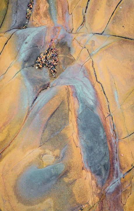
Bean Hollow Beach along Highway 1 south of San Francisco is a treasure trove of rock colors and formations. It is often foggy there, allowing for good diffuse lighting.
I am interested to know if this is too saturated, though I know that is often a matter of personal taste.
Canon 5d,M3, ISO500, 67mm, f/16, 1/160. I used Color Effex Pro on this one.
Thanks in advance for any comments or critiques.
Comments
16 commentsFor the intimate scene, this does not seem too saturated to me
I like this a lot, Kathy. The lines and textures work very well. I think color looks good--the saturation is not too high, and I like the warm against the cool. The pebbles add a nice detail and sense of scale.
--P
Very nice abstact, Kathy. Love the colors, they don't seem too strong for me at all. The collection of pebbles at the top are a sweet little addition. Hope you got some shots focused more on them.
This may be more saturated than the real thing, but it looks great to me. The pebbles are a nice addition. The upper collection of pebbles being cut off is a little bothersome, but you may not have had much choice.
Real nice abstract. The colors look good to my eye. Very well seen and executed.
This is really nice, Kathy! The colors and textures look great and I love the comp.
Nick Bristol
Nice imaging, Kathy. For the first few moments, it looked so wonderfully painterly abstract. Then the pebbles came into my focus and reality set in. I kInda preferred that first glance, but it still is a fine scene well captured realism. This is not a negative comment, just my personal experience.
I love these intimate landscapes. This one has all the features necessary for a great image... color, lines, texture and the simple touch of reality. Love it!
Having lived in SF for 10 years and having been there, this seems right to me. Not saturated at all and very realistic for what one would find. Good eye.
I don't know what the original looks like, but the saturation looks ok to me as presented. An interesting array of colors and elements.
I like the colors and their combinations very much. Having been to Been Hollow (lived up the road for 25 years) I can understand your question about saturation. The rocks actually look less colorful but this is a great rendition of those rocks.
To me the image feels a bit top heavy. Most of what's visually interesting is in the upper half of the image. I can see an interesting composition which includes that upper portion.
The light is often wonderful in that area, wonderful for photography but not for living.
Definitely not too saturated, Kathy. While the colors may be pushing the limits of reality, I think they're fine and work very well in an abstract (where reality isn't so important, ). The shapes, textures, and details look terrific. Very well done.
I find the patterns very cool, and the sat. well within the realm of believability, having not been there. My only wish was that the top grouping of pebbles was more within the frame - I'm led out of the picture too soon. Maybe not possible though. A beauty of a find.
I really like the color contrasts and the abstract quality. It feels a bit overexposed to me. The colors would be richer if it were less bright.
Wonderful lines and pleasing pastel colors Kathy. I agree with Harry on having a little more room at the top of the frame but all and all this is a beautiful abstract.
Kathy: This works very well for me as is. Exceptionally well seen and captured. Congrats on the WP. >=))>