Nature Photographers Network
This is the preserved archive of the original Nature Photographers Network. The community continues at naturephotographers.network.
Morning Light & Leaves 2
‹ PreviousLandscape GalleryNext ›

Morning Light & Leaves 2

by Wayne Jones

Gallery: LandscapePosted October 29, 2015267 views13 comments
Please click on the image above to see a larger view.

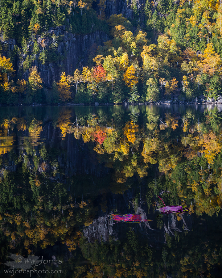
FULL TITLE:  Morning Light and Leaves Fall on Chapel Pond (4x5 Vertical Version)

Thanks for all the valuable comments on the previous (square) version of this image, Morning Light and Leaves.  Only on NPN can a photographer get such detailed constructive critiques that really help improve a photographer's work!  I am posting this version to address the major issue that NPN members mentioned: the "
electric magenta" color of the foreground leaves.  Also, this gives me a chance to see what you think of this 4x5 vertical, compared to the previous square crop.  So I have two questions:

1. WHICH CROP -- Vertical or Square?
2. Does the color adjustment in the foreground leaves look better? 
    Note that the foreground leaves may still look somewhat magenta, but that's because red maple leaves (unlike sugar maple) ARE more of a magenta-red color in the fall, in addition to them being in the cool shade, while the rest of the scene is bathed in warm sunlight. (* See my illustration and comment on this, below.)

Canon 5D3; Canon 24-105 mm.; Circ. pol.
3 horizontal images stitched in PSCC
  (bottom image shot twice to focus on foreground leaves, and then background)

Comments

13 comments
Comment posted by Wayne Jones on October 29, 2015 at 8:52 PM
This illustrates the difference between the original photo and my latest color adjustment to address the "electric magenta" comments about the colors in the square version that I posted earlier.  The color of the foreground leaves in the square version were between the two version shown here.

*FOREGROUND COLORS WHEN PHOTOGRAPHING REFLECTIONS FROM THE SHADE.  When you photograph the reflection of a sunny scene, shooting from a shady position, any foreground objects in the shade will have a significantly cooler color than the sunny objects or their reflections.  In some cases, the deep blue hue of foreground objects compared to the sunlilt scene can appear bizarre.  Some people like it, and some people don't.  I often accept this effect, as it illustrates the real difference between foreground and background colors.  However, our brains do some "automatic color correction" when we see everything, especially when we know what color things are "supposed" to be.  For this reason, I warmed up the color of the foreground leaves in the original (square) post of this image.  Even with some color adjustment, that still looked strange to many viewers. 

ANOTHER issue is that the leaves red maple (Acer rubrum) in autumn are much more on the magenta side than other leaves in sunny side of this photo, including sugar maple (Acer saccharum) which turns yellow-orange in the fall.  My intention was to keep that difference in the photograph, but it's all a matter of perception.  If the viewer thinks magenta leaves look unnatural -- in the shade or not -- it defeats my purpose of accurately presenting a natural scene.  

 
Registered on April 18, 2007, 953 Posts, 6435 Comments
Comment posted by Eva McDermott on October 29, 2015 at 9:32 PM
Hi Wayne,

I like the vericle 4X5 crop.  With regards to the more intimate leaf scenes.....  I like the color adjusted version.  Glorious autumn color in both cases Wayne.

 
Registered on January 4, 2009, 1015 Posts, 13229 Comments
Comment posted by Aaron Feinberg on October 30, 2015 at 3:23 AM
Looks good to me.  The leaves in the fg would be very blue considering the warm tones up top.  Nice work.

aF
Registered on October 26, 2009, 399 Posts, 2789 Comments
Comment posted by John Tobias on October 30, 2015 at 8:24 AM
I like both formats, but tend to the vertical one.  As far as the foreground leaves go,  The closest one I find distracting, but like the other.  A great scene well captured.  Certainly would be difficult to drive by without stopping.  Thank you for sharing both versions and background info.
Registered on September 12, 2009, 2120 Posts, 6455 Comments
Comment posted by Roel Wijtmans on October 30, 2015 at 8:26 AM
Both the crop and the adjustment on the leaves are improvements as far as I'm concerned. I liked the previous version, but I like this one even more.
Registered on September 30, 2012, 116 Posts, 2257 Comments
Comment posted by Harley Goldman on October 30, 2015 at 9:23 AM
Put me down for the vertical crop. The foreground leaves look better, especially on the zoomed version. Much more realistic to my eye. Real nice image.
Registered on November 19, 2003, 586 Posts, 11271 Comments
Comment posted by Daniel Rappaport on October 30, 2015 at 3:01 PM
 I like the vertical crop better - glorious fall scene, but I'd give up and desaturate the heck out of those foreground leaves.
Registered on September 9, 2009, 294 Posts, 2006 Comments
Comment posted by Mark Seaver on October 30, 2015 at 4:44 PM
Yep, those two leaves fit in much better here, Wayne.  Comparing the two crops, I prefer the square crop because it feels better balanced to me with those two leaves closer to the bottom, plus it puts more emphasis on those two leaves not having the extra reflections below them.
Registered on January 23, 2011, 1103 Posts, 17270 Comments
Comment posted by Nick Bristol on October 30, 2015 at 7:39 PM
Wayne, I like this version alot. The adjustments you made worked out great for my taste. 

Nick Bristol
Lone Rock, WI
Registered on February 1, 2004, 752 Posts, 14140 Comments
Comment posted by gary phillips on October 30, 2015 at 9:46 PM
I think I prefer this version over the square, but both are a treat,  Wayne.  To be honest, I think either image works with or without the foreground leaves.  They add a unique element but the real stars are the reflection and kaleidoscope of fall colors.
Registered on October 24, 2013, 185 Posts, 4136 Comments
Comment posted by Gary Minish on October 31, 2015 at 2:07 AM
A beautiful scene, Wayne!  I personally prefer the more square version, especially when viewed large as it has a lot more information and thus a lot more presence.  Both of the compositions are well balanced and the color of the floating leaves is quite striking.  I appreciate the samples and description of your adjustments and I think you made a good choice on warming the colors a bit.  devil
Registered on February 4, 2006, 625 Posts, 3583 Comments
Comment posted by Ryan Shain on October 31, 2015 at 9:46 AM
Hi Wayne,

After looking at both of you images, I am all aboard on the vertical format. The leaves look good to me with their color profile, and this image is so sweet with all of the glorious colors. The interplay of light and shadow is so wonderfully captured in this image, and sweet work Wayne.
 
Registered on February 20, 2007, 226 Posts, 4571 Comments
Comment posted by Albert Darmo on November 6, 2015 at 8:49 PM
Hi  Wayne  crying I  liked  the first version.   but  i think  you improved  it  a  bit with  this version..   a stunning scenedevil

Albert Darmo
Canada
Registered on November 25, 2008, 1386 Posts, 11978 Comments