Gallery: POP PhotosPosted November 15, 2015960 views7 comments
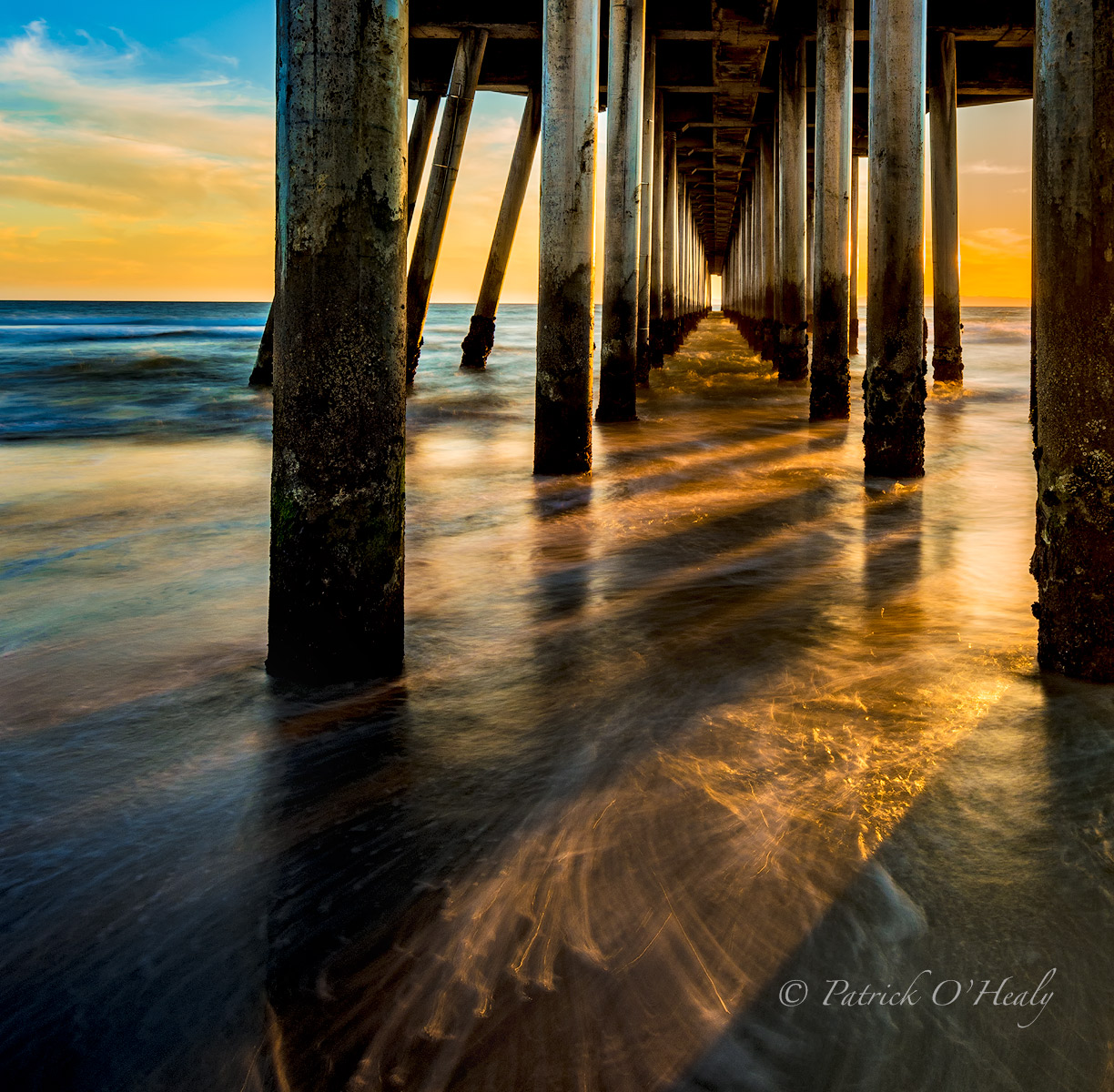
November 12, 2015 at Huntington Beach Pier This re-post incorporates the suggestions Paul and Basil made. Thank you for giving me feedback.
Comments
7 comments
Comment posted by Kathy Barnhart on November 15, 2015 at 8:17 PM
I like this very much with the strong parallel lines in both the pier and the shadows. Love the little bits of water movement in the foreground and the colors look very good to my eye.
Registered on November 11, 2011, 404 Posts, 1639 Comments
Comment posted by Philip Hodgkins on November 15, 2015 at 9:53 PM
Very striking image, Patrick, with the piling leading the eye inexorably out to sea. The color values are great!
Registered on July 24, 2006, 2741 Posts, 12349 Comments
Comment posted by Reno DiTullio on November 16, 2015 at 3:57 PM
Love the warm tones, Patrick, and of course the leading lines of the pier pilings, well done.
Registered on November 14, 2003, 130 Posts, 1644 Comments
Comment posted by Harley Goldman on November 16, 2015 at 10:05 PM
I like this presentation better. Fine image!
Registered on November 19, 2003, 586 Posts, 11271 Comments
Comment posted by D.A. Edwards on November 17, 2015 at 1:06 AM
I also think this is a better comp, Patrick. I like the FG water and the light and color throughout.
Registered on October 8, 2014, 226 Posts, 1187 Comments
Comment posted by John Launstein on November 20, 2015 at 12:22 AM
While I did not see the original, this is exquisite, Patrick! Forgive me if this comes across the wrong way, but the moment I saw this thumbnail I immediately reacted with a "WHO is the photographer on this one?"
I'm guessing you didn't load a separate smaller file, just like I don't, as the colours are pretty punchy above (particularly the sky in ULC), but are wonderful in the larger version.
I will suggest one change...I'm pretty sure this could benefit from a slight counter-clockwise rotation. To me the pilings felt tilted slightly to the right but I wasn't sure how to check that until I thought of checking the horizon...when I scroll down so the image moves up, the waterline is higher on the left than the right. That being said, I've dealt with multiple vertical and horizontal lines in an image myself and was left trying to put it somewhere in between so no one element felt particularly off...that may be the case here.
This is one of your best, IMO, and that's saying something.
Registered on April 5, 2011, 223 Posts, 1193 Comments
Comment posted by Ian Wolfenden on November 25, 2015 at 12:30 PM
Vivid, dramatic image, Patrick ! Love the composition with the fg sweep of waves over the sand leading the eye in. Beautifully processed with colour that seems to heighten the effect almost to the surreal.
Registered on May 18, 2007, 1108 Posts, 7647 Comments

Comments
7 commentsI'm guessing you didn't load a separate smaller file, just like I don't, as the colours are pretty punchy above (particularly the sky in ULC), but are wonderful in the larger version.
I will suggest one change...I'm pretty sure this could benefit from a slight counter-clockwise rotation. To me the pilings felt tilted slightly to the right but I wasn't sure how to check that until I thought of checking the horizon...when I scroll down so the image moves up, the waterline is higher on the left than the right. That being said, I've dealt with multiple vertical and horizontal lines in an image myself and was left trying to put it somewhere in between so no one element felt particularly off...that may be the case here.
This is one of your best, IMO, and that's saying something.