Nature Photographers Network
This is the preserved archive of the original Nature Photographers Network. The community continues at naturephotographers.network.
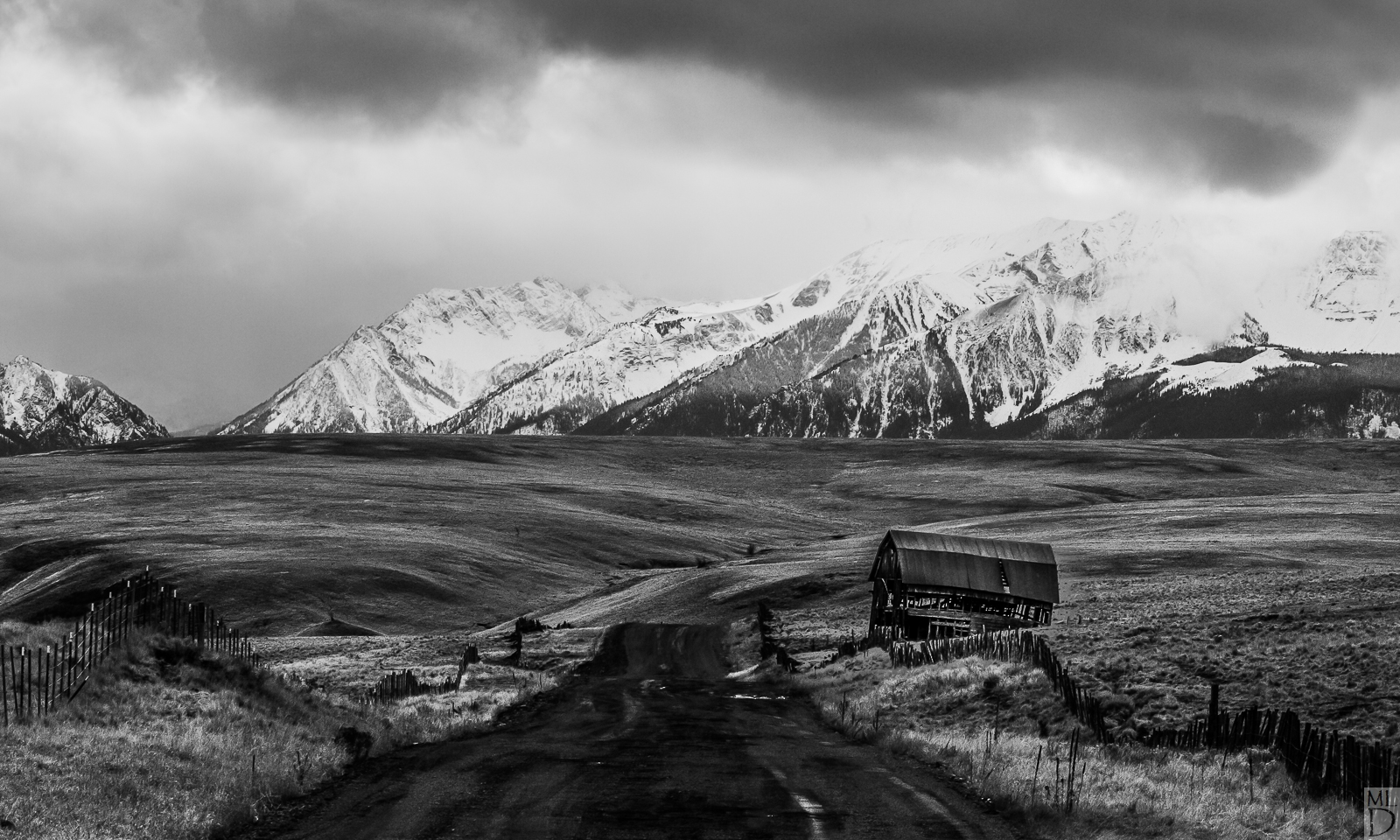
Hanging On + Repost x3
‹ PreviousMan & Nature GalleryNext ›

Hanging On + Repost x3

by Marylynne Diggs

Gallery: Man & NaturePosted November 27, 2015295 views10 comments
Greetings Everyone,
Here is the sixth in a series of black and white images I'm working on.  This others were shared in the Landscape Gallery, but I think the road and barn place this one here.  My apologies for not sharing here much.  I'll make up for it over the next couple of weeks.

As always, I'm eager for feedback on composition, processing, etc.  Let me know what you think, and feel free to visit my NPN Gallery here to see the other images in the series.

Canon 7D with 24-105mm at 100mm
ISO 160, f/11, 1/200s
Processed in Nik Silver Efex and LR

Comments

10 comments
Comment posted by Stephen Stanton on November 27, 2015 at 2:22 PM
Marylynne, I don't think I have left any comments on B&W images,  as I have very little experience with them, so my comments are very much from a beginners crouch. I believe the strongest attributes of a B&W image would be the subtle gray shadings and tones complementing deep blacks and sharp whites, spot on focus, and of course subject a matter.  This is a sweeping image with a lot to look at. The grassland has a lot of interesting  mixed gray tones; but  the "barely hanging in there" barn, a great subject with lots of old age personality, has pretty small stature in the image. The exposed framing timbers are barely seen and image wise they could make a strong statement  positioned with the stormy mountain range. The barn timbers do compliment and balance the fence line on that side. Could the snow fields in the mountains benefit from a richer back tone on the storm cloud?   For me, the road leading into the image does not work. With its wheel marks,puddles and shadings, it detracts and competes with the grassland shapes and tones. There is interesting light on the mountains and the barn roof, but none on the road bed.

You might consider cropping  the left side and  some of the foreground and play with darkening the shadows and enhancing the clarity in the cloud.  Do you have any close ups of the barn? There is a lot of potential in this type of image but getting off the road may have been a better choice.    
Registered on March 1, 2015, 54 Posts, 453 Comments
Comment posted by Patrick O'Healy on November 27, 2015 at 2:51 PM
Marylynne,
I love the difference in viewer perspectives as Stephen gave you wonderful feedback.  Did you take any images to the left of the road looking a little more down the fence line?  Not sure how that would look, but your image made me wonder.  The foreground is a little dark for my taste.  I think the image may be a bit more balanced if it were lighter.  I like the image and wish the road did not disappear as my eye traveled down it and then stopped.  But, we can only work with the subject we are given, now how we wish it to be.  Thanks for posting. 
Registered on March 13, 2011, 326 Posts, 1679 Comments
Comment posted by Alberto Patiño on November 27, 2015 at 8:11 PM
I like the  perspective a lot! I would move the horizon a bit further from the center, but I'm not sure which way. My first reaction would be to bring it down, but that would put the barn too close to the edge, so perhaps up, by cropping some sky? I like the processing, although I do think that the way the peaks merge with the clouds on the upper right is a bit distracting, I can see myself increasing the contrast just a bit up there. I hope this helps!
Registered on December 2, 2014, 278 Posts, 1736 Comments
Comment posted by Mark Seaver on November 28, 2015 at 9:39 AM
Marylynne, I like the perspective.  There's a nice dynamic balance in the foreground with the fence on the left, the barn on the right, and the arching valley leading into the distance.  Your high contrast approach creates what someone (on one of my images) called a "grunge" look, that I'd describe as foreboding and dramatic in the region leading up to the mountains.  I would like to see slightly better definition between the ridgeline on the right and the sky and I think some dodging/burning through luminosity masks would bring that out but that brings to mind the question of, "Is it better to make everything clear or should you make the viewer work/think a little?" and the answer is a personal choice.
Registered on January 23, 2011, 1103 Posts, 17270 Comments
Comment posted by Marylynne Diggs on November 28, 2015 at 12:57 PM
Thanks for the great feedback everyone.  I'll keep tinkering with this one. I have other versions of it, different compositions, so I might check the others and then do the conversion from scratch in LR.  It tends to result in a cleaner image.  The way the road disappears is unfortunate and unavoidable.  I'm not sure why I didn't shoot from closer to the barn, to tell you the truth.  I think I wanted to get those big mountains in the background and I wanted a decent length of road before dips and disappears.  More to come.

 
Registered on December 14, 2010, 122 Posts, 1034 Comments
Comment posted by Marylynne Diggs on November 28, 2015 at 2:38 PM
Here is a different image of the same subject.  In looking over what I have (various compositions, the tonal range in the color versions, etc.), I'm thinking this is just a problematic subject.  One reason I went black and white is that the color are totally divided (tan prairie and black and white granite), and it isn't pleasing that way.  But realistically, its their mid-tonal quality that remains a problem in b/w.

This is a much longer focal length (but also a higher ISO).  Let me know if you all think this one works better.  The barn is more the subject, but some of the other issues remain.
 
Registered on December 14, 2010, 122 Posts, 1034 Comments
Comment posted by Genny K. on December 4, 2015 at 8:35 PM
I like the repost better, maybe because I can see a little more detail in there, and there seems to be more focus on the barn.  The first one seems a little HDR-ish to me, and I don't think this scene needs any more contrast, but I also realize that is a very personal thing.  I'm just a big fan of that barn!!
I would try getting off to the edge of the road if you ever get a chance to go back, to have the road at a bit of a diagonal.  Nice.
Registered on June 5, 2006, 132 Posts, 2001 Comments
Comment posted by Marylynne Diggs on December 5, 2015 at 2:07 PM
Wow!  Thanks for the EP!  I'm still tinkering with this, so any and all suggestions are welcome.
 
Registered on December 14, 2010, 122 Posts, 1034 Comments
Comment posted by Marylynne Diggs on December 23, 2015 at 7:10 PM
Well after discussing this image with a couple of friends over beer last night, I tried two more crops (both with slightly different processing to emphasize the Z lines).  Let me know if you think either of these are better than either of the first two.  As always, I love a poll on favorite versions.
Registered on December 14, 2010, 122 Posts, 1034 Comments
Comment posted by Marylynne Diggs on December 23, 2015 at 7:11 PM
And the last (?) version:
 
Registered on December 14, 2010, 122 Posts, 1034 Comments