Gallery: LandscapePosted November 29, 2015161 views6 comments
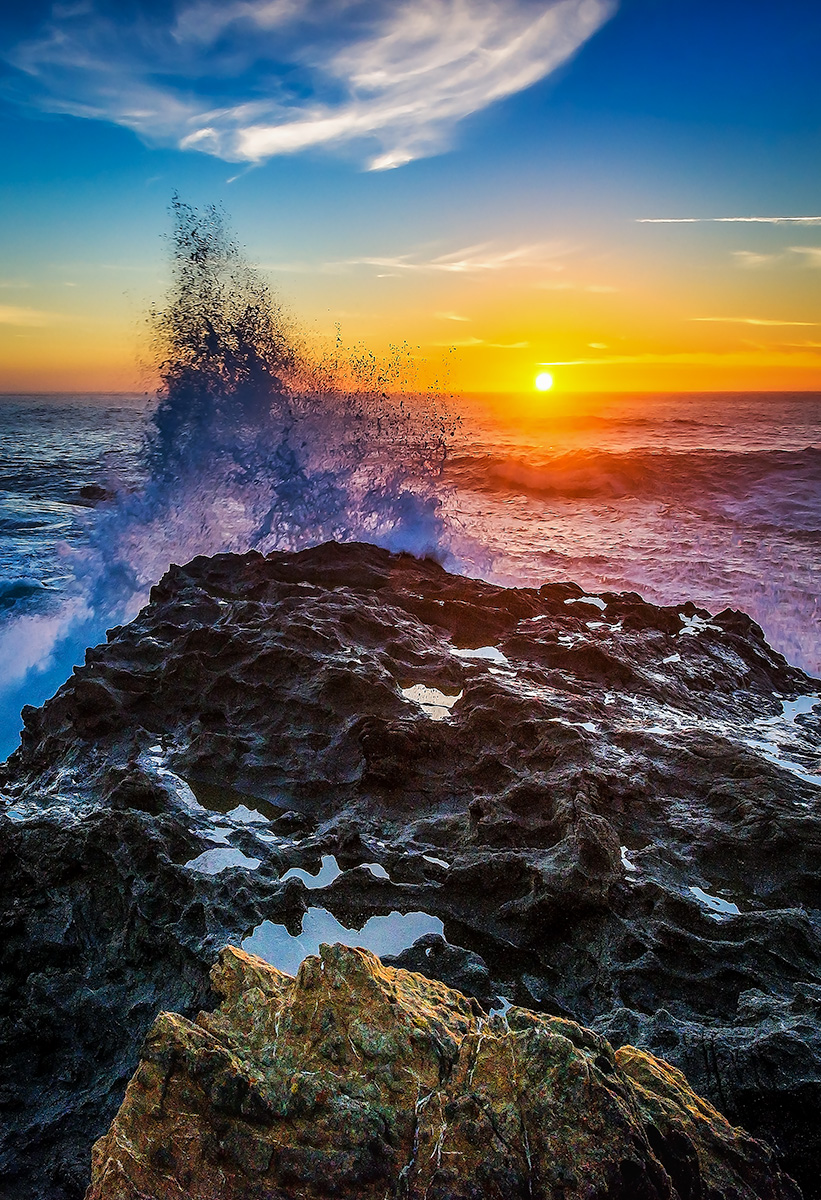
This was taken at the Russian Gulch State Park in Mendocino CA.
Equipment: Nikon D800, Nikkor 14-24mm @ 24mm, f22, 1/60 sec., ISO 400, with tripod.
Comments
6 comments
Comment posted by Preston Birdwell on November 29, 2015 at 10:17 AM
Gina, I like the composition and the power displayed in this image. I do have some things I'd like to point out, however.
The foreground boulder looks out of key with the rest of the image. I think this is because the shaded side is too bright.
I am seeing what appear to be sharpening halos around the some of the pools and the edge of the main rock where it meets the surf.
The blues and cyans are over-saturated. This is especially evident in the spray and the surf to the left of the spray.
I think this is very nice, but could be improved with some tweaking.
Please feel free to comment on the work of others, too.
--P
Registered on November 1, 2003, 471 Posts, 5188 Comments
Comment posted by Jim Jirka on November 29, 2015 at 12:33 PM
While the view looks like it would be a nice image, I just can't get past the electrifying colors.
Jim
Registered on November 1, 2003, 254 Posts, 1620 Comments
Comment posted by Luke Ormand on November 29, 2015 at 1:02 PM
I love the action, the different textures and the shutterspeed here. However, I feel like it's a bit oversatured - especially with the magenta cast on the water
Registered on February 4, 2009, 1093 Posts, 7035 Comments
Comment posted by Lon Overacker on November 29, 2015 at 2:02 PM
Gina,
I agree with the others about the saturation. Not only the saturation, but the variance in color throughout. purple in the water to the right of the splash and cyan to the left.
Even though the rock at the bottom almost seems out of place, what I do like about this image is how that rock is mimmicked by the cloud at the top of the frame.
This image has great potential, but I do think needs some color processing work.
Lon
Registered on November 24, 2006, 521 Posts, 19147 Comments
Comment posted by Katie Jones on November 30, 2015 at 8:41 PM
Gina,
Beautiful capture here, but I have to agree with the over-saturation comments of the others. It's just a little too much and I think it might actually detract from on otherwise beautiful shot. Tone it down a bit in the post-processing and I think you have a winner! :)
Registered on November 17, 2015, 17 Posts, 91 Comments
Comment posted by Gina Cox on December 1, 2015 at 2:27 AM
Thanks for all the comments and suggestions. This images was taken a few years ago. It was originally a landscape image that I cropped to what you see here. When I get a chance I'll reprocess and repost.
Thank you!

Comments
6 commentsThe foreground boulder looks out of key with the rest of the image. I think this is because the shaded side is too bright.
I am seeing what appear to be sharpening halos around the some of the pools and the edge of the main rock where it meets the surf.
The blues and cyans are over-saturated. This is especially evident in the spray and the surf to the left of the spray.
I think this is very nice, but could be improved with some tweaking.
Please feel free to comment on the work of others, too.
--P
Jim
I agree with the others about the saturation. Not only the saturation, but the variance in color throughout. purple in the water to the right of the splash and cyan to the left.
Even though the rock at the bottom almost seems out of place, what I do like about this image is how that rock is mimmicked by the cloud at the top of the frame.
This image has great potential, but I do think needs some color processing work.
Lon
Beautiful capture here, but I have to agree with the over-saturation comments of the others. It's just a little too much and I think it might actually detract from on otherwise beautiful shot. Tone it down a bit in the post-processing and I think you have a winner! :)
Thank you!