Nature Photographers Network
This is the preserved archive of the original Nature Photographers Network. The community continues at naturephotographers.network.
Merced Calm
‹ PreviousLandscape GalleryNext ›

Merced Calm

by Lon Overacker

Gallery: LandscapePosted November 29, 2015294 views21 comments
Thanks for everyone's comments on my previous post, Much appreciated.

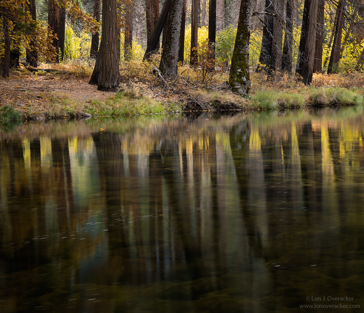
This one is a bit more standard fare. A quiet section of the Merced river just downstream a hundred yards or so from a very popular pullout and view across the valley of Bridal Veil falls.  I was attracted to the fall color reflecting in the river, although this cropped version doesn't really say that.  I'm going to post the original file I worked up and would like your opinion on which you may prefer.  I know why I prefer one over the other, but would like  your thoughts.

I thought about cloning out all the foam streaks in the water and I did just a couple in the LRC, but there's just too many of them. I'm wondering if those are distractions?

Comments, critiques and suggestions always welcome!

Nikon D800E
Tamron 24-135mm @

Comments

21 comments
Comment posted by Lon Overacker on November 29, 2015 at 2:47 PM
original for reference.  
Registered on November 24, 2006, 521 Posts, 19147 Comments
Comment posted by Dan Baumbach on November 29, 2015 at 5:51 PM
Lon,

I like the original composition better.  I like the yellow tree at the end.  I might try darkening it a bit to see if it makes it less distracting.  I don't know if it's just the cropping, but the contrast looks a little higher on the cropped version.  Or maybe it's just a bit darker.  Anyway, I like it.  The trunks and the river look a bit darker in the cropped version.

- Dan
Registered on November 1, 2003, 473 Posts, 7980 Comments
Comment posted by Alberto Patiño on November 29, 2015 at 6:05 PM
This is truly marvelous, Lon. I prefer the cropped version, as it keep my attention on the wonderful tree reflections. I would not worry about cloning anything out, I don't find the streaks distracting. 
One interesting observation, on the sharpness saga: to me, the uncropped vesrion that you included as a comment looks definitely sharper than the large cropped version. There must be something in the way that the NPN site handles the larger jpgs...
Registered on December 2, 2014, 278 Posts, 1736 Comments
Comment posted by Igor Doncov on November 29, 2015 at 6:28 PM
In my opinion the cropped version is clearly superior to the original. The cropped version is art - the original is more of a grab shot. The bright yellow at one end is drawing too much attention. The foam streaks are not a problem, they improve the image. This is excellent.
Registered on November 22, 2014, 189 Posts, 2733 Comments
Comment posted by Ian Cameron on November 29, 2015 at 6:53 PM
I love the reflected lines of the trees and the detail you can see through the very shallow Merded river.  Very pleasing and I think this crop you made was exactly right the more vibrant yellow autumnal leaves in the full version you showed is too dominant and distracts from the subtle reflections.
Registered on August 6, 2004, 1125 Posts, 3318 Comments
Comment posted by David Schoen on November 29, 2015 at 7:17 PM
Cropped version works better for me.  The yellow tree is distracting.  I find the most interesting part of the image is the reflection of the tree trunks intermixed with the colored vegetal matter reflections; the color is close to the refllections of the trunks, yet in reality, the color is behind the trunks.
Registered on November 6, 2006, 1213 Posts, 4587 Comments
Comment posted by Chris Chamberlain on November 29, 2015 at 7:21 PM
As much as I like the color in the uncropped version, I think the crop is the stronger of the two. I like them both though. The crop really does seem to have more intent than the other. The light and colors are fantastic! Don't sweat the foam streaks, It's a personal taste thing and you aint' gonna please everybody. I happen to like them.
I have an early morning shot from here last year. It was windy so there's a little motion blur in the foliage. It was dark, so a longer exposure smoothed out the water. It's quite a bit cooler than this one here. But that's kind of my thing though. I might take another look at it though.

Chris
Registered on March 13, 2007, 500 Posts, 8365 Comments
Comment posted by Harley Goldman on November 29, 2015 at 10:02 PM
Beautiful Lon. I would clone out the foam streaks if it were mine. Less time that cleaning up dust on a 4x5 scan. sad  This is a really peaceful serene scene and I like it a lot. Definitely the cropped version works for me. 
Registered on November 19, 2003, 586 Posts, 11271 Comments
Comment posted by gary phillips on November 30, 2015 at 2:14 AM
As presented, I like the cropped version.  I do like the original if the log and it's reflection were burned down quite a bit.  The cropped version has a very nice symetry, but the uncropped version adds a different look to what you might expect.  Perhaps that's why I like it.  I would clone only the stray bits, particuarly btm right.
Registered on October 24, 2013, 185 Posts, 4136 Comments
Comment posted by Eva McDermott on November 30, 2015 at 2:28 AM
I love the mood and more subtle light in the cropped versin Lon.  I also like the 4X5 crop.
Registered on January 4, 2009, 1015 Posts, 13229 Comments
Comment posted by scott lanz on November 30, 2015 at 6:55 AM
I like both images, Lon. The colors and lines in the reflection are terrific, and the overall scene is beautiful. Like Gary, I find the log and water at the far right side is just a bit bright. If this area can be toned down, this becomes a difficult choice, but I like the way the cropped version emphasizes the lines in the reflection. 
Registered on November 14, 2003, 840 Posts, 12902 Comments
Comment posted by Roel Wijtmans on November 30, 2015 at 10:46 AM
The cropped version is the winner for me, the big yellow piece in the original is screaming a bit too much for attention. I wouldn't clone out the streaks, they are subtle and create some nice movement in the water. Very lovely shot, Lon!

Just a hint if you want to get rid of the streaks, it might be easier to take several exposures, load them as separate layers into PS and combine the parts without streaks to one single file. In my hands, that is a quicker and easier process than taking one photo and cloning them out. After all, making several exposures is no big deal anymore now that you are on the digital side, haha.
Registered on September 30, 2012, 116 Posts, 2257 Comments
Comment posted by Jim Jirka on November 30, 2015 at 11:34 AM
A quiet tranquil setting. I think the presented image is much better than the original, it allows for more deeper viewing than the one with more color.
Jim
Registered on November 1, 2003, 254 Posts, 1620 Comments
Comment posted by Lon Overacker on November 30, 2015 at 12:52 PM
Thanks everyone for your comments and perspectives.  It seems there is quite the range of opinions on both the crop/bright tree and the foam streaks, but most favor the crop which I do as well.  I may tweak this further.

Yes, there is a difference in contrast and exposure between the two.  The original uncropped version was processed a couple weeks ago.  But it was only a few days ago that I decided to crop and post.  Some additional burning in both the water and bg foliage are a little more in the cropped version.  

Roel, thanks very much for the tip on the streaks!  Great idea I don't know why I didn't think of it, given that I don't have a problem taking multiple images for focus stacking.  ;-)  I'll  have to remember. 

Thanks everyone!

 
Registered on November 24, 2006, 521 Posts, 19147 Comments
Comment posted by Dietrich Gloger on November 30, 2015 at 2:09 PM
Standard fare perhaps, but a classy version of it!  I really enjoy exploring the lower 2/3 - how the dark trunks fade into the dark river bottom just works extremely well for me. And so I like the weight this crop gives to that aspect of the scene. I think this would work equally well with a slightly tighter crop from the top (where the yellow underbrush starts) or even more cropping from the top showing just the river bank. Lots of cropping options. Meaning the original was just badly composed....sad  No, surely not, but the bright yellow tree and its reflection is indeed pulling the eye away from the best part.
Registered on January 26, 2007, 360 Posts, 9876 Comments
Comment posted by Preston Birdwell on November 30, 2015 at 6:34 PM
The difference btween the two frames is really something. I love the crop in OP, and the composition and processing look spot-on. I think the bits of foam add a nice sense of motion to the river. The reflections are beautiful. Well done, sir!

--P
Registered on November 1, 2003, 471 Posts, 5188 Comments
Comment posted by Nick Bristol on November 30, 2015 at 6:41 PM
Lon, What a wonderful image this is. It has a beautiful quiet mood that makes it so inviting to look at. Great light, colors and I just love those reflections. This is the kind of image that I can just sit back and enjoy.The cropped version as you posted it looks fantastic! Really Nice! 

Nick Bristol
Lone Rock, WI
Registered on February 1, 2004, 752 Posts, 14140 Comments
Comment posted by Stephen Stanton on December 2, 2015 at 12:26 AM
Like seeing the deeper tree trunks patterned and slightly angled into the frame. The reflection of the yellows contrasting with the darker trunks is real sweet. Would you consider cropping a bit off the bottom?...up to that cigarettte looking foam on the right side .  I don't mind the diagonal buch in the middle, as some pick up the reflection of colors. Image #1 for sure...I blinked and backed away when I saw image 2. The explosion of yellow intrudes and overcomes the calmness of that soothing river bank. The river refection with the submerged rocks is quite sublime.  Nice work.
Registered on March 1, 2015, 54 Posts, 453 Comments
Comment posted by Kah Kit Yoong on December 4, 2015 at 3:43 AM
I like the cropped version a lot better. That tree on the right and the bright colour unbalances the image too much. A beautifully serene image, I like everything about it.
Registered on September 27, 2006, 636 Posts, 10682 Comments
Comment posted by Youssef Ismail on December 10, 2015 at 8:54 PM
Keep the streaks. They add a subtle dynamicism to the whole scene.  BTW, are you finding that cropping the D800 files to the 4x5 format loses much resolution in terms of enlargement for printing?
Registered on November 1, 2003, 474 Posts, 5555 Comments
Comment posted by Albert Darmo on December 12, 2015 at 10:25 AM
Hi  Lon  crying    Sorry  i missed  the comment on this  one..  it  just sliped  through my  fingers..    happens  when your 82.  ..... the  harmony  of  color and  form  in this scene is  remarkable.  .. the croped version is  my choice.              Congrat  on the WP. 
Albert Darmo
Canadadevildevildevil
Registered on November 25, 2008, 1386 Posts, 11978 Comments