Nature Photographers Network
This is the preserved archive of the original Nature Photographers Network. The community continues at naturephotographers.network.
Angel Fish
‹ PreviousLandscape GalleryNext ›

Angel Fish

by gary phillips

Gallery: LandscapePosted December 11, 2015244 views18 comments
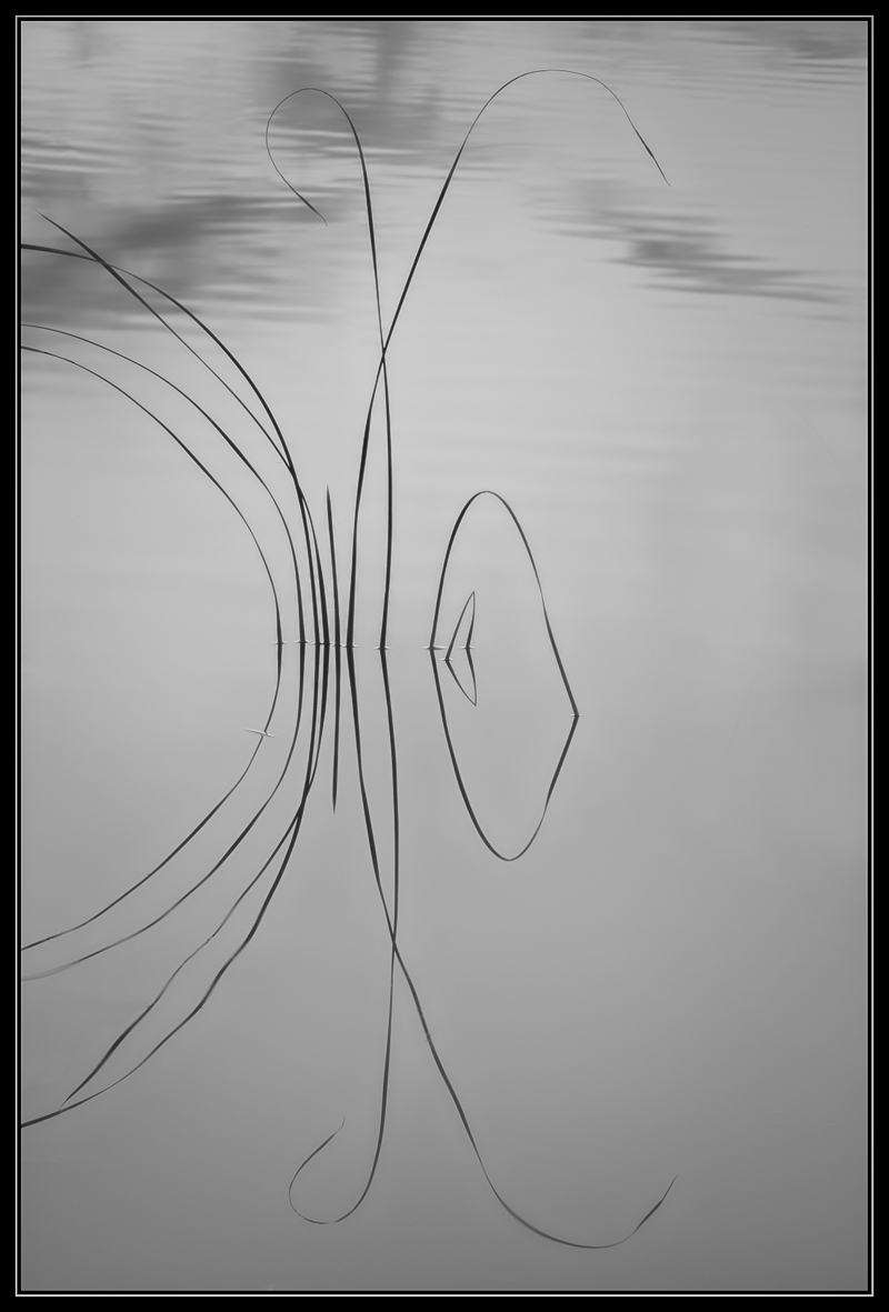
Found this little jewel on an evening when the fall colors just weren't right.  It was 37 degree and the only way to reduce clutter was to wade in to my ankles.  I liked this with a more high key presentation and I'd like to know what you think.

iso 100, 70-200 @ 97mm, f/8, 1/8s

You comments and critiques are greatly appreciated

Comments

18 comments
Comment posted by Lon Overacker on December 11, 2015 at 1:10 AM
Gary,

The only word I can come up with is elegance.  Ok, maybe graceful, poingant and strking.  Graphic, dynamic and engaging.  Ok,  how about I LOVE this, this is outstanding.

I'm not sure I would call this high key though.  You could quickly make it so, and I bet there is an alternative in doing that... but I love this simple presentation.  Not enough words...

Lon
Registered on November 24, 2006, 521 Posts, 19147 Comments
Comment posted by Peter Richter on December 11, 2015 at 3:00 AM
Gary, there is a wonderful subtlety to your image to me,  and the slight asymmetry makes for an amazing tension.

I think of brightening the greys and enhancing the contrast a little bit, but that is just a matter of opinion of course. Great work to my eye!

Peter
Registered on November 10, 2010, 218 Posts, 2723 Comments
Comment posted by scott lanz on December 11, 2015 at 6:52 AM
Simple and evocative, Gary. A real beauty. devil
Registered on November 14, 2003, 840 Posts, 12902 Comments
Comment posted by Thomas Haney on December 11, 2015 at 8:22 AM
Wonderfully seen Gary, I love the simplicity and interesting shapes.  Part of me wishes the composition was shifted more to the left so that grass wasn't cut off, but I like this very much as is. 
Registered on April 7, 2013, 138 Posts, 537 Comments
Comment posted by Roel Wijtmans on December 11, 2015 at 10:31 AM
Wow, what really stands out for me is the elegance of the shapes of the grass. Normally at least one of them is broken which interupts the flow a bit, but you succeeded in finding a bunch of them with only smooth and elegant shapes (ok, except for the tiny one which is broken, but that doesn't count). Very neat! Maybe I would have liked to see more of the left side, but this works just as fine like this. BTW, the subtle details in the top part of the water are great too.
Registered on September 30, 2012, 116 Posts, 2257 Comments
Comment posted by Roberto Facchini on December 11, 2015 at 10:44 AM
I agree with others: a beautiful composition. essential and elegant.
Registered on November 15, 2012, 35 Posts, 202 Comments
Comment posted by Ed Lowe on December 11, 2015 at 12:07 PM
This is so zen and peaceful looking and I love those graceful lines of the grasses, Gary. I could also see you brigtening this a bit more for your high key effect. This is being super picky, but I think would like this even more if you used the content aware bush and used it on those couple of grasses on the left that got cropped off. Just a suggestion of course as this is a beauty as is.

Ed
Registered on February 7, 2004, 414 Posts, 7115 Comments
Comment posted by Dave Dillemuth on December 11, 2015 at 12:40 PM
Gary,
This is excellent. The elements are beautifully framed and the image evokes a sense of calm. My only suggestion is that I might try to lighten the overall image and increase the contrast slightly. 
Registered on December 10, 2015, 104 Posts, 1112 Comments
Comment posted by Bill Chambers on December 11, 2015 at 12:41 PM
A true jewel!  I love this Gary.  I wish the reeds on the left didn't extend through the frame but that's relatively minor.  A beautiful capture.
Registered on April 10, 2005, 753 Posts, 21216 Comments
Comment posted by Nick Bristol on December 11, 2015 at 3:29 PM
Gary, This is really nicely done. Great composition and I like the b&w processing on this. I could see it a tad brighter but it works just fine as is. Cool shot!!

Nick Bristol
Lone Rock, WI
Registered on February 1, 2004, 752 Posts, 14140 Comments
Comment posted by Harley Goldman on December 11, 2015 at 5:44 PM
Simple and beautiful!!! Love it.
Registered on November 19, 2003, 586 Posts, 11271 Comments
Comment posted by David Schoen on December 11, 2015 at 6:09 PM
This is very simple yet complex with respect to lines and form.  I think it is very effective in an abstract sense.  The individual blades of grass seem to fit together well to convey deeper significance.
Registered on November 6, 2006, 1213 Posts, 4587 Comments
Comment posted by Jim Greenwood on December 12, 2015 at 9:06 AM
I think this is just about perfect as you have presented it.  Some have suggested brightening the image.  This would result in a different composition of course, not better in my opinion, perhaps equally as good but different.  My only suggestion is to clone out the small artifact disturbing the reflection of the leftmost blade of grass.
Registered on November 9, 2003, 229 Posts, 1523 Comments
Comment posted by Mark Seaver on December 13, 2015 at 5:51 PM
Gary, I'd say that your wading was well worth the cold feet.  This is a simple, graceful beauty with a fine emphasis on the lines formed by the leaves and their reflections.  I also really like how you've offset those in the frame.
Registered on January 23, 2011, 1103 Posts, 17270 Comments
Comment posted by Albert Darmo on December 14, 2015 at 11:05 PM
Hi  Gary  cryingLove this intimate  zen like  composition. !!!!! awesomedevil

Albert Darmo
Canada
Registered on November 25, 2008, 1386 Posts, 11978 Comments
Comment posted by Ryan Shain on December 15, 2015 at 10:28 PM
HI Gary,

This image is such an elegant and graceful work of art. I do not feel it is high key, as that would be pushing the grays more towards white? At least not high key to me. However, this is image is truly wonderful, and some really fine work.

I would be interested to see how you saw this image in a darker mood than this current presentation, but also a even higher key would be interesting too. Hey, maybe you could do a series of there different exposures and presentations. cool
Registered on February 20, 2007, 226 Posts, 4571 Comments
Comment posted by Igor Doncov on December 17, 2015 at 10:53 PM
I wanted to comment on this before it scrolls off the screen. This is a very peaceful yet elegant image. I like it very much especially the upper half where the water is more varied in it's tonality. I'm wondering if you could make the water slightly lighter in tone yet not lose the tonal richness in the upper section. Perhaps a bit more contrast without becoming too stark.
Registered on November 22, 2014, 189 Posts, 2733 Comments
Comment posted by Lucy Aron on January 25, 2016 at 12:59 AM
Just right Gary.  My kind of image with its utter simplicity of line that's often so elusive.   Magical.
Registered on February 25, 2011, 189 Posts, 1160 Comments