Gallery: LandscapePosted December 17, 20153,255 views10 comments
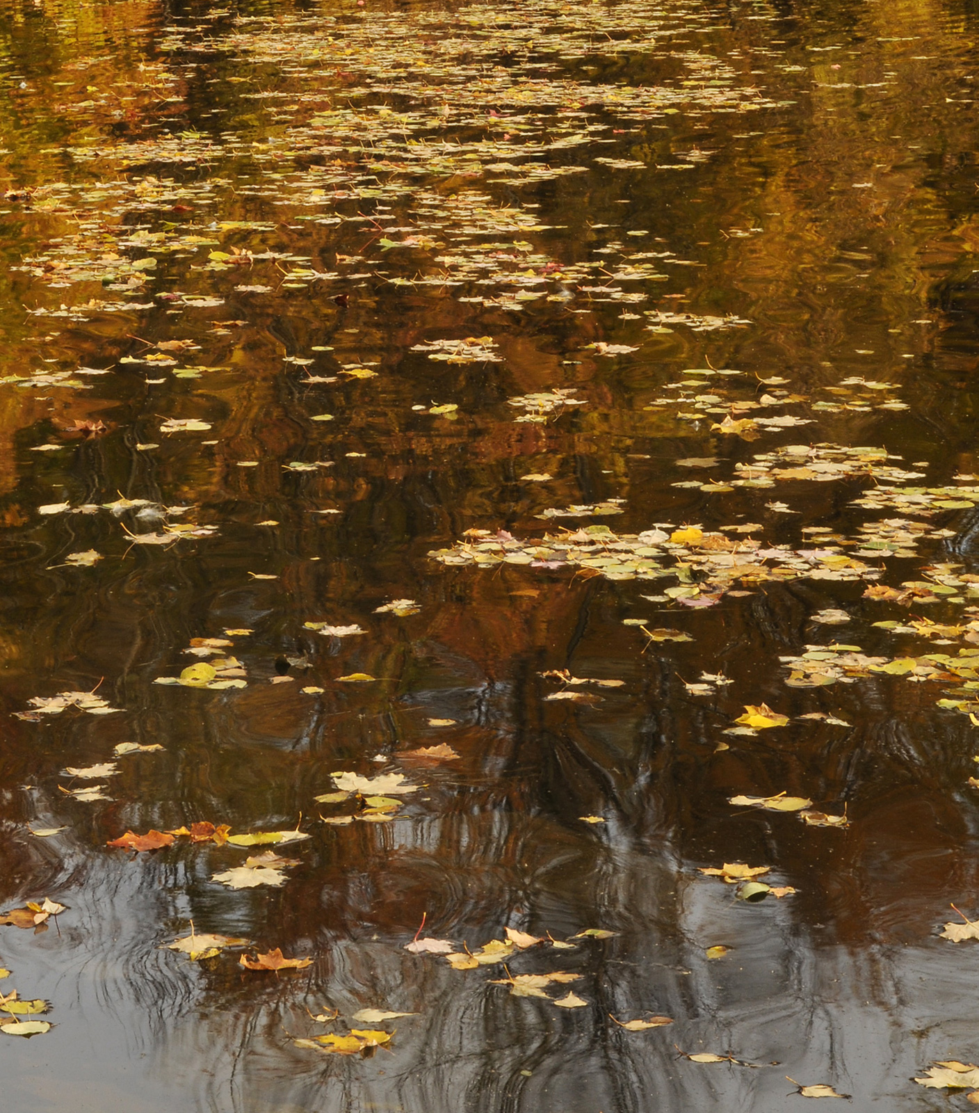
I like how the colors of the maple tree reflected in the water along with the fallen maple leaves .. comments appreciated..
D300... 17-55 F /2.8. @ 55mm f/20... 1/30 sec.. iso 200. tripod. cable release...
Comments
10 comments
Comment posted by David Schoen on December 17, 2015 at 7:02 PM
This is nice Albert. I like the way the leaves with definite shape give way to the reflections of the trees with irregular shape. The color also cascades from deep orange to yellow from BG to foreground. Nice comp.
Registered on November 6, 2006, 1213 Posts, 4587 Comments
Comment posted by Wayne Jones on December 17, 2015 at 10:02 PM
Nice scene, Albert. I think the reflected orange leaves make a great backgound for the lighter floating leaves, but I don't think the the sky and bare treetops at the bottom of the frame work as well. I like the more uniform look of the top 3/4 of the picture better. For my taste, a sqare, or a horizontal 4x5 comp of the top of this looks "cleaner." Cover up the bottom, and see what you think.
Registered on April 18, 2007, 953 Posts, 6435 Comments
Comment posted by Jim Hansen on December 17, 2015 at 11:21 PM
Love this Albert! Nice how the leaves make a trail, front to back, through the water. Very nice.
Registered on May 5, 2011, 161 Posts, 908 Comments
Comment posted by Jim Greenwood on December 18, 2015 at 12:59 AM
Hmmm ... I have to respectfully differ with Wayne's comments and crop suggestion. In my opinion the more intricate reflections at the bottom add significant interest to the image. I like the composition as presented. But, as an alternative, I'd actually suggest pretty much the opposite of what Wayne suggested, to crop this to a square format by cropping from the top to eliminate the less distinctly separated leaves in the upper part of the image as well as the area in the upper right corner where there are only a few leaves. I think this would result in a nicely balanced square composition.
Registered on November 9, 2003, 229 Posts, 1523 Comments
Comment posted by Lon Overacker on December 18, 2015 at 10:47 AM
Albert,
What a wonderful comgination of the floating leaves and bg, abstract reflections.
I would add to the cropping discussion here. In fact, this came to my mind when i first viewed this before any comments were posted. Actually what made me think crops was simply because I'm forced to do vertical scrolling in the extra large view on my measly 23" monitor. Good news is that you have good detail top to bottom which gives you flexibility here.
I see 3 independent options. This is a wonderful autumn scene as presented. Only suggestion is maybe a slight boost in saturation - personal taste of course. But I also see a horizontal crop of the top, AND of the bottom. This creates 2 unique images with their own very nice qualities. The upper crop actually improves what detail we can see, including the reflection details. The bottom crop would have a much more abstract look to it with the distorted branch reflections.
These are great choices to have Albert!
Lon
Registered on November 24, 2006, 521 Posts, 19147 Comments
Comment posted by Preston Birdwell on December 18, 2015 at 11:02 AM
...to crop this to a square format by cropping from the top to eliminate the less distinctly separated leaves in the upper part of the image as well as the area in the upper right corner where there are only a few leaves. I think this would result in a nicely balanced square composition.
This was my thought, exactly. The reflected branches and leaves at the bottom of the image are what really grab me. I also agree with Lon's suggestion to increase the yellow saturation just a bit. If you decied on the quare crop, you migh also look at darkening the greys and blacks there just a bit.
As Lon said, it's nice to have choices.
--P
Registered on November 1, 2003, 471 Posts, 5188 Comments
Comment posted by gary phillips on December 18, 2015 at 1:19 PM
I lov this one Albert. When I first viewed it I thought a crop from the bottom would suit this, but the more I enjoyed it, the more I like it just the way it is. Really nice.
Registered on October 24, 2013, 185 Posts, 4136 Comments
Comment posted by Patrick O'Healy on December 18, 2015 at 3:40 PM
Very nice shot Albert. I really like the way the leaves lead my eye through the shot. A very nice rendition of a shot I might not ever take because I would not understand its potential.
Registered on March 13, 2011, 326 Posts, 1679 Comments
Comment posted by Daniel Rappaport on December 18, 2015 at 8:36 PM
Have to say I like this as is. The flow of the leaves from foreground to background really works for me and pulls me into the reflections.
Registered on September 9, 2009, 294 Posts, 2006 Comments
Comment posted by Ed Lowe on December 18, 2015 at 10:16 PM
I like this as is, but I could see the crop suggestions working also, Albert. I think those abstract reflections bring so much more to this scene. Great eye to spot this.
Ed
Registered on February 7, 2004, 414 Posts, 7115 Comments

Comments
10 commentsWhat a wonderful comgination of the floating leaves and bg, abstract reflections.
I would add to the cropping discussion here. In fact, this came to my mind when i first viewed this before any comments were posted. Actually what made me think crops was simply because I'm forced to do vertical scrolling in the extra large view on my measly 23" monitor. Good news is that you have good detail top to bottom which gives you flexibility here.
I see 3 independent options. This is a wonderful autumn scene as presented. Only suggestion is maybe a slight boost in saturation - personal taste of course. But I also see a horizontal crop of the top, AND of the bottom. This creates 2 unique images with their own very nice qualities. The upper crop actually improves what detail we can see, including the reflection details. The bottom crop would have a much more abstract look to it with the distorted branch reflections.
These are great choices to have Albert!
Lon
As Lon said, it's nice to have choices.
--P
Ed