Gallery: LandscapePosted December 19, 2015248 views20 comments
Hi All,
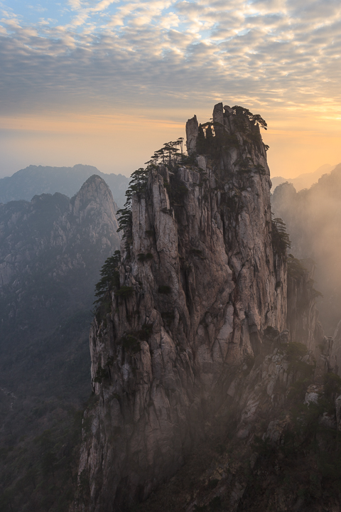
Here is my final image from a Yellow Mountain in Anhui Province, China. Appreciate any comments and/or suggestions.
5D II, 17-40L @ 22mm
ISO100, f/13, 1/10 sec.
Thanks
Comments
20 comments
Comment posted by Harry Lichtman on December 19, 2015 at 7:51 PM
I find this the best of your series. The rock face is a strong focal point and gorgeous filtered light surround. I'm not one to usually suggest more sat., but I think it could really help the image and still be well within the realm of believability. Maybe a little contrast too. Outstanding dramatic view.
Registered on September 17, 2010, 304 Posts, 3507 Comments
Comment posted by Ed Lowe on December 19, 2015 at 9:03 PM
Another beauty, Dave. The POV is fantastic as are the cluds along with the atmospherics created with the fog. I like Harry's suggestion of a bit more sat and contrast. I just have to ask: did you climb to get these images?
Ed
Registered on February 7, 2004, 414 Posts, 7115 Comments
Comment posted by Dave Dillemuth on December 19, 2015 at 9:13 PM
Harry, Ed,
Thanks for the comments. Here's a version with saturation and contrast boost.
Registered on December 10, 2015, 104 Posts, 1112 Comments
Comment posted by Mark Seaver on December 19, 2015 at 10:25 PM
Neat shot, David. I like how the front peak sticks out clearly showing so much detail and how the other peaks fade into the foggy distance. You've also got some nice light and a fine set of clouds. Although somewhat unconventional, I also like where you got that front peak placed in the frame. I actually prefer the gentle softness (sense of quiet solitude) of the original post, while the extra contrast and saturation give more pop, they change the mood for me.
Registered on January 23, 2011, 1103 Posts, 17270 Comments
Comment posted by Ian Cameron on December 20, 2015 at 7:08 AM
I love the original post and believe this is just the right palette of colour and density of contrast the second post is marginally garish by comparison. Great scene and an amazing place to be.
Registered on August 6, 2004, 1125 Posts, 3318 Comments
Comment posted by scott lanz on December 20, 2015 at 9:46 AM
Beautiful image, Dave. I like the comp and the terrific atmospheric conditions. I can't decide between the orig and repost. Both look good to me.
Registered on November 14, 2003, 840 Posts, 12902 Comments
Comment posted by Roel Wijtmans on December 20, 2015 at 11:24 AM
Man, those are some photogenic mountains over there! This is once again very nice, although the patch of blue is a bit disturbing to me, so I would suggest a slight crop from the top. Love that misty part in the lrc. The softness of the original is the winner for me, the repo removes a bit of the mystical feeling you have in the original.
Registered on September 30, 2012, 116 Posts, 2257 Comments
Comment posted by Lon Overacker on December 20, 2015 at 12:12 PM
Dave,
Indeed a terrific, mystic look and feel to this one. The mist creates great mood and atmoshphere. My first thoughts before seeing comments was a slight boost in midtone contrast. I do like the repost very much, but do see the point others are making.
Perhaps there is a compromise. A technique I use freqently is masking and painting. what you could do here is whatever layer you used to adjust the contrast, through a layer mask on top. Fill that layer mask with black (black conceals, white reveals.) Then using a soft brush of appropriate size, paint white in the mask at some level of opacity. that's the technique - now to the why and where. If it were mine I would selectively paint back in the contrast of just the rock tower, or whatever it would be called. This would increase contrast in the rock selectively, but leave the mist and atmospher surrounding, thus maybe increasing the thought of this formation being enshrouded in mist. (of course the opposite masking could be used - a white revealing layer mask, then paint black all over the misty areas to remove the contrast adjustment.)
Just a thought, a compromise between the two. but then again, many might not see that as a compromise at all....
Regardless, a fabulous landscape that is certainly worthy making it the best it can be.
Lon
Registered on November 24, 2006, 521 Posts, 19147 Comments
Comment posted by Sairam Sundaresan on December 20, 2015 at 2:30 PM
Spectacular Atmosphere! Such a towering Monolith and the light really makes this sing :)
Registered on March 14, 2013, 100 Posts, 643 Comments
Comment posted by gary phillips on December 20, 2015 at 2:36 PM
Beautiful DAve. Those are some dramatic looking mountains, but the mist and the sky puts this over the top, excellent
Registered on October 24, 2013, 185 Posts, 4136 Comments
Comment posted by Jim Hansen on December 20, 2015 at 5:18 PM
Gorgeous David! I love everything about it. Beautifully layered, great textures, and that wonderful fog. Excellent work.
Registered on May 5, 2011, 161 Posts, 908 Comments
Comment posted by David Schoen on December 20, 2015 at 6:43 PM
This is very nice. Almost like a Chinese painting. Beautiful light. Both versions have their merits. I read what Lon had to say and his idea is certainly worth pursuing.
Registered on November 6, 2006, 1213 Posts, 4587 Comments
Comment posted by Daniel Rappaport on December 20, 2015 at 7:57 PM
Definitely my favorite of the group you've presented. I like everything about this. The mist adds to the mood. The ceiling of clouds really emphasizes the thust of that moutain, and the perspective just about gives me vertigo!
Registered on September 9, 2009, 294 Posts, 2006 Comments
Comment posted by Igor Doncov on December 21, 2015 at 1:11 PM
This is probably your best image on this subject. I would like to make a few observations. The heart of the matter is the ridge line with the trees on it, the distant mountains, the mist between the mountain and the distant mountains, and the sky. The inclusion of the rest diminishes the image because it makes these main components smaller. Specifically the bottom 1/3 of the image. I would suggest a crop of about 1/3 of the bottom, a little from the left up to the large distant peak, and some of the sky. Cropping the sky is unfortunate because it is so beautiful but it needs to be reduced to balance the greater prominance to the ridge.
Registered on November 22, 2014, 189 Posts, 2733 Comments
Comment posted by Mark Zelinka on December 21, 2015 at 3:05 PM
Excellent - thanks for sharing these images from a location we seldom see on this site.
Registered on August 20, 2007, 206 Posts, 998 Comments
Comment posted by Dietrich Gloger on December 21, 2015 at 4:46 PM
Another fine image of this exotic landscape, very intriguing.
Registered on January 26, 2007, 360 Posts, 9876 Comments
Comment posted by Dave Dillemuth on December 21, 2015 at 5:26 PM
Thank you all for the excellent, constructive input! I plan re-work the image based on your suggestions. This image has been especially challenging to optimize with my limited Photoshop skills.
Registered on December 10, 2015, 104 Posts, 1112 Comments
Comment posted by D.A. Edwards on December 21, 2015 at 7:30 PM
I like Roel's suggestion for some cropping of the blue sky up top, not all of it, just enough to reduce the impact/distraction. I prefer the original contrast for the mood it conveys. I find myself hoping that the mist is not actually industrial haze based on my limited knowledge of the location.
Registered on October 8, 2014, 226 Posts, 1187 Comments
Comment posted by Marylynne Diggs on December 21, 2015 at 9:45 PM
Another great one, Dave. I like this one and the one with twin mountains the best of the three. This one has lots more detail, but it's also kind of a portrait of a monolith rather than the "scene" of the first one. The more I look at it, the more I notice: the cloud "texture" mimicking the rock scales, the trees on the right edge disappearing into the fog. It's simply gorgeous.
Registered on December 14, 2010, 122 Posts, 1034 Comments
Comment posted by Nick Bristol on December 23, 2015 at 6:53 PM
Dave, This is an impressive image! Excellent comp but just a small crop to below the larger blue area of the upper left corner does work for me. It is an amazing scene and I love both versions but feel the second one works best for me. Wonderful work capturing this image!
Nick Bristol
Lone Rock, WI
Registered on February 1, 2004, 752 Posts, 14140 Comments

Comments
20 commentsEd
Thanks for the comments. Here's a version with saturation and contrast boost.
Indeed a terrific, mystic look and feel to this one. The mist creates great mood and atmoshphere. My first thoughts before seeing comments was a slight boost in midtone contrast. I do like the repost very much, but do see the point others are making.
Perhaps there is a compromise. A technique I use freqently is masking and painting. what you could do here is whatever layer you used to adjust the contrast, through a layer mask on top. Fill that layer mask with black (black conceals, white reveals.) Then using a soft brush of appropriate size, paint white in the mask at some level of opacity. that's the technique - now to the why and where. If it were mine I would selectively paint back in the contrast of just the rock tower, or whatever it would be called. This would increase contrast in the rock selectively, but leave the mist and atmospher surrounding, thus maybe increasing the thought of this formation being enshrouded in mist. (of course the opposite masking could be used - a white revealing layer mask, then paint black all over the misty areas to remove the contrast adjustment.)
Just a thought, a compromise between the two. but then again, many might not see that as a compromise at all....
Regardless, a fabulous landscape that is certainly worthy making it the best it can be.
Lon
Nick Bristol
Lone Rock, WI