Gallery: LandscapePosted December 22, 2015930 views13 comments
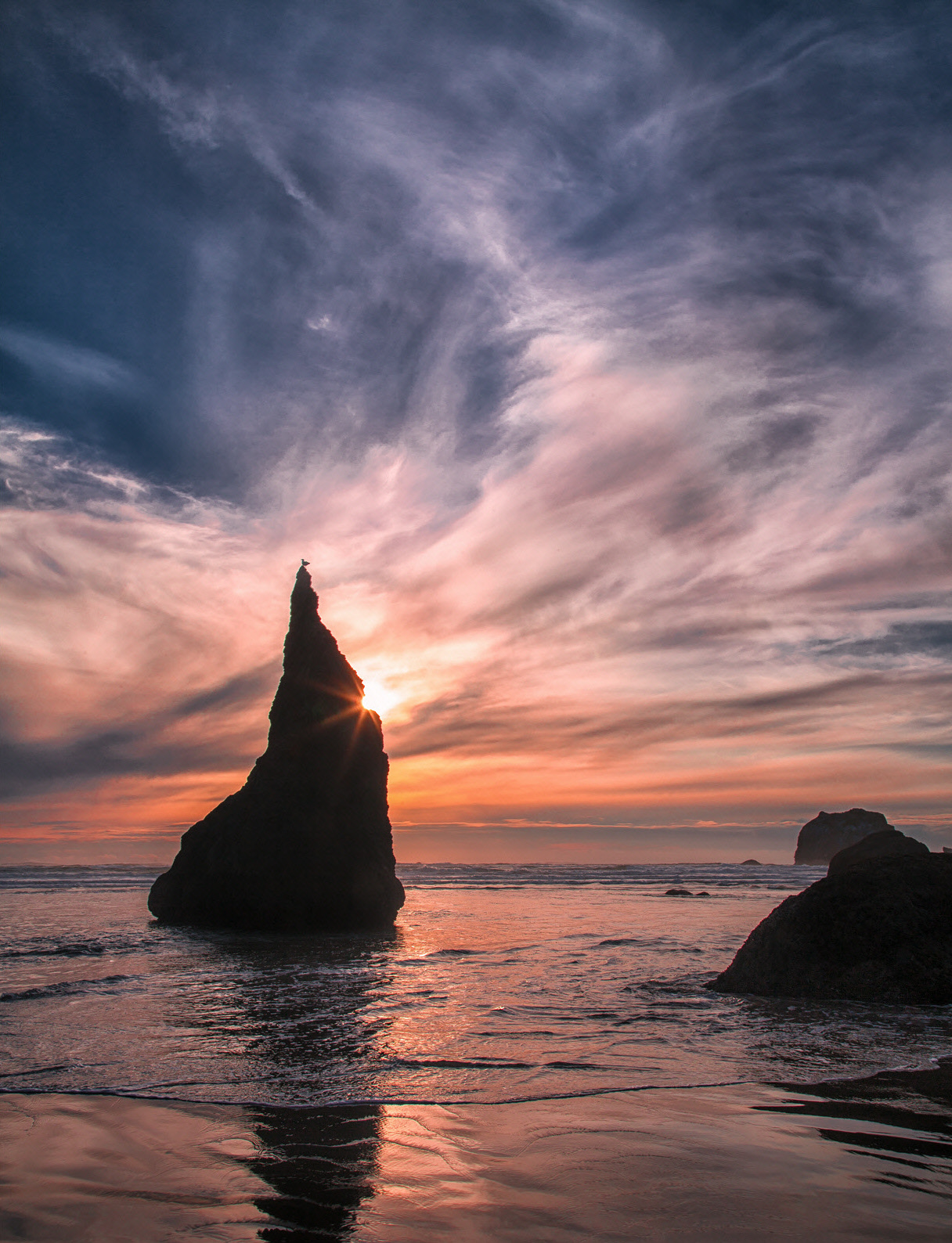
Same image as the previous B&W
Comments
13 comments
Comment posted by Pete Bengeyfield on December 23, 2015 at 12:02 PM
Color of B&W, it's tough to beat Bandon. Nice touch with the gull.
Registered on December 2, 2003, 1247 Posts, 3439 Comments
Comment posted by Roel Wijtmans on December 23, 2015 at 12:05 PM
Still very nice, but I must say I prefer the drama of the B+W version over this one. Also there is quite a bit of chrom. aberration visible around the main rock in this version which is a bit distracting.
Registered on September 30, 2012, 116 Posts, 2257 Comments
Comment posted by Dietrich Gloger on December 23, 2015 at 2:07 PM
The composition is very good, so this works well in color. But that sky in the B&W version is hard to beat...
Registered on January 26, 2007, 360 Posts, 9876 Comments
Comment posted by Lon Overacker on December 23, 2015 at 2:27 PM
Daniel,
Hard to go wrong here with the color version. Yes, I think the b&w version is more dramatic, simply because it's boiled down to contrast and graphics. But this certainly stands on it's own as a beautiful seascape. The gull having just the same amount of impact and touch to the scene.
I see you've cropped a bit off the bottom.... works for me! The only suggestion I have, and it's not a nit, but I think you have room to boost the saturation of the warm tones in the sunset clouds. But that's a personal choice of course.
Lon
Registered on November 24, 2006, 521 Posts, 19147 Comments
Comment posted by Daniel Rappaport on December 23, 2015 at 4:42 PM
No halo around the wizard's hat in the tif or the initial less compressed jpeg but after resizing and sharpening for the web - there it is. I hate sharpening artifacts - would rather see something sharpened not at all, so sorry for that!
Registered on September 9, 2009, 294 Posts, 2006 Comments
Comment posted by Nick Bristol on December 23, 2015 at 5:52 PM
Daniel, It is a beautiful scene and I think both versions are very nice. I like it in color and especially the reflections but overall I think I like the b&w version the best. Hard to beat the dramatic mood of that one. Very nice either way!
Nick Bristol
Lone Rock, WI
Registered on February 1, 2004, 752 Posts, 14140 Comments
Comment posted by Dave Dillemuth on December 23, 2015 at 6:01 PM
Daniel,
Well composed image. This is nice in color but I prefer the B&W rendering which is more dramatic.
Registered on December 10, 2015, 104 Posts, 1112 Comments
Comment posted by Ed Lowe on December 23, 2015 at 6:41 PM
I just went back and checked out the B&W and while I think both are first rate images I prefer the B&W slightly. The sky just seems more dramatic to me in the B&W. Great touch with the gull perched on top of the rock formation. Wonderful image, Daniel.
Ed
Registered on February 7, 2004, 414 Posts, 7115 Comments
Comment posted by Marylynne Diggs on December 23, 2015 at 6:51 PM
Great to see this one in color, Daniel. For me, the black and white works better (the hot sun doesn't present a problem in the b/w version), but I like the bottom crop here. This cloud color in this one seems a tish off too, perhaps it's the warm/cool thing mentioned above. If you can adjust the cloud temperature, remove the CAs, and burn the sun a bit (if possible), this will be great.
Registered on December 14, 2010, 122 Posts, 1034 Comments
Comment posted by David Schoen on December 23, 2015 at 7:25 PM
Another vote for the BW. But they each have their own merit.
Registered on November 6, 2006, 1213 Posts, 4587 Comments
Comment posted by Bill Fach on December 26, 2015 at 4:16 PM
Daniel: I like the B&W but I'm an avowed color junkie so I do prefer this version. One of my favorite places on the Oregon coast superbly captured.>=))>
Registered on November 1, 2003, 1805 Posts, 26981 Comments
Comment posted by Albert Darmo on December 27, 2015 at 12:49 PM
Hi Daniel What can i say . after Lon's excellent comment.. love both versions, each has it's qualities..excellent work,
Albert Darmo
Canada
Registered on November 25, 2008, 1386 Posts, 11978 Comments
Comment posted by Mark Metternich on December 28, 2015 at 6:10 PM
Nice job Daniel! We are going to have to hook up soon now that I have moved back to the PNW! :)
Registered on June 19, 2009, 276 Posts, 6240 Comments

Comments
13 commentsHard to go wrong here with the color version. Yes, I think the b&w version is more dramatic, simply because it's boiled down to contrast and graphics. But this certainly stands on it's own as a beautiful seascape. The gull having just the same amount of impact and touch to the scene.
I see you've cropped a bit off the bottom.... works for me! The only suggestion I have, and it's not a nit, but I think you have room to boost the saturation of the warm tones in the sunset clouds. But that's a personal choice of course.
Lon
Nick Bristol
Lone Rock, WI
Well composed image. This is nice in color but I prefer the B&W rendering which is more dramatic.
Ed
Albert Darmo
Canada