Nature Photographers Network
This is the preserved archive of the original Nature Photographers Network. The community continues at naturephotographers.network.
Isolated
‹ PreviousLandscape GalleryNext ›

Isolated

by Bill Fach

Gallery: LandscapePosted December 28, 2015269 views14 comments
Sony A77
Sony 70-400G @ 180mm, CPL
ISO 200, 1/250 @ f11
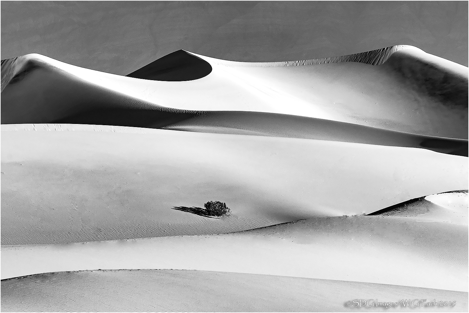
Mesquite Dunes, Death Valley NP

Taken the same morning as my previous post. I was attracted to the lone bush in the vast field of sand but I also liked the curves and textures of the overall scene. Thought I would try a conversion so would appreciate your thoughts on that result especially. Color version in first comment. >=))>

Comments

14 comments
Comment posted by Bill Fach on December 28, 2015 at 9:22 AM
Color version
Registered on November 1, 2003, 1805 Posts, 26981 Comments
Comment posted by Roel Wijtmans on December 28, 2015 at 10:21 AM
Apart from the highlights being a bit too bright, I would say this is a very succesful conversion to B+W! Nice shapes in the dunes, with the lonely bush being a nice anchor.
Registered on September 30, 2012, 116 Posts, 2257 Comments
Comment posted by Marylynne Diggs on December 28, 2015 at 12:06 PM
Another lovely dune image, Bill.  I just love the spill-over waves.  Those were not there when I visited.  The highlights don't bother me, but I'm on vacation with only my iPad mini-tablet at the moment. Once again, you diminished the background ridge effectively.  I fought that dang road up thay hillside in several shots.  

As for composition, I think I like it better with the lowest dune cropped off, making it more of a pano aspect, which places the bush more in the fg than middle.  I'd be interested in other thoughts on that though.
Registered on December 14, 2010, 122 Posts, 1034 Comments
Comment posted by Mark James Ford on December 28, 2015 at 12:56 PM
Hi Bill, wonderful composition and conversion - I like it! - I'm ok with the highligths (I prefer contrast rich B/W conversions). I think the pano composition without the lower dune would work but find the multiple horizontal lines work very well as is.  There is of course (and just to confuse the issue enlightened) also a good 'portrait' crop with the bush in the 1/3 left (or right!) and 1/3 from bottom buried in the composition as shown (not that these are necessarily better!) ... and that's the beauty of such a motif - there is so much you can do with it! 
Cheers, Mark
Registered on January 16, 2015, 60 Posts, 430 Comments
Comment posted by Harry Lichtman on December 28, 2015 at 2:07 PM
Beautiful dunescape.  I would prefer a little more detail in the left brightest dune if at all possible, but it still works very well as is.  Several crop options are available - th most intruiging part for me is the uppermost central section of the dunes.  Great contrast and lovely curves.  The color is pretty sweet too!
Registered on September 17, 2010, 304 Posts, 3507 Comments
Comment posted by Ed Lowe on December 28, 2015 at 2:21 PM
You can't go wrong with ether version, Bill. You gotta love those graceful lines, shapes and patterns in this beauty. Nicely done.

Ed
Registered on February 7, 2004, 414 Posts, 7115 Comments
Comment posted by Lon Overacker on December 28, 2015 at 3:28 PM
Bill,

The potential and options available here seem endless, including your previous post.  This one of course is a broader view, but the lines, shapes, contrasts, etc. are all exceptional here as well.  I like the added lines and shapes that include the lower dune - although I do see a vertical/squarish crop starting from the left, putting that little bush more off center.

For me, I much prefer the color version.  Just like in the previous post, I find the background to be a very important and beautiful element.  the soft blues in the color version just make the color combo really work.  Also, the color/contast of the dunes is beautiful; where as in the b&w version, the highlights are a little hot and seem to have lost texture.

Color version for me is outstanding!

Lon
Registered on November 24, 2006, 521 Posts, 19147 Comments
Comment posted by Eva McDermott on December 28, 2015 at 7:38 PM
While the color version is wonderful, I find I prefer the contrast and tones in the B&W version.  Great lines too Bill.
Registered on January 4, 2009, 1015 Posts, 13229 Comments
Comment posted by David Schoen on December 28, 2015 at 8:18 PM
I prefer the BW with the highlights toned down.  The shapes and shadows contribute to a more abstract interpretation.
Registered on November 6, 2006, 1213 Posts, 4587 Comments
Comment posted by Dennis Plank on December 29, 2015 at 9:33 AM
Hi Bill.  This isn't my normal milieu, but I had to chime in on this one.  To me the B&W and the color are two completely different images here.  The B&W fits the title very well, giving a feeling of cold and desolate isolation.  The color, with that gloriously rich looking sand just invites me in and is far too warm to let me contemplate a feeling of isolation.  Others have covered all the technical stuff, so I'll let it go at that.

devil
Registered on January 28, 2008, 1767 Posts, 23192 Comments
Comment posted by Harley Goldman on December 29, 2015 at 5:51 PM
I like them both, but I would like to see the highlights brought back in the upper left dune in the B&W. Or clone in a very light texture as another option. Each has a totally different mood and feel and both stand on their own rather well. The B&W has strong impact and the color has a very painterly look.
Registered on November 19, 2003, 586 Posts, 11271 Comments
Comment posted by scott lanz on December 30, 2015 at 7:12 AM
Very nice image of the curves and lines of the dunes, with the lone bush adding interest and a focal point. Both versions are excellent, Bill. I think the B&W would be viewed by most people as more "artisitic." 
Registered on November 14, 2003, 840 Posts, 12902 Comments
Comment posted by Sandro Bisotti on December 31, 2015 at 9:04 AM
great effect, wonderful image(s). I usually prefer monochrome, but here the colours are essential and not-disturbing, and in this particular case I have not preferences.
All the best,
Sandro
Registered on February 8, 2015, 30 Posts, 265 Comments
Comment posted by Lucy Aron on June 7, 2016 at 3:35 PM
Outstanding composition and grey scale hues.  Love how this still life has the illusion of movement because of the lines.
Registered on February 25, 2011, 189 Posts, 1160 Comments