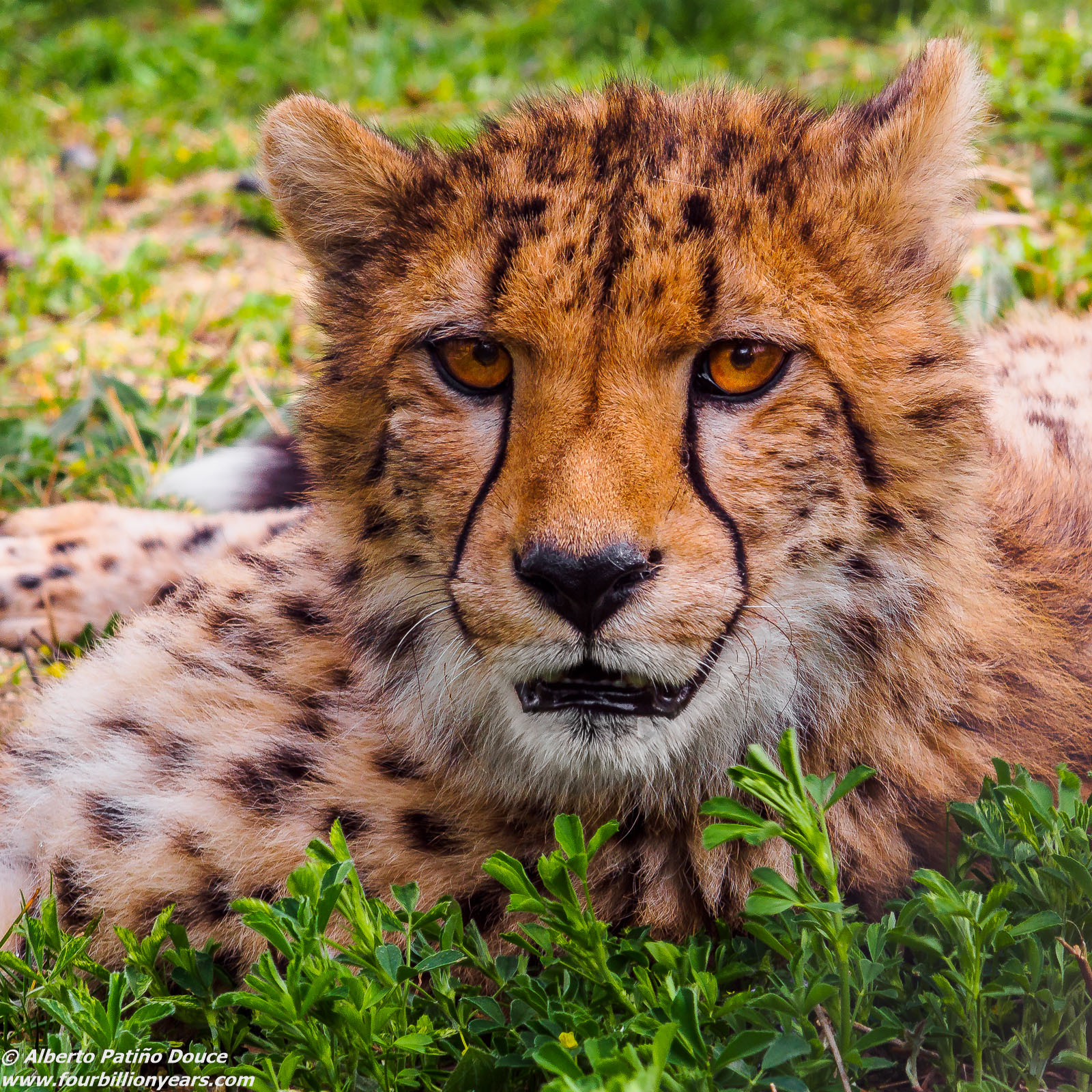
I'm watching you
by Alberto Patiño
Schönbrunn Zoo, Vienna, April 2015. It was a muggy overcast day and, perhaps because of the flat "sick" light, I've had a hard time getting what I think is the right color for a cheetah. I also toyed with b&w, and am posting one of the versions below. All comments/suggestions/preferences are welcome!!
OM Zuiko 100 mm f2.8 MF lens at f/8 or f/11 (more or less), Olympus OM-D EM-5, ISO 500, 1/125 sec, handheld, manual focus peaking "hack" on first generation EM-5, now it comes standard.

Comments
6 commentsthis is a very nice portrait and I like that you were able to get a low angle of photography. It is alos nice to see the eyes of the cheetah which in wild are often difficult to get since they are deeper in the skull as in other cats. That is because cheetahs hunt at day and need the eyes protected against sunlight. The colors look a bit saturated but still fine.
Technically very well done, good sharpness, good choice of depth of field and exposure is also fine.
I prefer the color version since I think that for black & white there is not enough contrast, something that is required for it. I also find that the spots at the background get more distracting since they are too bright.
Very nice kitty...you do seem to have quite the passion for cats!
My preference lies with the colour version vs. the current rendering of the B&W version. I do think there is good potential for a B&W conversion here, and the first thing I'd experiment with is lightening (not darkening) the greens.
While I agree that overall saturation seems a bit high, I think pulling the reds down MORE than all the other colours would work nicely. Another minor (and easily remedied) technical issue is that I think the sharpening has been pushed a little too far...(at least as viewed on my monitors...and I've checked a few different ones(.
Cheers...
Brad