Nature Photographers Network
This is the preserved archive of the original Nature Photographers Network. The community continues at naturephotographers.network.
Iceland Impression-Re-Post
‹ PreviousLandscape GalleryNext ›

Iceland Impression-Re-Post

by Harry Lichtman

Gallery: LandscapePosted January 19, 2016218 views14 comments
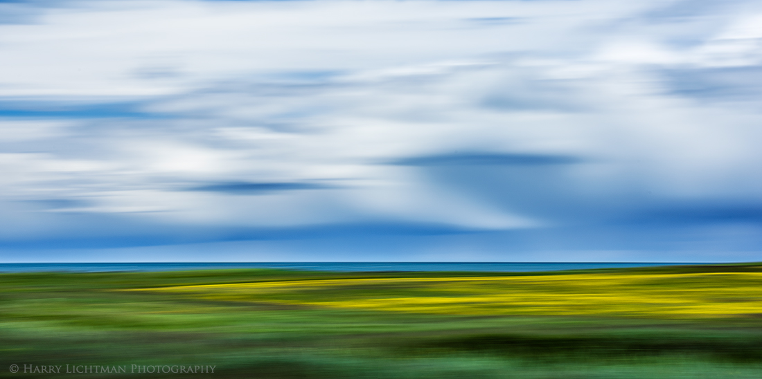
Another attempt at blurred landscape abstract taken while driving the south coastal plains of Iceland.  I thought the mix of colors and the distant storm clouds might be an interesting mix.  I have considered cropping some off the top, but I figured I would include the full image.  Hopefully it overcomes some of the shortcomings of the previous one.  If not, let me know!  A single image taken while driving and panning the camera.

Nikon D810; Nikon 80-400mm; ISO 31; f16; 1/10th sec.

Comments

14 comments
Comment posted by gary phillips on January 19, 2016 at 9:21 PM
I like this one Harry, I don't remember exactly what the first one was or the comments, but this is pretty dang artistic to me.  Love the layers of texture and color, particuarly the yellow.  I think this works because you can still tell where earth, sea, and sky come together in abstract.  Very interesting and engaging.
Registered on October 24, 2013, 185 Posts, 4136 Comments
Comment posted by Marylynne Diggs on January 19, 2016 at 10:13 PM
This one works much better for me than the first, Harry.  There is no variation vertically to distract, and the similarities in the sky and grass textures (or waves) provides a lovely unity. I'm tempted to say a 50/50 pano comp of sky/grass might work well too (the top 1/3rd of sky is a little lacking), but I really like it as presented here as well.

Since you were tempted to crop the top, I'd love to see that here too.

Great second opportunity well executed.

ML
Registered on December 14, 2010, 122 Posts, 1034 Comments
Comment posted by Alberto Patiño on January 19, 2016 at 11:25 PM
I like this one much more than the previous one - this one has an abstract landscape painting feeling that is missing from th eother one. I can see this one hanging on a white wall of a fancy apartment ! My only comment would be to bring down the blues just a hair? 
Registered on December 2, 2014, 278 Posts, 1736 Comments
Comment posted by Lon Overacker on January 20, 2016 at 1:18 AM
Harry,

A clear winner over your previous post. I totally agree with Marylynne, and was even thinking a top crop before reading the comments.  There is a similar abstractness between the top and bottom, even though the colors are in stark contrast.  I would consider cropping down to just above the elongated blue and white strips merging with the left edge.  Most everything above that is not adding to the comp.  I like the idea of the near 50/50 split with this.

A very striking and effective abstract of nature. 

Lon
Registered on November 24, 2006, 521 Posts, 19147 Comments
Comment posted by Harry Lichtman on January 20, 2016 at 6:48 AM
Thanks for the suggestions.  In the re-post, I have cropped some off the top ( I kept it roughly 2/3 sky though I do see the possibility of the 50/50).  I also adjusted the blue tones in the sky by reducing the blue and cyan without touching the sat.to give it more of a stormy feel.  I left the water area as is as the sun was hitting it and I wanted to let the colors reflect that.  Thanks for the input!
Registered on September 17, 2010, 304 Posts, 3507 Comments
Comment posted by Roel Wijtmans on January 20, 2016 at 11:09 AM
The sky issues I had with your previous abstract are gone with this one! In this case the sky matches the land, and that makes this a sweet a abstract. I dig your second crop, I think 50/50 would be a bit too much cropping for me.
Registered on September 30, 2012, 116 Posts, 2257 Comments
Comment posted by Dave Dillemuth on January 20, 2016 at 11:52 AM
Harry,
Intriguing abstract. Agree that this one works much better than the prior post. Very attractive and inviting color palate you captured of blues, greens and yellows. In viewing your re-post, I think I prefer the crop version.
Registered on December 10, 2015, 104 Posts, 1112 Comments
Comment posted by D.A. Edwards on January 20, 2016 at 1:03 PM
I too like this image better Harry and think the crop is a definite improvement. I'm confused a bit on your technique though... were you moving the camera to pan or were you just allowing the motion of the vehicle to provide the panning effect? I've occasionally tried the latter but have never tried to do both at the same time. I'm always the passenger so I hope you weren't also the driver!   frown
Registered on October 8, 2014, 226 Posts, 1187 Comments
Comment posted by Dietrich Gloger on January 20, 2016 at 2:59 PM
Very "artsy", Harry! The feel and idea this image conveys reminds me of the work of contemporary photographers e.g. Andreas Gursky - although he is known for different subject matter. Very intriguing work Harry!
 
Registered on January 26, 2007, 360 Posts, 9876 Comments
Comment posted by Marylynne Diggs on January 20, 2016 at 11:20 PM
Love it!
ML
Registered on December 14, 2010, 122 Posts, 1034 Comments
Comment posted by Eva McDermott on January 21, 2016 at 12:56 PM
I definitely like how this came out Harry.  The smoother transition of colors and shape work much better.
Registered on January 4, 2009, 1015 Posts, 13229 Comments
Comment posted by David Schoen on January 22, 2016 at 12:39 AM
There is more in common with the top and bottom of this image than the first post so it works better for me.  I'm happy with both crops.  It's fun to experiment with this type of image.
Registered on November 6, 2006, 1213 Posts, 4587 Comments
Comment posted by Nick Bristol on January 22, 2016 at 9:28 AM
Harry, This one works great! It all just seems to flow together beautifully. I like the motion and the colors look great. Very cool image! Both version work nice for me.

Nick Bristol
Lone Rock, WI
Registered on February 1, 2004, 752 Posts, 14140 Comments
Comment posted by Mark James Ford on January 25, 2016 at 2:50 PM
Hi Harry, love the re-post a lot! A wonderful abstract!
Cheers, Mark
Registered on January 16, 2015, 60 Posts, 430 Comments