Nature Photographers Network
This is the preserved archive of the original Nature Photographers Network. The community continues at naturephotographers.network.
Aspens Galore
‹ PreviousLandscape GalleryNext ›

Aspens Galore

by Lon Overacker

Gallery: LandscapePosted January 30, 2016230 views16 comments
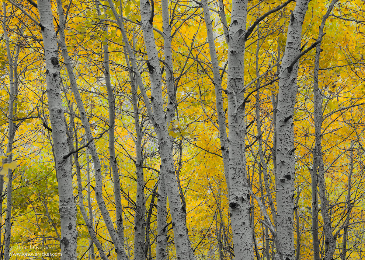
Still with the aspens... pretty straight forward here.  This is the same grove of aspens as the pano I posted a while back.  There is a picnic area on Silver Lake along the June Lake Loop.  Lot's of different possibilities in here, and a favorite spot of mine over the years.

As always, I appreciate any and all comments, critiques and suggestions.

Nikon D700
Nikon 28-300 @70mm
f/11 2-image focus stack
Tony's magic and a low-opacity Orton layer

Thanks!

Comments

16 comments
Comment posted by Lucy VanSwearingen on January 31, 2016 at 12:40 AM
 IMO, this one needs a little color/contrast "punch".  Everything seems to have the same value...maybe, it's the low opacity.  But, I do like the composition with the yellow leaves "only" behind the aspens.
Registered on May 23, 2009, 800 Posts, 2042 Comments
Comment posted by Tom Falley on January 31, 2016 at 12:57 AM
A very pleasant rendition. I live right in the middle of an Aspen-Birch forest, this looks much like the view out my kitchen window in season. The only item that i do find a little distracting is the thin tree in the background at the far left.

Thanks for sharing!   Tom
Registered on November 21, 2014, 189 Posts, 454 Comments
Comment posted by Harley Goldman on January 31, 2016 at 8:48 AM
I am finding this a solid image. That said, I find the comp a bit chaotic. I might pull up the white values in the main tree trunks to provide more of an anchor. Also, maybe clone out the dead snag coming up from the bottom a little right of center?

 
Registered on November 19, 2003, 586 Posts, 11271 Comments
Comment posted by Preston Birdwell on January 31, 2016 at 1:11 PM
I agree with Lucy and Harley that this could be punched up a bit, both in terms of contrast and the trunks of the trees. I also agree about the bit of cloning Harley suggested. I do like the composition, and with a little punch up, this would have a nice ring to it.

--P
Registered on November 1, 2003, 471 Posts, 5188 Comments
Comment posted by Nick Bristol on January 31, 2016 at 2:01 PM
Lon, I like this very much as it is. I checked the other comments and can understand them, but for me this has such a quiet, peaceful and inviting feel and especially in the large version. A little more contrast and punch I'm sure would work but I bet this would make a beautiful print as you have it here. I'm just enjoying the quiet mood I guess.
The larger version does seem to make quite a difference and doesn't have the flatter look / feel of the small version, at least to my eyes. Very nice.

Nick Bristol
Lone Rock, WI
Registered on February 1, 2004, 752 Posts, 14140 Comments
Comment posted by Dave Dillemuth on January 31, 2016 at 2:26 PM
Lon,
Beautiful, calming image. Love the soft light and delicate color palate as rendered. Very fine as presented but agree that it would be worthwhile experimenting with nudging up the contrast and lightening up the tree trunks. I guess in the end this comes down to personal taste. 
Registered on December 10, 2015, 104 Posts, 1112 Comments
Comment posted by Ken Henke on January 31, 2016 at 4:14 PM
Wonderful image!  I am a sucker for any fall aspen image and this is quite pleasing to the eye. Well executed. 
Registered on February 20, 2012, 117 Posts, 285 Comments
Comment posted by Albert Darmo on January 31, 2016 at 5:29 PM
Hi  Loncrying  Please leave it as it  is   frowncool.  to  me  oversaturating color is like  junk  food. wink This  is something  i would  hang  on  my  wall .    So beautiful  and naturaldevil

Albert Darmo
Canada 
Registered on November 25, 2008, 1386 Posts, 11978 Comments
Comment posted by David Schoen on January 31, 2016 at 5:29 PM
I also agree with Lucy and Harley that this could be punched up a bit, both in terms of contrast and the trunks of the trees.  That said, I really like the idea and you just didn't have enough sun at the time you took the image.  The Orton layer was applied to the tree leaves? 
Registered on November 6, 2006, 1213 Posts, 4587 Comments
Comment posted by Daniel Rappaport on January 31, 2016 at 8:08 PM
I could see this with more brightness in the aspen trunks, but then it would be a different image and not so gentle/calm as I assume you intended to create.  I like it as is.
Registered on September 9, 2009, 294 Posts, 2006 Comments
Comment posted by gary phillips on January 31, 2016 at 11:04 PM
Really nice Lon.  I really like the understated aspen look here.  When I blew the image up enough to fill my scene, I found the bright spots in the background slightly distracting.  Nothing big, but a small highlight adjustment to those would go a long way.  Love the overwhelmingly complex comp.
Registered on October 24, 2013, 185 Posts, 4136 Comments
Comment posted by Todd Liotine on February 1, 2016 at 12:24 PM
Lon, I like this image the way it is. I can see what the others are saying with their comments but I feel like you were going for something a little different. For example, I appreciate the brighter spots (especially after enlarging) as they have a green tone to them and they compliment all the different yellows, that along with the light orton layer give this a real painterly style but comes across as natural. 
Registered on July 1, 2008, 131 Posts, 671 Comments
Comment posted by Dietrich Gloger on February 1, 2016 at 1:31 PM
Ha, this is one of your "film images" right..enlightened
The composition is as solid as always and I like the "lighter" processing here. Some might call the light dull and life-less but I like the understated look this has.
I do have a suggestion, too: A slight crop from the left to eliminate the out of focus leaves...
 
Registered on January 26, 2007, 360 Posts, 9876 Comments
Comment posted by D.A. Edwards on February 1, 2016 at 2:17 PM
I like the coloration/contrast as is but could see the crop from the left to eliminate the OOF leaves and the birch beyond. Unfortunately that would necessitate a similar crop from the right to maintain the balance of the main stand of trees and that would probably be giving up too much nice real estate for the benefits... IOW, leave it like it is enlightened
Registered on October 8, 2014, 226 Posts, 1187 Comments
Comment posted by Roel Wijtmans on February 6, 2016 at 11:40 AM
It doesn't work as well for me as the pano, but that one was godlike, so it's an unfair comparison maybe. After all, this is still very nice, and my only nit would be the out of focus leaves to the left.
Registered on September 30, 2012, 116 Posts, 2257 Comments
Comment posted by Lon Overacker on February 6, 2016 at 1:16 PM
Thank you everyone for your thoughts and comments on this one.  Sorry I hadn't responded sooner to some of the comments and reactions, been crazy busy lately.

Anyway, I think of all the images I've posted since returning, this one has garnered the most varied of reactions.  I was initially worried that the colors/contrast were too bold, but then several thought this lacked punch.  I actually can see that now, but certainly never thought of in when processing.

Thanks for the suggestions too with the few little things like the leaves on the left, the stick, etc. and the crop suggestions.  I will be taking this back to the drawing board for some tweaking.

Thank you again, as Wayne and others have mentioned, the feedback we get is invaluable!

Lon
Registered on November 24, 2006, 521 Posts, 19147 Comments