Nature Photographers Network
This is the preserved archive of the original Nature Photographers Network. The community continues at naturephotographers.network.
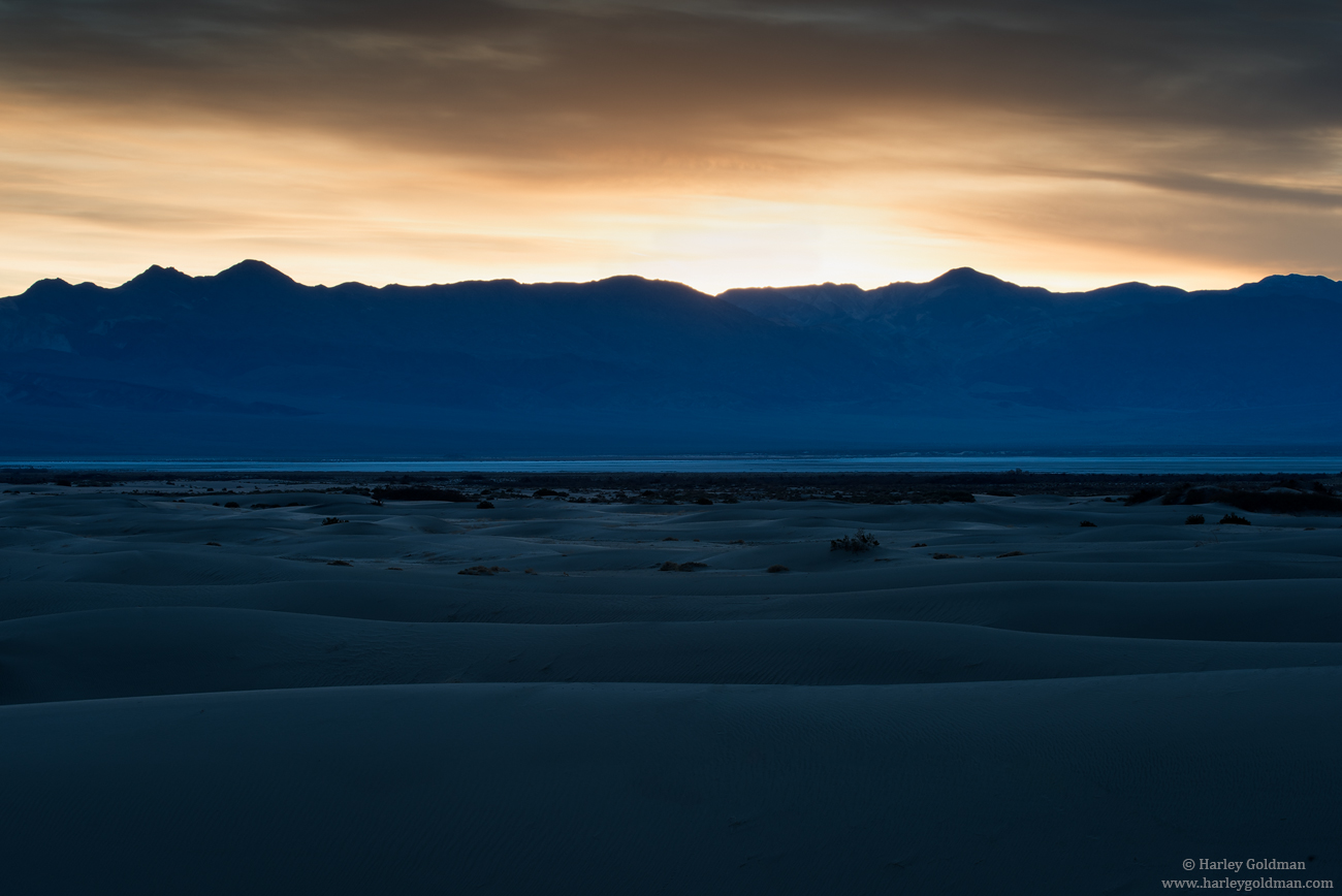
Blue - Sand & Salt Flats
‹ PreviousLandscape GalleryNext ›

Blue - Sand & Salt Flats

by Harley Goldman

Gallery: LandscapePosted February 4, 2016228 views15 comments
The one is a bit of a departure from my usual.  The image is close to the raw file, with a small curve to lighten the foreground and a small curve to darken the sky. That is it on processing. After experimenting with warming up the image in ACR, I decided I liked it better with the blue tones left as is.

D810, 70-200mm

Comments, critiques and suggestions are always welcome.

Comments

15 comments
Comment posted by Dave Dillemuth on February 4, 2016 at 11:31 AM
Nice capture. A very different take from all the warm light sand dune images. I'm finding the blue tones really nice mixing with the warm tones of the sky. I might suggest nudging up the exposure just slightly of the foreground.
Registered on December 10, 2015, 104 Posts, 1112 Comments
Comment posted by Pete Bengeyfield on February 4, 2016 at 5:36 PM
This is one that I didn't expect would be this good when I looked at the thumb.  But it gets better as it gets bigger.  The shades of blue are great.  You tweaked it just right.
Registered on December 2, 2003, 1247 Posts, 3439 Comments
Comment posted by Igor Doncov on February 4, 2016 at 11:22 PM
I agree that the larger image is a must see because the best part of it is the subtle definition in the foreground dunes. The water in the distance is pretty strong in color but I like it. It would be nice if the distant mountain range was sharper, better defined. Nice job Harley.
Registered on November 22, 2014, 189 Posts, 2733 Comments
Comment posted by Michael Lowe on February 4, 2016 at 11:40 PM
I'm glad you left it " as is". Well done.
Registered on February 11, 2004, 777 Posts, 5252 Comments
Comment posted by gary phillips on February 5, 2016 at 2:47 AM
This is really a departure for you Harley and I like it a lot .  The large really makes the image sing.  Usually we bemoan the blues, but here it works very well..  Nice job my friend.
Registered on October 24, 2013, 185 Posts, 4136 Comments
Comment posted by Nick Bristol on February 5, 2016 at 3:42 PM
Harley, Yes, a bit different for you but I sure do like it. The larger version is a must look in my opinion and just shows this off so much better. I like the comp and love the blues! Cool.!!

Nick Bristol
Lone Rock, WI
Registered on February 1, 2004, 752 Posts, 14140 Comments
Comment posted by Preston Birdwell on February 5, 2016 at 6:44 PM
First, the large version is a must-see.

Harley, I like this a lot. The layers of texture and color work very well, and have a nice balance. You could bring up the foreground a bit, but it looks fine as it is. I do suggest that you dial back the cyan, especially in the salt flat, as it seems a tad strong to me.

You did a fine job holding detail in the sky and also keeping the brightest parts from blowing out.

--P
Registered on November 1, 2003, 471 Posts, 5188 Comments
Comment posted by Ed Lowe on February 6, 2016 at 11:03 AM
Works for me, Harley. This is one of those images that must be viewed with the large version to really appreciate the wonderful mood created with the range of blue tones. I could also see this working with the FG lightened just a touch.

Ed
Registered on February 7, 2004, 414 Posts, 7115 Comments
Comment posted by Roel Wijtmans on February 6, 2016 at 11:12 AM
Appreciate your new take on this, Harley! Always fun seeing people experimenting. This looks a lot more abstract, and especially the curves in the sand look very nice like this. Maybe I would tone down the highlights a bit, but that is a minor nit. WB is spot on if you ask me.
Registered on September 30, 2012, 116 Posts, 2257 Comments
Comment posted by Lon Overacker on February 6, 2016 at 12:54 PM
Harley,

Awesome!  Granted, the composition is a bit static and of course 50/50 - however, it works because it allows light and color to be the main interest. And of course that line of brilliant cyan that splits the frame says it all for me.  But also, there is great contrast between the gentleness and cool tint of the dunes and the warm hardness of the dramatic sky.And enough detail in the mountains to bridge between the two.

The only small nit I have, is that the ridge line appears a little soft for me.  A perfect candidate for a focus stack - which btw, I owe you an email on!

A departure, sure, but a darn beautiful one.

Lon
Registered on November 24, 2006, 521 Posts, 19147 Comments
Comment posted by David Schoen on February 6, 2016 at 1:27 PM
I find the color layers very compelling here and the textural differences between the sky and the ground work.  Large view needs to be evaluated.
Registered on November 6, 2006, 1213 Posts, 4587 Comments
Comment posted by Albert Darmo on February 6, 2016 at 2:57 PM
Hi  Harleycrying   The large  view   has  to  be seen  frownblushfrown   here  the lines  , light  and color are just  mesmerizing.   just  beautiful..

Albert Darmo
Canada
Registered on November 25, 2008, 1386 Posts, 11978 Comments
Comment posted by Aaron Feinberg on February 6, 2016 at 4:24 PM
Super good.  Really super good.  Gursky would approve ;)  Could play with some TK masks to pop the highlights on the top of the dunes if you wanted. Yummy scene.

aF
Registered on October 26, 2009, 399 Posts, 2789 Comments
Comment posted by Ryan Shain on February 6, 2016 at 10:59 PM
Hi Harley,

A beautiful mood conveyed in this image with sweet dark to light layers. I really dig the blue shadow tones in this image. One of the adjectives that come to mind while I enjoy this image is SEXY! 

Awesome image
Registered on February 20, 2007, 226 Posts, 4571 Comments
Comment posted by Mark Seaver on February 7, 2016 at 1:28 PM
Harley, I'm enjoying all of the subtle blue tones in the land and how nicely they contrast with the bright warmth of the sky.
Registered on January 23, 2011, 1103 Posts, 17270 Comments