Nature Photographers Network
This is the preserved archive of the original Nature Photographers Network. The community continues at naturephotographers.network.
Leave it to Beaver +rp
‹ PreviousLandscape GalleryNext ›

Leave it to Beaver +rp

by Lon Overacker

Gallery: LandscapePosted February 10, 2016278 views17 comments
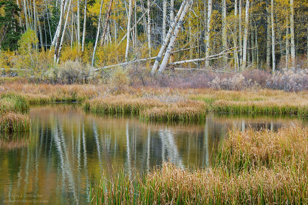
Another title I couldn't resist.  This is another rendition from the same morning up in Lundy Canyon last fall.

I'm more than curious to see how this one gets rendered and interpreted in terms of "pop," color, saturation, etc.  I've processsed it to my liking and my goal as in most all my processing is to make the image natural, and believable, but often bordering on too much.  Like Tony taught me, "make the image the best that it can be."  I just hope when I post, it looks like I want it too.

This one is also another focus blend.  Three images manually blended rather than relying on the stacking algorithms in PS.  Stacking of course presents alignment problems.  But for an image like this, it will be pretty hard to detect them.  I had one image focused on the front grasses, the next image on the next set of grass and the third focus on the grove of aspens, I believe.

Anyway, would love your impressions, comments and suggestions.  Always welcom.

Lon

Nikon D700
Nikon 28-300mm @85mm
F/8, 3 image focus stack

Thanks!

edit:  ok, the image looks just about the same here, Chrome, IE and Photoshop.  So any comments about punch or flatness is on me! angel

Comments

17 comments
Comment posted by Harley Goldman on February 10, 2016 at 5:24 PM
Very sweet fall scene. Getting very picky, I might burn the yellow leaves top left corner, but it is a real picky suggestion.  I like it a lot.

I have been to those ponds a whole lot of times and I can count my successes on one hand with it balled into a fist. Very well done.
Registered on November 19, 2003, 586 Posts, 11271 Comments
Comment posted by Igor Doncov on February 10, 2016 at 5:31 PM
I'm looking at this image from a mobile device so can't make valuable comments. I'm just curious- did you need to make separate images for the far grass and trees? Wasn't the plane of focus virtually the same?  If not then how did you determine that the f8 wasn't going to cover both. My DOF preview button is almost useless due to small preview screen and small focus differences. 
Registered on November 22, 2014, 189 Posts, 2733 Comments
Comment posted by Vance Gese on February 10, 2016 at 6:57 PM
Love your composition, Lon, the lines of the tilting trees and their reflections complemented perfectly with the grasses.  Your focus blend seems to have worked exactly as you planned  (must be a challenge after relying on lens tilt in the 'old' days).  Likely just my computer or my own goofy biases but the brighter values seem a bit bright, as though a bit of a glare is in the higher values.  Either way, a wonderful image. 
Registered on November 13, 2008, 298 Posts, 6629 Comments
Comment posted by scott lanz on February 10, 2016 at 9:11 PM
Excellent image, Lon. Probably not a big surprise, but my favorite part is the relection of the trees and foliage. Beautiful! 
Registered on November 14, 2003, 840 Posts, 12902 Comments
Comment posted by Dave Dillemuth on February 10, 2016 at 10:02 PM
Lon,
Really gorgeous image. Beautiful array of elements with those reflections being especially strong. Saturation/contrast look very natural as rendered - certainly not overdone. Might be my monitor but the layer of bushes just in front of the trees seems a bit bright and lacking punch. If it were mine, I'd burn down this area and try to coax up some of the textures/tonalities a bit more.
Registered on December 10, 2015, 104 Posts, 1112 Comments
Comment posted by Chris Chamberlain on February 10, 2016 at 10:57 PM
I really enjoy this scene! There are a lot of things to like here. The comp is stellar, and the reflection is really nice and painterly. Love the grasses too, and the fall color in the willows. All contrasting nicely by the white trunks.

Looking at this on my phone. But I did think it could tolerate a little more color and punch. My phone almost always shows images as more punchy and colorful, so????
Registered on March 13, 2007, 500 Posts, 8365 Comments
Comment posted by Sairam Sundaresan on February 11, 2016 at 11:17 AM
Really love the pastel colors here, and you've done a great job with the focus stack! All around, a great image!
Registered on March 14, 2013, 100 Posts, 643 Comments
Comment posted by Roel Wijtmans on February 11, 2016 at 12:55 PM
I like how my eye goes around the frame and finally ends up in the water body, to find that sweet reflection pattern. Processing looks good to me, nothing unnatural!
Registered on September 30, 2012, 116 Posts, 2257 Comments
Comment posted by Lon Overacker on February 11, 2016 at 1:38 PM
Thanks for the comments, observations and suggestions folks!  I've tweaked this a little, all good suggestions.

Harley - I took your suggestion a step further and just eliminated the cluster of leaves in the ULC.

Vance - for the brighter values, I'm assuming you mean mostly the aspen trunks?  They were problematic from the beginning, especially the two main ones.  I attempted to drop the highlights of most of the trunks.

Dave - re: the layer of bushes.  I used a curves layer masking just for this area and some burning burning.  I was able to see what you were describing.

Igor - re: focus stacking.  To be honest, I don't recall my decision making at the time.  In looking at my settings, and seeing the ripples in the pond and grasses moving, I might have been trying for a faster shutter speed, so choosing f/8 and I noticed iso 200 (by default I'm usually on 100.)  Another factor, and keep in mind this was my first outing and much of what I was doing was experimenting and learning.  Part of that was testing the lenses at various apertures.  As it turns out, f/8 with only 3 images to blend was NOT suffiecient to create a perfection sharp image front to back.  I can assure you looking at the master file.  ;-)  It's actually quite soft in that line of bushes that Dave pointed out.

Thanks folks, here is a reworked version
Registered on November 24, 2006, 521 Posts, 19147 Comments
Comment posted by Ed Lowe on February 11, 2016 at 2:07 PM
Another clever title; I like it, Lon. The processing looks very natural to me and not overdone. The image to me is one of those scenes that is very tranquil and you could just immerse yourself in and savor.  Beautifully done.

Ed
Registered on February 7, 2004, 414 Posts, 7115 Comments
Comment posted by Alberto Patiño on February 11, 2016 at 2:20 PM
I think I prefer the repost by a small margin, but the original also works for me. Gorgeous photography!
Registered on December 2, 2014, 278 Posts, 1736 Comments
Comment posted by Preston Birdwell on February 11, 2016 at 6:03 PM
The change in the repost is subtle, but it works well. I like this a lot. You got some nice images from Lundy--I usually come away from there with very little. You hit the light just right.

--P
Registered on November 1, 2003, 471 Posts, 5188 Comments
Comment posted by Michael Lowe on February 11, 2016 at 9:00 PM
Lon, youreally have a distinctive style. I can't describe it, but I know it when I see it. I'venever calibrated my monitor so I can't comment on the things the others are seeing re. brightness, etc. No nits from me.enlightened
Registered on February 11, 2004, 777 Posts, 5252 Comments
Comment posted by Paul Breitkreuz on February 11, 2016 at 9:25 PM
Lon, I feel the re-post works better IMO. This area of Lundy is unmistakable for all us sierra photo trekkers. Although I've shot here several times over the years, my net gain was one image I liked. So, you're way out in front with the ones you've bagged from here so far. Nicely done.....laugh
I see you mention Chrome, IE and PS as viewing options you're using? Have you tried Firefox? Just thinking out loud as that is the only browser I've used since it was first available. I know Chrome is suppose to be color managed, but I'm not sure IE latest or the Edge as it's called is CM'd. Not sure. Anyway, just more for us to ponder in the life of post processing & web mounting issues...wink
Registered on February 25, 2006, 525 Posts, 8448 Comments
Comment posted by Albert Darmo on February 12, 2016 at 12:19 PM
Hi  Lon      Sometimes  i  think processing  a  landscape scene  is  like  a makeup  artist  working on  a pretty model..   we always  want the beauty  technician    to  maximize the beauty of the subject , as  we do  the  photographer.  for the landscape...       i think  your approach  to  keep  things  beautiful,  but natural,    is the way to go.  i would not  change a thing. in the first  image.   in the second image, my eye is   more pulled  away  from  the   beautiful foreground.  to  the background trees, is that  what you  wanted?   i hope  what  i   see  is right.  my eyesight  is very weak.  the    both are  very  beautiful  images.


Albert Darmo
Canada
Registered on November 25, 2008, 1386 Posts, 11978 Comments
Comment posted by Lon Overacker on February 12, 2016 at 4:17 PM
Thanks for the additional comments!  As others have noted, it's so helpful to have others view and critique our images. So thanks!

@Paul - Thanks for your comments as well.  Regarding browsers, I know pretty much they are only a problem when whomever is posting doesn't embed the sRGB profile and save as sRGB.  I used to have FF, but what I do know is that the images all look the same across the browsers that I have.  It seems that the issues observed are imaged base, which is why we don't notice the difference all the time.  This recent image seems to display the way I processed it, where as the aspen image a couple posts ago did not.  I'm still confused about it all.

in the second image, my eye is   more pulled  away  from  the   beautiful foreground.  to  the background trees, is that  what you  wanted?

@Albert - Thank you for your comments.  And what a profound observation this is!  I did not intend, nor had I even thought about this. But now that you mention, I can see exactly what you're talking about. When I re-worked the image all I was considering was addressing the feedback.  And yes, now the bg bush and aspens look better, but now draw more attention.  At least I can pick up on that now that you mention it.   Thank you for making me think more deeply about presentation and still thinking about the big picture and overall presentation when making changes!

Lon
Registered on November 24, 2006, 521 Posts, 19147 Comments
Comment posted by Mark Metternich on February 16, 2016 at 11:48 AM
As has always been my irritation about this forum, I wish I could see this larger... :)   Very nice image with nice details. 
Registered on June 19, 2009, 276 Posts, 6240 Comments