Nature Photographers Network
This is the preserved archive of the original Nature Photographers Network. The community continues at naturephotographers.network.
Cascading Merced +new version!
‹ PreviousLandscape GalleryNext ›

Cascading Merced +new version!

by Lon Overacker

Gallery: LandscapePosted February 14, 2016245 views18 comments
Thank you everyone for your comments on my last post.  Here is another "leftover" from the November trip to Yosemite.  Been sitting there waiting to post, but never did during my run of posts a couple months ago.

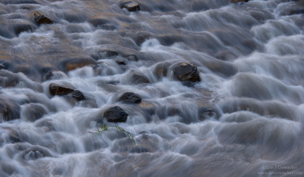
In early November we hadn't yet started receiving any El Nino water and the river was pretty low, as it is this time of year.  I've always been attracted to these sections of the river where the bottom of the river is revealed during over areas where the elevation drops quickly.  I love the patterns in the water, the texture and flow through all the rocks.  I even tried to catch some of the reflected light off the surrounding mountain sides that were catching morning light.  

The biggest issue I have with this image are the edges and crop choices.  I did like the end-around flow so I kept the right side in.

What are your impressions, critiques and suggestions?  As always, all opinions welcome!

NIkon D800E
Nikon 28-200VR @125mm
f/29 @ 1/2

Thanks!

Comments

18 comments
Comment posted by Brad Strong on February 14, 2016 at 9:20 PM
Lon, this is really nice. Very pleasing without being too soft. Love the C curve in the water on the right side. I think that,s pretty much the dot on the i so to speak. I might clone out the sliver of rock in the URC since there's so little of it. I also like that the rocks give a point of focus for the eye. I love water abstracts but I need something in the image that's in focus or I get dizzy. 
Registered on October 1, 2012, 43 Posts, 302 Comments
Comment posted by Dave Dillemuth on February 14, 2016 at 9:45 PM
Lon,
Very nice capture. The patterns created by the flowing water work well and add a lot of interest. I really like the placement of that small plant in the lower left-center. I think it adds much to the comp. To that end, I might try to bring it out and make it a bit more prominent. Also agree with Brad on cloning out that small rock on the URC of the frame.
Registered on December 10, 2015, 104 Posts, 1112 Comments
Comment posted by Bill Chambers on February 14, 2016 at 11:10 PM
Man, you nailed the exposure perfectly for beautiful texture in the water.  Love the composition too.  The one nit I have is that it appears a little dull on my monitor (old piece of crap).  I would perhaps brighten the whites just a bit.
Registered on April 10, 2005, 753 Posts, 21216 Comments
Comment posted by Mark Seaver on February 15, 2016 at 9:20 AM
Lon, the sense of movement here works very well.  I can hear the rushing water.  The big reverse C curve works well.  The hints of reflected sun add nicely and that green plant is a great accent that's perfectly placed.  My one thought would be to crop some (maybe up to half) of the outflow along the right side.  That might add a subtle emphasis to the overall sense of movement.
Registered on January 23, 2011, 1103 Posts, 17270 Comments
Comment posted by Harley Goldman on February 15, 2016 at 10:46 AM
This is nice, Lon.  I played with Mark's crop suggestion and I prefer it as presented.  I might consider bringing in the white point a bit, brightening things up?
Registered on November 19, 2003, 586 Posts, 11271 Comments
Comment posted by Roel Wijtmans on February 15, 2016 at 12:28 PM
Hmm, unfortunately, this one isn't working for me. What I like most about these long exposure abstract water photos is their compositional simplicity, but this wider view contains a lot more to see, which cancels the effect for me.
Registered on September 30, 2012, 116 Posts, 2257 Comments
Comment posted by Ryan Shain on February 15, 2016 at 1:30 PM
Hi Lon,

This image is nice, but it does not hold my interest like most of your captures. The flow of the water is in deed a wonderful element in this image, but I feel there is a missing element. I love these kind of images when they have another complimenting element. IN this case, a composition with more rocks would create a structure to this image, or the inclusion of more soft reflected  light on the flowing water would add another layer of interest. 

I have not found a crop I like yet, but I do see where you could separate the darker tones in the water from the lighter tones to create a more layered effect. If this was my image, I would experiment with boosting the whites in the water, and adding contrast to the darker tones. This maybe create some added interest with out cropping to my eye. Maybe even some Orton effect could help with the toning part.
What do you think Lon?
Registered on February 20, 2007, 226 Posts, 4571 Comments
Comment posted by Lon Overacker on February 15, 2016 at 2:40 PM
Thanks everyone for your comments and honest opinions. They are truly valued and appreciated.

This isn't actually a repost, it's a different exposure worked from scratch.  I had exposed 3 images of this scene.  This one here is actually 95%of the third image, and a small bit from the first. The original post was from the second image at 1/2s. This one here is 1/3 of a second.  I did some content aware cloning along the upper edge as had been suggested.  You'll notice more room at the bottom now.  Well, I had cropped originally because there was a rock and some willow leaves/branches in the lower right.  Too complicated for a content clone, so I brought in the 1st exposure as a new layer (which didn't have the leaves in the LRC) and painted the corner in from the first image, to eliminate the leaves and branches in this one.  Whew.

 IN this case, a composition with more rocks would create a structure to this image, or the inclusion of more soft reflected  light on the flowing water would add another layer of interest.  - Ryan


I think I know what you mean by having more rocks, so I don't think this composition addresses that, but technically there are more rocks on the left.  I think the ones in the upper left are a little distracting, but I liked the added flow towards the bottom and so I think that trumped the UL.  Also, with more on the bottom, I now like the right to left flow.  Also, and to your point about "more soft reflected light..."  I didn't see your comment until after I finished working on the repost, but I think this one has picked up more of the reflected color throughout, but mostly in the flow near the bottom.  What do you think?

I'm much happier with this, so thanks everyone.

Regarding boosting the whites and being dull, this is yet another example of what is posted no longer matches what was processed.  And seeing Harley's recent images with the shadows much more blocked in the 720px version than the larger view, I still can't see how it could be my processing.  I can't hardly ever recall folks commenting that my images lacked "punch" or looked dull.  And I don't see why someone should have to boost, inflate or exaggerate their processing just so it looks good here.  So anyway, I take no offense and with a grain of salt, feedback on brightness, contrast, punch, etc.

With that said, I processed this 1,000px image the same as always. I believe we're not seeing any issues with larger views, or images posted as comments.  It seems to be only the "720px" version that's getting effected.

ANYWAY, thanks so much for your comments!  How does this new image come across?  Any preferences? comments? Thanks!
Registered on November 24, 2006, 521 Posts, 19147 Comments
Comment posted by Roel Wijtmans on February 15, 2016 at 3:06 PM
New version is MUCH better if you ask me! I like it a lot! In this new version the overall scene and pattern of the water flow is very nice and can stand on its own, whereas it felt a bit like "in between" in you original version. Too narrow for the same impact as your repo, too wide for the intimate "flowscapes" you excel in doing. I don't know if I am making any sense, haha. Thanks for the repo!
Registered on September 30, 2012, 116 Posts, 2257 Comments
Comment posted by Ryan Shain on February 15, 2016 at 3:12 PM
Lon,

The new image is much better, and the larger version is really nice. The composition works much better for me, and there is more structure with better balance and flow. The reflected light looks great here too.

Nice job on the re-work.
Registered on February 20, 2007, 226 Posts, 4571 Comments
Comment posted by Preston Birdwell on February 15, 2016 at 3:23 PM
Lon, I much prefer the new image. The position of the stones in the frame are a nice anchor to the flow of the water. The tones in the new image have more punch and improved separation. I like the subtle reflected reds and the flow of the river.

After seeing your 720px images, as well as Harley's and my own, I am pretty much convinced this 'dulling' and 'shadow blocking' of the initial 720px image is being caused by the gallery software, but I have no idea why it is happening.

One thing is for certain: We sure had a fine time in Yosemite in November!

--P
Registered on November 1, 2003, 471 Posts, 5188 Comments
Comment posted by Harley Goldman on February 15, 2016 at 3:35 PM
Nice improvement
Registered on November 19, 2003, 586 Posts, 11271 Comments
Comment posted by Chris Chamberlain on February 15, 2016 at 3:40 PM
I like the scattering of rocks, and the numerous riffles. Not as tight or intimate a scene as usual. I think the shutter speed is just right, but it needs to be a little brighter, imo. I notice the reflected light, and would like to see that become more noticeable. If I had a nit about the comp, the one rock at the top near center is kind of tight to the edge. But a crop makes the next rock down on the left edge become tight then. Maybe make the top one disappear?
Registered on March 13, 2007, 500 Posts, 8365 Comments
Comment posted by Chris Chamberlain on February 15, 2016 at 3:46 PM
Okay, saw the repost. The wet luster of the rocks and reflected light do play ba bigger role in that one. I still get slightly distracted by that upper most rock near center. Also the upper left corner. So, if it were mine, I might disappear that top rock, and make some sort of crop from the left, but not too much. :)
Registered on March 13, 2007, 500 Posts, 8365 Comments
Comment posted by Nick Bristol on February 15, 2016 at 3:48 PM
Lon, I think the second image works much better and I like it very much. It is a big improvement for me over the first one. I actually think I would like it even better without the grass but not a big issue for me either way.

Nick Bristol
Lone Rock, WI
Registered on February 1, 2004, 752 Posts, 14140 Comments
Comment posted by Ed Lowe on February 16, 2016 at 9:37 AM
I looked at this a couple of different times and I think the repost is the way to go, Lon. For me all the good stuff is centered around all those rocks and solitary grass toward the center of the frame and the extra bit of image at the bottom of the repost seems to emphasize that more IMO. I hope that makes sense.

Ed
Registered on February 7, 2004, 414 Posts, 7115 Comments
Comment posted by David Schoen on February 16, 2016 at 6:59 PM
I actually like the first crop a little better than the second crop because of the placement of the greenery in the image. I'm not at all bothered by the rocks in the top of the frame. It seems more balanced in the panorama view. The color is better in the second image. It is a little brighter and I think it goes a lot better with more luminosity. I think you hit the shutter speed right on the nose. Moving water captured correctly is fascinating.
Registered on November 6, 2006, 1213 Posts, 4587 Comments
Comment posted by Albert Darmo on February 17, 2016 at 1:11 PM
Hi  Lon    Agree with the  others,  the repost  looks  more vibrant.  but  not necessarily  more  natural. love the water  flow   and the  graphic rock structures   in both versions.. excellent work.


Albert Darmo
Canada

 
Registered on November 25, 2008, 1386 Posts, 11978 Comments