Nature Photographers Network
This is the preserved archive of the original Nature Photographers Network. The community continues at naturephotographers.network.
Islands in the Stream
‹ PreviousLandscape GalleryNext ›

Islands in the Stream

by Lon Overacker

Gallery: LandscapePosted February 28, 2016265 views17 comments
Thought I would take a short break from the trees. Often times someone will write, "I found this in the archives..."  Well for some reason today I looked in a folder called "To be posted" where I realized I have a whole bunch of 4x5's that I've yet to post. These were from 2014-15, where I was absent from NPN, but yet I had processed them.

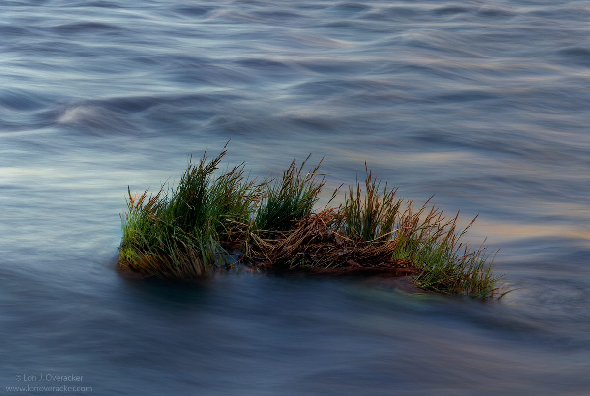
So now that I'm fully engaged in the dslr world, these 4x5 images are truly in the archives now.  This was captured just downstream from Valley View in Yosemite just over two years ago.  I don't remember any of the technicals, which film, lens, etc.  Just know it's 4x5.

Would love your critique and comments.  I liked the blue tones here so I didn't try to reduce it. Curious if you think the color works here.  Of course your overall impression welcome as well.

Thanks!

Lon

Comments

17 comments
Comment posted by John Launstein on February 28, 2016 at 10:07 PM
Beautiful, Lon! Would not change a thing. Can't wait to see what else you dig up from the "archives." enlightened
Registered on April 5, 2011, 223 Posts, 1193 Comments
Comment posted by Mark Seaver on February 29, 2016 at 9:10 AM
Lon, the juxtaposition of flowing water and sharp grass is very striking.  The variety of subtle colors in the water works very well at controlling the overall sense of blueness.  That same variety of tones makes this an image that's easy to look at again and again.
Registered on January 23, 2011, 1103 Posts, 17270 Comments
Comment posted by Pete Bengeyfield on February 29, 2016 at 10:35 AM
Excellent.  The water is blurred just enough.
Registered on December 2, 2003, 1247 Posts, 3439 Comments
Comment posted by Roel Wijtmans on February 29, 2016 at 11:52 AM
Dammit, I was wrong! From the thumbnail it was impossible to see if this was water or a curvy piece of sandy desert in blue hour light. In the end I went for sand, and I was wrong....
There is A LOT to like about this one. The symbolism of the grasses against the current of course, the amazing abstract pattern of the water, the light.... Very well done!! Don't change the color please, they are one of the reasons I like this!
Registered on September 30, 2012, 116 Posts, 2257 Comments
Comment posted by Harley Goldman on February 29, 2016 at 1:45 PM
Real nice, Lon. The blues work real well for me in this one.

I can't say I miss scanning trannies! :)
Registered on November 19, 2003, 586 Posts, 11271 Comments
Comment posted by David Schoen on February 29, 2016 at 4:04 PM
Very nice color here. And this is hard to pull off if there's any wind because it appears that you have some motion in the water which would be detrimental to the stability of the plant life if there was any wind. Looks like it was taken just before sunrise. Yes the color works here and the blue tones go very well with the green of the plant life. Overall I like it
Registered on November 6, 2006, 1213 Posts, 4587 Comments
Comment posted by Dennis Plank on February 29, 2016 at 7:55 PM
A lovely image, Lon.  I like the soft curves in the water with the subtle color palette matching that softness.  The shape of the grass clump works very well with the rest of the composition. 

devil
Registered on January 28, 2008, 1767 Posts, 23192 Comments
Comment posted by scott lanz on February 29, 2016 at 8:53 PM
Gotta say, Lon, that I was not expecting much from the thumbnail, but this image got better as it got bigger, and the larger view has beautiful colors and detail that show beautifully in the nice light. I like the colors and details in both the grasses and the streaking water.
Registered on November 14, 2003, 840 Posts, 12902 Comments
Comment posted by Dave Dillemuth on February 29, 2016 at 9:49 PM
Lon,
The larger version is superb. Amazing that such an ordinary subject can make such a compelling image! Something to be learned from that.
A lot to like here - the blues and dark greens mixing with the warm reflected light is gorgeous. I find the sharpness/stillness of the grasses makes a very strong comp. when isolated on a background of flowing water. Processing/color balance looks spot-on. Great work.
Registered on December 10, 2015, 104 Posts, 1112 Comments
Comment posted by Ryan Shain on February 29, 2016 at 10:17 PM
Lon this image is simply stunning to look at in the large presentation. The color palette of cool blues  and warm oranges is so soothing to the soul. The texture in the silky water is perfect for my tastes, and the way the sharp grasses contrast with the softness in the water is genius. I can't see anything to change or improve on, STUNNING PHOTOGRAPHY!!! devil
Registered on February 20, 2007, 226 Posts, 4571 Comments
Comment posted by Ed Lowe on March 1, 2016 at 9:18 AM
Please do not reduce the blues, they compliment the grasses beautifully, Lon. I really like the soft undulation of the water movement in this scene.

Ed
Registered on February 7, 2004, 414 Posts, 7115 Comments
Comment posted by Igor Doncov on March 1, 2016 at 11:21 AM
I like the handling of the water here, Lon. It has the energy of a Van Gogh painting. I don't find the grass that compelling as a main subject nor it's placement within the frame. 
Registered on November 22, 2014, 189 Posts, 2733 Comments
Comment posted by Albert Darmo on March 1, 2016 at 12:23 PM
Hi  Lon  crying   The large image is a must  , to appreciate  the fine textures and color  of the water.  i find the grass  stranded   or  isolated in the current of water adds tention.  and  mood .    love the image....  but  the title  does not reflect the mood.     hint   change title to  STRANDED   or  ISOLATED


Albert Darmo
Canadaenlightened
Registered on November 25, 2008, 1386 Posts, 11978 Comments
Comment posted by Lon Overacker on March 1, 2016 at 9:58 PM
Thank you everyone!  About as close as one of my posts has come to a consensus. cool

RE: the grass.  definitely movement in there as of course rushing water creates in own wind.  @Igor, I actually have a pano crop of just the top... ;-)  but I think from my comp the inclusion of the grass was intentional.  enlightened

@Albert.  I hear ya on the title.  I often like to use titles with some play on words.  The Title "Islands in the Stream" is/was a hit by Dolly Pardon some years back - Duet with Kenny Rogers....  angel  Originally I thought of "Rising Tide" or "Flood Stage."  I guess those might have made more sense... 

Thanks again everyone!
Registered on November 24, 2006, 521 Posts, 19147 Comments
Comment posted by Fred Weymouth on March 2, 2016 at 7:39 AM
This is a beauty.

The colors work well in my opinion. The only change I might make is a lightening of the shadows and/or a lightening of the water in the first 3rd of the frame, below the grass.

Nicely done.
Registered on December 29, 2006, 36 Posts, 62 Comments
Comment posted by John Williams on March 3, 2016 at 11:00 PM
Interesting. This looks so much better to my eye in the larger version; I'd bet it would make a great large print. The color works fine for me.
Registered on September 6, 2007, 221 Posts, 5985 Comments
Comment posted by Igor Doncov on March 4, 2016 at 10:52 PM
Islands in the Stream was also a work by Hemingway. It referred to the Gulf Stream in the Carribean. They made a film based upon it with George C Scott playing the leading role. It's pretty good. 
Registered on November 22, 2014, 189 Posts, 2733 Comments