Nature Photographers Network
This is the preserved archive of the original Nature Photographers Network. The community continues at naturephotographers.network.
Winter Tapestry + Repost
‹ PreviousLandscape GalleryNext ›

Winter Tapestry + Repost

by Dave Dillemuth

Gallery: LandscapePosted April 8, 2016500 views18 comments
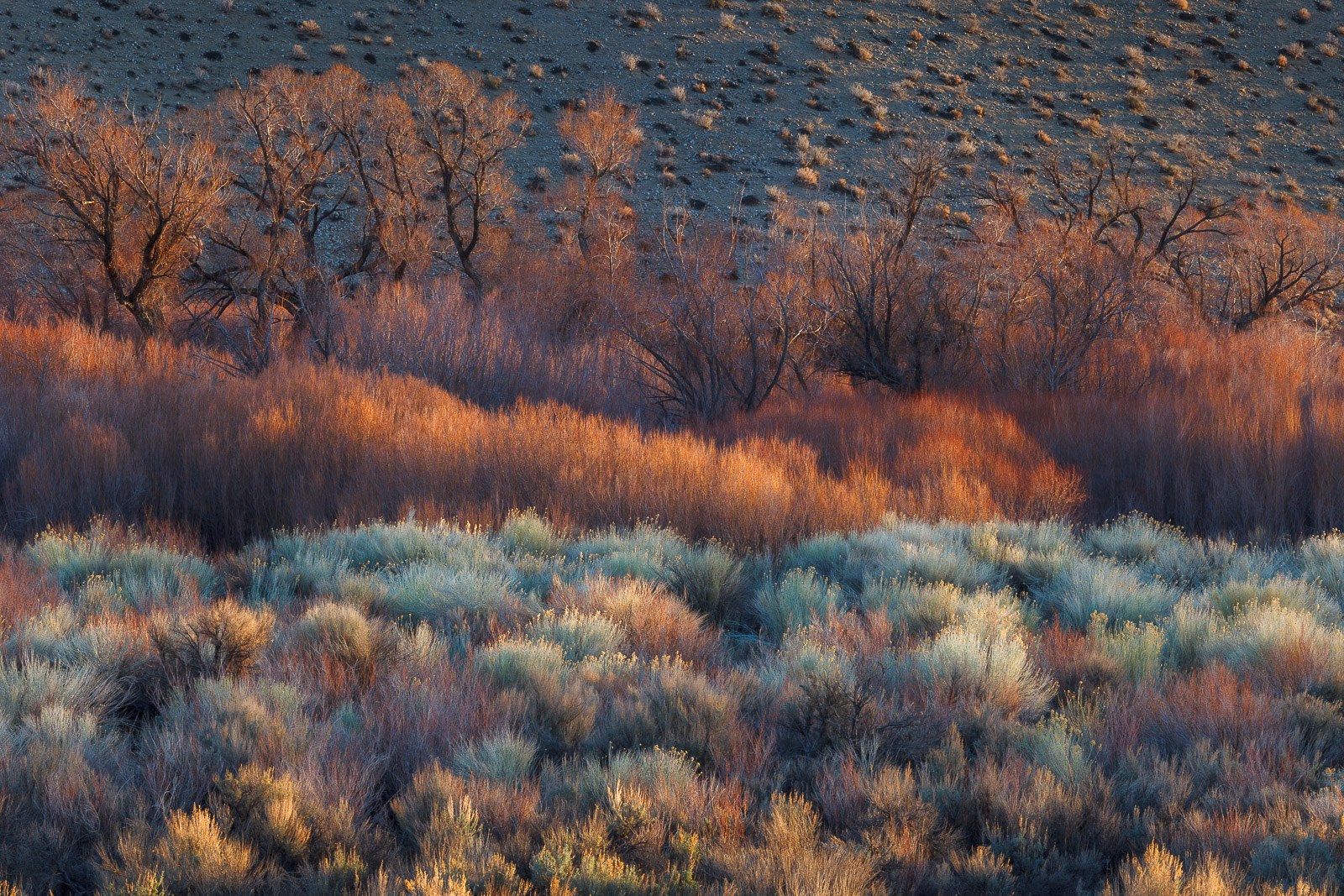
Image taken in the first few minutes after the suns rays touched the willows, grasses and sages in this scene. I welcome your comments, suggestions and/or critiques.  

5D2, 70-200 f/4L IS @ 160mm
ISO 100, f/22, .5 sec

Comments

18 comments
Comment posted by Harry Lichtman on April 8, 2016 at 10:17 PM
Tough to decide between this and your last post.  Both have elements I like.  Really like the sun catching the grasses, colors pop.  The UR area might take away a little, as the trees loose some separation from the background there.  Maybe cool down those warm tones a bit and see if improves that at all. Details are spectacular.
Registered on September 17, 2010, 304 Posts, 3507 Comments
Comment posted by Ed Lowe on April 8, 2016 at 11:01 PM
The lighting is spectacular along with layers in this scene, Dave. When I opened the large version all those wonderful details were waiting to be enjoyed. Beautifully done.

Ed
Registered on February 7, 2004, 414 Posts, 7115 Comments
Comment posted by Igor Doncov on April 8, 2016 at 11:04 PM
This is a very interesting image. You have done some color enhancements that have worked really well. That together with the tonal range in the foreground bushes. For me the image gets less interesting as you reach the distant trees and the far background takes away from the image. I would crop from the top to remove all the light colored background and from the right to the end of the bright bush at the bottom which is an eye catcher. That makes the trees be the background and draws more attention to the tapestry of bushes leading back.
Registered on November 22, 2014, 189 Posts, 2733 Comments
Comment posted by Roel Wijtmans on April 9, 2016 at 10:27 AM
Winter tapestry should be white, right?? All joking aside, this is gorgeous! The details, the colors, the light. Can't think of anything wrong with this. Another beauty in your gallery!
Registered on September 30, 2012, 116 Posts, 2257 Comments
Comment posted by Preston Birdwell on April 9, 2016 at 12:50 PM
The light, textures and colors here are real nice, Dave. I like the framing the way it is, but I do agree that the background hillside and the bush at bottom right are a little distracting. Rather than crop, which I think would make the image too tight, you might consider burning down the hillside and the brighter bushes along the bottom edge.

I have always loved the layers and color of the East Side high desert.

--P
Registered on November 1, 2003, 471 Posts, 5188 Comments
Comment posted by Dave Dillemuth on April 9, 2016 at 1:17 PM
Harry, Igor, Preston,
Thanks for the suggestions. This version has the bright foreground sages burned down and the URC area cooled, burned and de-saturated.
Registered on December 10, 2015, 104 Posts, 1112 Comments
Comment posted by Aaron Feinberg on April 9, 2016 at 6:51 PM
Yea, those colors are unreal.  Super great scene.  Eastern sierra?

aF
Registered on October 26, 2009, 399 Posts, 2789 Comments
Comment posted by Jim Hansen on April 9, 2016 at 7:23 PM
Dave, I have really been enjoying these images you've been presenting from East of the Sierra.  You've got some great light here and you put it to great use.  Love the combination of layers.  Seems maybe a tad oversaturated, but wonderful all the same.
Registered on May 5, 2011, 161 Posts, 908 Comments
Comment posted by Jean C Cajolet on April 10, 2016 at 10:56 AM
I like the warm colors that give a composition by layers. Beautiful details in the foreground that keep the eyes looking for the lights. I would have tried to crop just a little at the top just over the bushes to avoid the eyes looking for a great surface. But, I like it as is.
Registered on April 28, 2014, 53 Posts, 532 Comments
Comment posted by Doug Koepsel on April 10, 2016 at 11:20 AM
Dave, the bands of color among the sage, brush and trees is very nice.  Temptation would lead to cropping off the bottom bright brush in the repost.  What you did to the back hil is effective.
Registered on April 1, 2010, 196 Posts, 1592 Comments
Comment posted by Nick Bristol on April 10, 2016 at 2:09 PM
Dave, This looks great. I like the composition very much and absolutely love the light and colors in the grass. Nice layers and very interesting to look at. The repost works even better for me! Really nice work on this!

Nick Bristol
Lone Rock, WI
Registered on February 1, 2004, 752 Posts, 14140 Comments
Comment posted by Sairam Sundaresan on April 10, 2016 at 2:15 PM
Love the layered comp, Dave. The repost works really nicely!
Registered on March 14, 2013, 100 Posts, 643 Comments
Comment posted by Ken Henke on April 10, 2016 at 3:34 PM
What a beautiful layered color pallete !  For me, the repost is definitely an improvement. 
Registered on February 20, 2012, 117 Posts, 285 Comments
Comment posted by Dan Kearl on April 11, 2016 at 11:45 AM
The colors (especially the blue) are so nice...
Excellent lighting throughout.
Registered on September 2, 2013, 209 Posts, 1514 Comments
Comment posted by Harley Goldman on April 11, 2016 at 5:42 PM
Beautiful layers and colors. The Owens valley in its glory!  Nice job on the repost.
Registered on November 19, 2003, 586 Posts, 11271 Comments
Comment posted by Lon Overacker on April 12, 2016 at 7:23 PM
Dave,

Yet another killer image from the Eastern Sierra.  This is simply gorgeous!  The light, layers of colors...just superp.

Very subtle difference with the repost.  I didn't have those concerns or suggestions, but will at least say the repost is at least as Great as the original! ;-)

What I did want to mention hasn't been mentioned yet, so apparently not a big deal for anyone.  Not a big deal for me either, buy my personal thoughts on the color is that the rabbit brush is a little cyan for me. Don't get me wrong, the colors are beautiful and especially because of the mix of warm and cool tones.  Just my little impression on color though.

Love this!

Lon
Registered on November 24, 2006, 521 Posts, 19147 Comments
Comment posted by Peter Richter on April 13, 2016 at 2:43 PM
There are most appealing layers for me in this scene, Dave. Your second version helps me to concentrate on the interesting midground elements. I also appreciate the interplay of cooler and warmer shades.

Peter
Registered on November 10, 2010, 218 Posts, 2723 Comments
Comment posted by Ken Smith on April 25, 2016 at 5:05 PM
Nice...glad to come across this in the Weekly Picks gallery.  Superb!  Well done!
Registered on September 5, 2008, 449 Posts, 2444 Comments