Nature Photographers Network
This is the preserved archive of the original Nature Photographers Network. The community continues at naturephotographers.network.
Looking Through + Repost
‹ PreviousLandscape GalleryNext ›

Looking Through + Repost

by Dave Dillemuth

Gallery: LandscapePosted April 20, 2016176 views15 comments
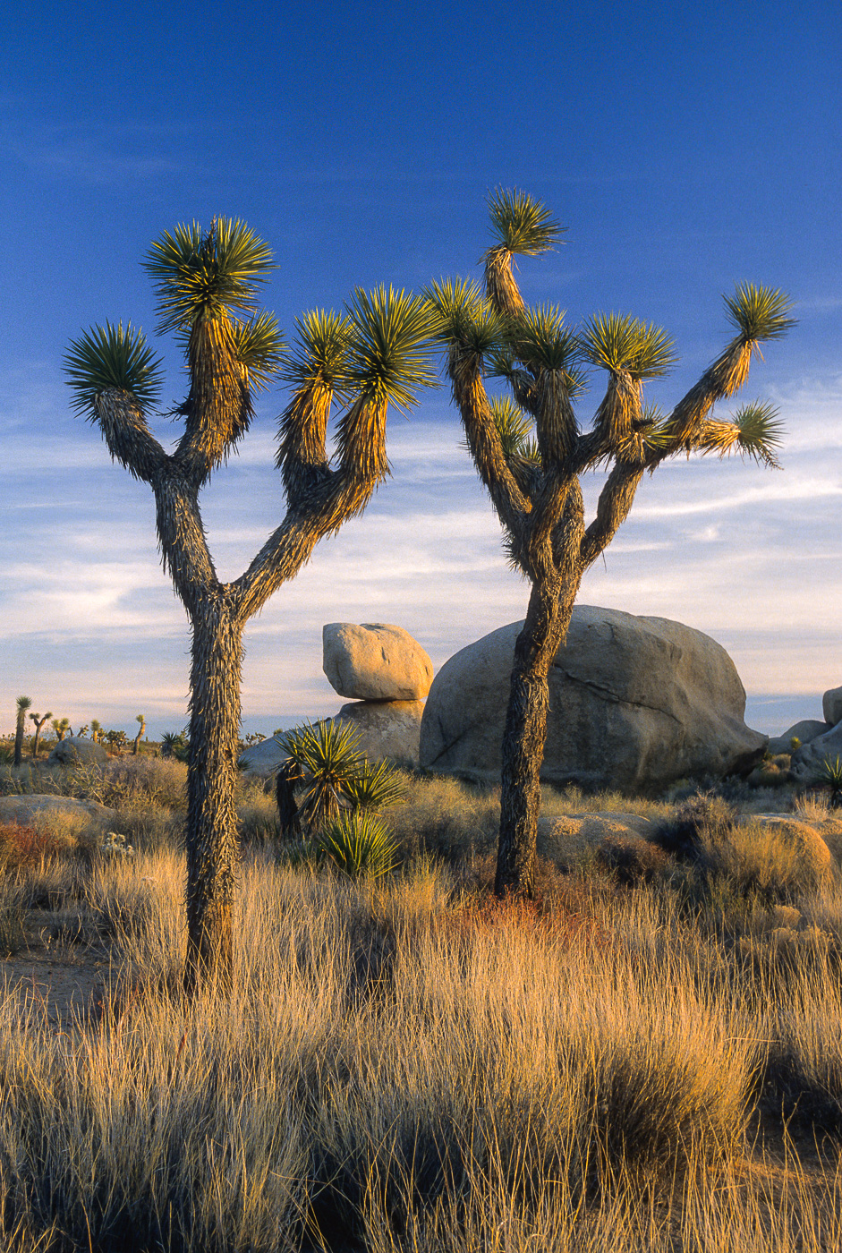
I have been going through and selectively reprocessing some of my older images trying to take advantage of improved software and processing skills. Appreciate any comments, critiques and/or suggestions. Thanks

Velvia 35mm scanned on a Nikon Coolscan 5000

Comments

15 comments
Comment posted by Pete Bengeyfield on April 20, 2016 at 1:30 PM
I really like the colors.  Very subtle.
Registered on December 2, 2003, 1247 Posts, 3439 Comments
Comment posted by Harley Goldman on April 20, 2016 at 3:56 PM
Looks real nice to my eye, Dave.  Sweet light and nice comp. Nice grasses detail, too.

I do miss the old Velvia, before they discontinued it and then brought it back.
Registered on November 19, 2003, 586 Posts, 11271 Comments
Comment posted by Marylynne Diggs on April 20, 2016 at 6:02 PM
Nicely composed, and what great light!  You managed to kee a Velvia feel here.  If I were to suggest anything (just as an experiment) I might suggest trying a nearly square crop or 8x10...just trying it.  It might not work, but it might be even more zen.
ML
Registered on December 14, 2010, 122 Posts, 1034 Comments
Comment posted by gary phillips on April 20, 2016 at 7:22 PM
Beautiful Dave.  The velvia colors are so rich with this sweet light.  Gotta be fun goin back through the old files.  I can't even get thru my new ones :(
Registered on October 24, 2013, 185 Posts, 4136 Comments
Comment posted by Sairam Sundaresan on April 20, 2016 at 7:38 PM
Really brilliant image, Dave. The framing of the rock between the two Joshua trees is really what makes this image sing. Lovely lovely work. No nits.
Registered on March 14, 2013, 100 Posts, 643 Comments
Comment posted by D.A. Edwards on April 20, 2016 at 8:20 PM
Very nicely composed, Dave, with superb lighting. I suppose it is probably an artifact of the slide to digital process but there is quite a bit of obvious noise in the sky, particularly the upper half. I'd bet that you can deal with that effectively unless of course that was the look you were after.
Registered on October 8, 2014, 226 Posts, 1187 Comments
Comment posted by Vance Gese on April 20, 2016 at 10:18 PM
Wonderful, warm light gracing this nicely designed composition.  The warm light with the lovely blue sky works so very well.  Great job scanning the 35mm Velvia, which can be a challenge.
Registered on November 13, 2008, 298 Posts, 6629 Comments
Comment posted by Stephen Stanton on April 21, 2016 at 12:17 AM
Some nice color combinations. The grass is such a nice foreground texture and good detail in the J trees.
Registered on March 1, 2015, 54 Posts, 453 Comments
Comment posted by Lon Overacker on April 21, 2016 at 2:31 AM
Dave,

This is a beautifully crafted, composed and basically seen landscape from JT.  The light is beauiful of course and the framing of the trees with the balanced rock in the distance.  I'm kinda with Marylynne on a crop; both the sky and warmly lit grass on the bottom are nice, the main story is the trees, rock and framing.  More from the sky, less from the bottom, but an 8x10 ratio could work I think.

Ok, I'm trying to consider this is a scanned 35mm, so I get and understand what that means in terms of difficulty and processing.  For me anyway, this is a rare occasion when I think the smaller version actually works better than the larger view.  The midtone contrast in the original view seems spot on; where as in the larger view it's just slightly more washy - if that's a term; most notable in the JT trunks.  Also, and I hate to bring up because I know it's a scan from 35mm, but the blue sky in the large view is pretty noisy - wait, I mean grainy. ;-)

Lon
Registered on November 24, 2006, 521 Posts, 19147 Comments
Comment posted by Dave Dillemuth on April 21, 2016 at 11:29 AM

 I have reworked the file based on the helpful suggestions from Marylynne, Dave and Lon:

1. Reduced the noise/grain in the sky (somehow I overlooked in the original).
2. Raised the mid-tone contrast
3. Cropped off the top
Registered on December 10, 2015, 104 Posts, 1112 Comments
Comment posted by Jean C Cajolet on April 22, 2016 at 10:54 PM
Nice colors, details in grass and beautiful light supported by a very good composition. 
Registered on April 28, 2014, 53 Posts, 532 Comments
Comment posted by Eva McDermott on April 24, 2016 at 9:45 AM
I like the repost Dave.  I love the beautiful warm light on the trees, rocks, and grass.  I agree with Lon that the smaller version looks better color wise.
Registered on January 4, 2009, 1015 Posts, 13229 Comments
Comment posted by Daniel Rappaport on April 24, 2016 at 1:47 PM
The repost is indeed an improvement.  Wonderful composition.  Love how the foreground grasses capture the color of the rock.
Registered on September 9, 2009, 294 Posts, 2006 Comments
Comment posted by Marylynne Diggs on April 25, 2016 at 3:17 PM
Works great for me, Dave.  That mid-tone contrast gave it a touch more warmth as well.  Nice job.
ML
Registered on December 14, 2010, 122 Posts, 1034 Comments
Comment posted by Ed Lowe on April 26, 2016 at 10:21 AM
Gorgeous image, Dave. The lighting throughout the scene is wonderful as is the framing of that rock with the two Joshua trees. I think you nailed it with the repost.

Ed
Registered on February 7, 2004, 414 Posts, 7115 Comments