Nature Photographers Network
This is the preserved archive of the original Nature Photographers Network. The community continues at naturephotographers.network.
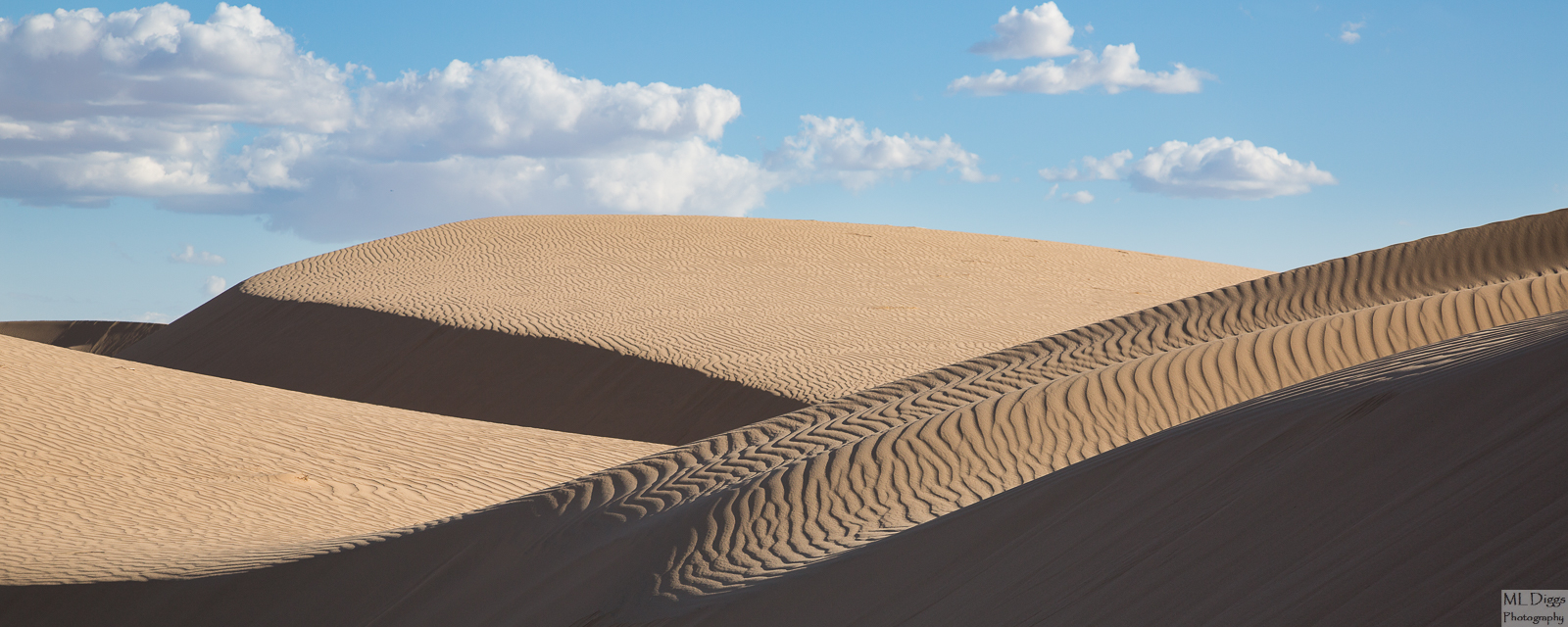
BW Repo of Algodones Dunescape #4
‹ PreviousLandscape GalleryNext ›

BW Repo of Algodones Dunescape #4

by Marylynne Diggs

Gallery: LandscapePosted May 31, 20161,789 views10 comments
Hi Folks,
Here is another dunescape from Algodones.  I have a few more abstracts, but I thought I would break that up with a more traditional landscape. 

Canon 5d3 with 24-105mm at 105 mm.
ISO 125,  f/10, 1/250s
Processed minimally in LR for contrast, sharpening, etc.

I'm interested in any and all suggestions and feedback.

Comments

10 comments
Comment posted by gary phillips on May 31, 2016 at 11:16 PM
Wow, you sure got some nice images on your trip.  The texture is amazing.  I'm a little surprised that you didn't go mono with this one.   It looks like it has great potential to me if you decide to go that route.  Either way it works very well. I got nothing for suggestions, love it.
Registered on October 24, 2013, 185 Posts, 4136 Comments
Comment posted by Marylynne Diggs on May 31, 2016 at 11:41 PM
Thanks, Gary.  I did go mono on it, but I was on the fence about which one I preferred.  One way I sometimes get some perspective on composition is by looking at the thumbnail in LR or on this forum.  When I look at it at that size, I sometimes see the big picture (ironically).

Here is the b/w version.  Let me know if you think it's a much better image.  I am trying to keep my hand in color a little, but I'm much more drawn to b/w lately. 

This was converted entirely in LR.  I could go to SilverEfex to get the sky darker, but for me, that would compete too much with the shadows in the dunes rather than complement them.  I am, of course, always game to try it if folks are curious.
Registered on December 14, 2010, 122 Posts, 1034 Comments
Comment posted by SandyRichardsBrown on June 1, 2016 at 1:06 AM
Nice perspective here. I also would consider a de-saturation here.
Great lines and textures.
Sandy
Registered on November 24, 2003, 3937 Posts, 12909 Comments
Comment posted by gary phillips on June 1, 2016 at 1:59 AM
I think I would go for the darker sky, and bring the clouds up to an almost infrared level.  The Lightroom conversion is too middle grey toned to pull off the necessary contrast. I would definitely use a red filter and darken the sky a lot. The sky would not only compliment the shadows in the fore but to me, complete the image.  My two cents worth anyway.
Registered on October 24, 2013, 185 Posts, 4136 Comments
Comment posted by scott lanz on June 1, 2016 at 6:50 AM
Very nice, Marylynne. Both versions. I do think Gary's suggestions are good ones. If you can darken the sky and bring out the clouds, then mono may be the way to go. Even in the color version I would try to darken the sky a bit.
Registered on November 14, 2003, 840 Posts, 12902 Comments
Comment posted by Harley Goldman on June 1, 2016 at 9:27 AM
Another nice one and count me in on the B&W with Gary's suggestions. 
Registered on November 19, 2003, 586 Posts, 11271 Comments
Comment posted by Marylynne Diggs on June 1, 2016 at 12:54 PM
Thanks everyone.  After playing around in Silver Efex, I am convinced you're all right, but not convinced I've nailed it yet.  Here is my first attempt in Silver Efex, but I think there is probably at least one more edit coming.  If you have time to weigh in on this version, I would greatly appreciate it.

With my (woefully inadequate) screen, there appears to be some haloing just above the dune to the right. Let me know if you see that too.  New computer comes next week, so I'm making do for now.
 
Registered on December 14, 2010, 122 Posts, 1034 Comments
Comment posted by Igor Doncov on June 1, 2016 at 1:35 PM
Clouds look perfect now. But the sky is too dark in some parts now. I would go for a sky of the tonal value that matches the lower sky. The image doesn't have to scream to be good. Also, I would clone out the few small clouds on the left horizon. 
Registered on November 22, 2014, 189 Posts, 2733 Comments
Comment posted by Marylynne Diggs on June 1, 2016 at 5:27 PM
Here is another b/w version with less darkening of the upper sky and with the clouds along the horizon removed.  I can revert easily if anyone thinks I went too far, so let me know either way.
ML
Registered on December 14, 2010, 122 Posts, 1034 Comments
Comment posted by Ian Wolfenden on June 4, 2016 at 4:30 AM
Terribly difficult to decide which is better !   I think you've done a great job with each - the delicacy of the sky in the b&w looks perfect to me, but then I also like the tones of the colour version.  Either way, a beautifully composed image !!
Registered on May 18, 2007, 1108 Posts, 7647 Comments