Nature Photographers Network
This is the preserved archive of the original Nature Photographers Network. The community continues at naturephotographers.network.
Repo of Algodones #8
‹ PreviousLandscape GalleryNext ›

Repo of Algodones #8

by Marylynne Diggs

Gallery: LandscapePosted June 8, 20161,861 views8 comments
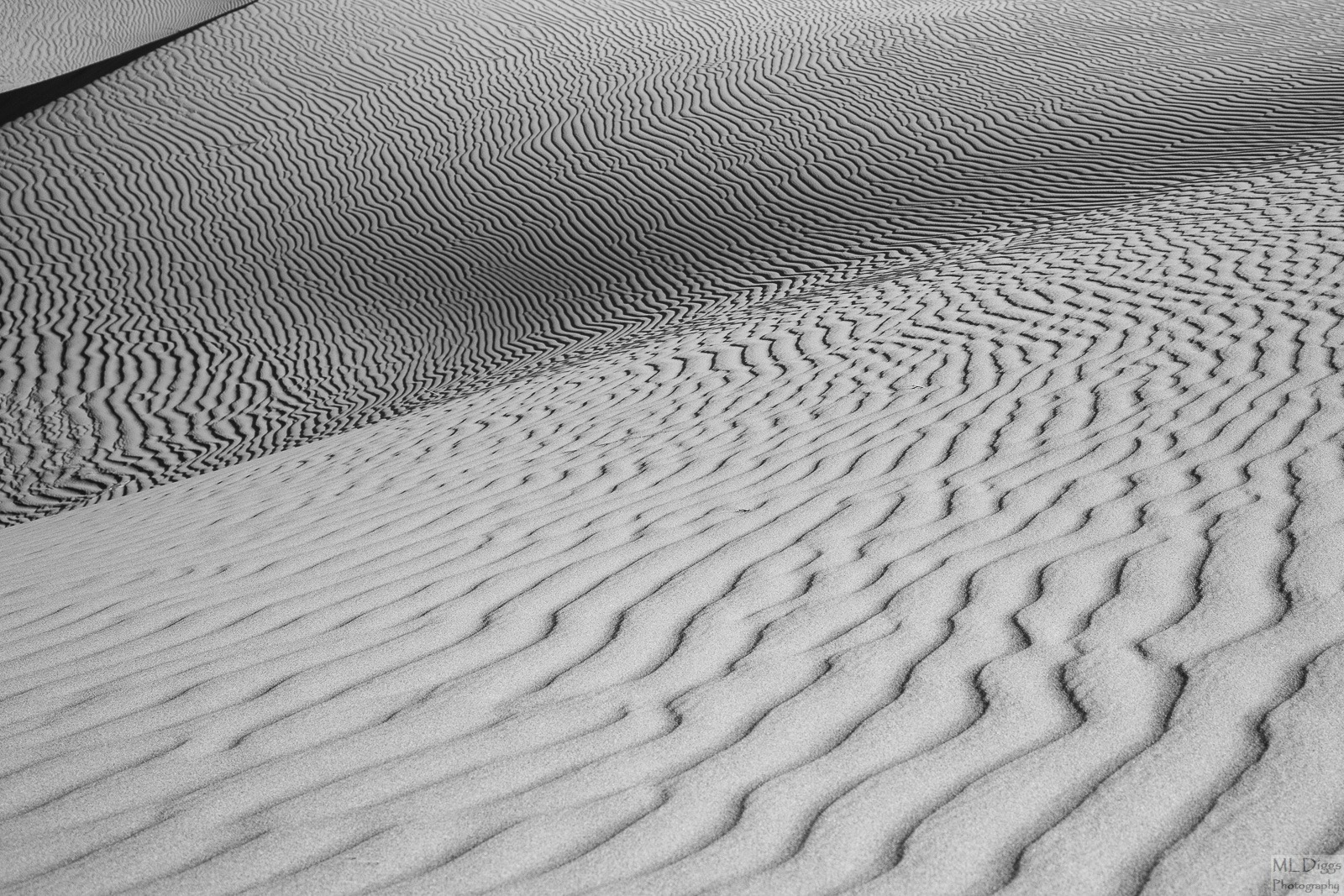
This is the last of the Algodones Dunescapes (there were 2-3 in M&N if you missed them).  I went abstract and b/w to begin with on this one, but it is interesting in color too.  I can't say enough about how much you all have helped me improve each image in this series.  Thanks a million, and as usual, feel free to let 'er rip or sing the praises of this final image. 


ML

Comments

8 comments
Comment posted by gary phillips on June 8, 2016 at 6:10 PM
I just love sand patterns and can't get enough of them.  I think this works without the shadow line top left.  To me it looks sorta like an afterthought.  I think either it needs more canvas there or I would crop it.  Nice work from these dunes.
Registered on October 24, 2013, 185 Posts, 4136 Comments
Comment posted by scott lanz on June 8, 2016 at 7:12 PM
I agree with Gary on this one. I like the abstract design with three distinct sections. Very unique and interesting. I just wish there was less of the lower section and more of that section in the ULC. Of course, I recognize that may not have been possible. I am just giving you my reaction to the image. I'd keep it as is rather than cropping out the ULC section, however.
Registered on November 14, 2003, 840 Posts, 12902 Comments
Comment posted by Marylynne Diggs on June 8, 2016 at 8:40 PM
Thanks for the honest appraisal. There was a big line of shrubs and then some dips that didn't really add to a good composition at the top end of the frame.  Here is a redo with a wider, pano crop and the two lowest shrubs cloned/healed out.  It's not as cosmically textured, in my mind, but perhaps it is an improvement.  I can do better with the clone job if this is otherwise a good  fix for the tiny ULC triangle.
Registered on December 14, 2010, 122 Posts, 1034 Comments
Comment posted by Doug Koepsel on June 9, 2016 at 9:03 PM
Nice shadows with the two sections of ripples and contrast between the ripple spacings in the two.  Maybe crop horizontally or vertically to rid the dark line and triangle in the upper left, as it really grabs the eye.
Registered on April 1, 2010, 196 Posts, 1592 Comments
Comment posted by Dan Kearl on June 10, 2016 at 1:36 AM
Pretty cool juxtaposed patterns.
I would also try a version with the upper LHC diagonal cropped off.
Registered on September 2, 2013, 209 Posts, 1514 Comments
Comment posted by Marylynne Diggs on June 11, 2016 at 2:14 PM
Thanks everyone.  Here is a version with the dark diagonal cropped out.  It feels like it's missing something to me, and the moire is more pronounced.  Reactions welcome as always.
ML
Registered on December 14, 2010, 122 Posts, 1034 Comments
Comment posted by Basil Greber on June 12, 2016 at 6:34 PM
Very nice overall, the pattern works great as always. I like how the frame is divided into three by those two diagonal lines where the pattern change. However, I think the uppermost sliver is a bit too small and the separating edge (shadow) too dark to exploit the full potential of this type of composition. So, if you have something where your frame is moved a bit up and left, I would be interested in seeing it.

[PS: Noticed after typing the above that you already provided that version. Works better for me.]
Registered on November 8, 2005, 219 Posts, 1340 Comments
Comment posted by Marylynne Diggs on June 12, 2016 at 8:03 PM
Thanks, Basil. I'll keep working on a more nuanced clone job to achieve that.  There were a ton of shrubs above, so my framing in camera was designed to limit that, but I did take a few with the scrub because I thought I might want to clone them out.
Registered on December 14, 2010, 122 Posts, 1034 Comments