Nature Photographers Network
This is the preserved archive of the original Nature Photographers Network. The community continues at naturephotographers.network.
2nd Repo Palouse #3
‹ PreviousLandscape GalleryNext ›

2nd Repo Palouse #3

by Marylynne Diggs

Gallery: LandscapePosted June 25, 20161,852 views14 comments
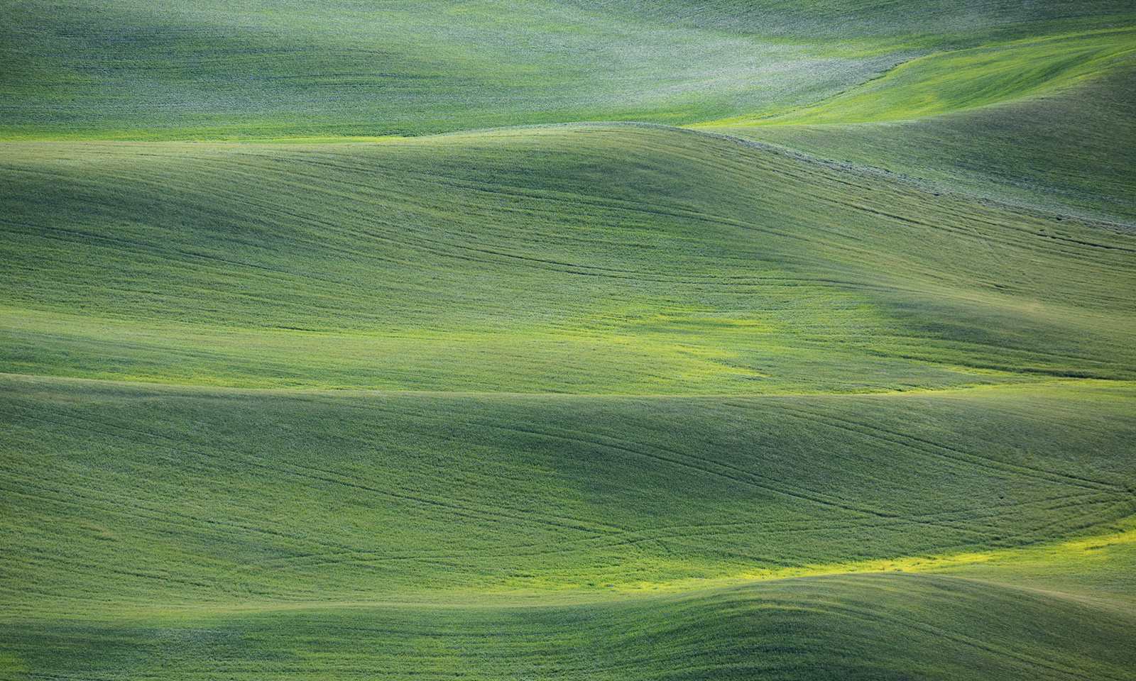
Here is the third from my recent Palouse trip.  The others are in M&A given the human element. 

With this one, I wanted to go abstract.  I'm usually attracted to 3s or intersecting curves.  This has more parallel lines, but I'm hoping it is still interesting.

Canon 5d3 with 100-400mm at 285mm
ISO 325, f/6.3, 1/800s

Let me know what you think. I'm always open to suggestions for different crops, processing, etc.
ML

Comments

14 comments
Comment posted by Jake Alletson on June 26, 2016 at 12:01 AM
A  lovely image of a soft landscape.  I find the tyre marks cutting across the grain of the surface a little jarring but there probably was no way of avoiding them.  Also, it might help to pull back the yellow in few places where the plants are very light.
Registered on May 3, 2016, 12 Posts, 163 Comments
Comment posted by gary phillips on June 26, 2016 at 2:39 PM
Pretty cool, Marylynne. I'm a sucker for rolling farm ground shots.  In my youth, I ran a tractor around a lot of rolling acres.  I've spent a fair amount of time enjoying this image and I agree with Jake, that the yellows are a little hot.  I also like a crop from the top  to where the last ridge curves up to the right edge.  For some reason it really helps the flow of the image for me. 
Registered on October 24, 2013, 185 Posts, 4136 Comments
Comment posted by scott lanz on June 26, 2016 at 2:53 PM
Very nice, Marylynne. I like it as is, but I could also see a vertical of just the right half or maybe right 2/3 (going toward a square format) which would emphasize the alternating zig-zagging lines on the right. Not necessarily better - - more of an alternate image or two for one. 
Registered on November 14, 2003, 840 Posts, 12902 Comments
Comment posted by Nick Bristol on June 26, 2016 at 4:42 PM
Marylynne, I'm enjoying the feel of this image very much. Kind of a soft, pleasing and inviting feel that works very nicely for me. I do like the small crop that Gary mentioned.

Nick Bristol
Lone Rock, WI
Registered on February 1, 2004, 752 Posts, 14140 Comments
Comment posted by Michael Lowe on June 26, 2016 at 9:05 PM
Very pleasing to look at. I would also probably tone down the yellows a little.devil
Registered on February 11, 2004, 777 Posts, 5252 Comments
Comment posted by Tom Falley on June 27, 2016 at 1:15 PM
The Poluse country has a unique flow to it, resulting from it's aeolean roots and it's own aestetic. In this case lightly modified by agricultural use. I find a slight vertical imbalance with the lower and top zones relative sizes making the image seem a little top heavy. This is somewhat increased by the flattening effect of a long focal length. Crop the top to more balance the top and bottom zones?  

I would agree this is a landscape, if not a wilderness shot. Perhaps we tend to confuse the two sometimes? 

Thanks for sharing of this beautiful area!
Registered on November 21, 2014, 189 Posts, 454 Comments
Comment posted by Marylynne Diggs on June 27, 2016 at 5:37 PM
Hi Everyone,
Thanks for the feedback.  It is much appreciated as always.  Here are two new variations: The first cropped down a tish from the top (far enough?) and a slight greening of the yellows and bluing of the greens.  Let me know if that takes care of the yellow intensity that seemed a bit off. 
Registered on December 14, 2010, 122 Posts, 1034 Comments
Comment posted by Marylynne Diggs on June 27, 2016 at 5:39 PM
And here is the same as the first repost, but with a square crop.
I'm interested in knowing whether either of the crops provokes standout preference as well.
Registered on December 14, 2010, 122 Posts, 1034 Comments
Comment posted by Harley Goldman on June 27, 2016 at 5:49 PM
Beautiful, Marylynne. The abstract works really well for me. I like this a lot. It really needs to be viewed large. 
Registered on November 19, 2003, 586 Posts, 11271 Comments
Comment posted by Harry Lichtman on June 28, 2016 at 9:13 PM
I think the image might improve with a little added contrast.  The parallel hills to make for a more static image, but the alternating green tones keep it interesting.
Registered on September 17, 2010, 304 Posts, 3507 Comments
Comment posted by Dave Dillemuth on June 28, 2016 at 9:50 PM
Beautiful abstract, Marylynne. I like all three of the versions and hard-pressed to pick a favorite.
Registered on December 10, 2015, 104 Posts, 1112 Comments
Comment posted by Sairam Sundaresan on June 28, 2016 at 10:28 PM
This is a beautiful image, and I think some added contrast can take it a long way!
Registered on March 14, 2013, 100 Posts, 643 Comments
Comment posted by Marylynne Diggs on June 29, 2016 at 1:02 PM
Thanks, everyone.  I'm still trying to calibrate my new computer, so the lack of contrast might be due to how wonderfully contrasty my new monitor is ;-).

Here is a new version of the square crop (increasingly my favorite comp) with more mid-tone contrast and more contrast overall.

Let me know if you think this is as good as this one gets ;-).
ML
Registered on December 14, 2010, 122 Posts, 1034 Comments
Comment posted by Igor Doncov on June 29, 2016 at 7:53 PM
It's funny how these palouse landscapes resemble the death valley dune abstracts in many ways. Personally I'm not too fond of the horizontal compositions. Their symmetry bothers me a bit. A horizontal line in the middle with 2 mirrored layers on each side, a wide one followed by a narrower one. It seems too simple. Although if you look at it long enough the simplicity starts to grow on you. It does have a calming, soothing effect and the simplicity adds to that feeing.

Perhaps its wrong to compare images to others but ... The best I've seen in this area seem to use the shadows of passing clouds to create a patchwork of tones on the rolling fields. It might be good to wait until weather conditions are optimal to go there.
Registered on November 22, 2014, 189 Posts, 2733 Comments