Nature Photographers Network
This is the preserved archive of the original Nature Photographers Network. The community continues at naturephotographers.network.
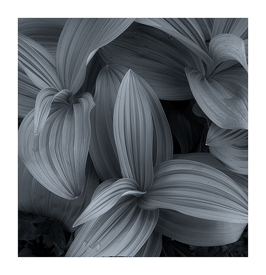
Mountain Corn Lillies
‹ PreviousLandscape GalleryNext ›

Mountain Corn Lillies

by Igor Doncov

Gallery: LandscapePosted July 7, 2016259 views14 comments
We have some of these plants growing here in the Cascades near my summer home. My initial plan was to photograph an image with saturated greens much like I had seen in Vance's portolio. After all the cropping was completed to my satisfaction I thought I would give B&W a thought and was amazed at the difference. The color version was very satisfactory but I could 'go crazy' in B&W and it looked even better. This conversion was done with NIK software almost entirely.

I know that this subject has been done ad nauseum but for me it's new so I feel a bit excited.

Let me know what you think.

I don't have the specifics on this shot because I'm in the process of moving from a PC to a Mac and half of the apps don't seem to work.

Comments

14 comments
Comment posted by Nick Bristol on July 7, 2016 at 3:47 PM
Igor, This looks great. I'm sure your color version is really nice but I just love this conversion. The tones are very cool and the shapes, texture and detail are wonderful. I like this composition very much as well.  The bottom leaf has a very small black edge showing so I would crop just a fraction off the bottom. Nice work!

Nick Bristol
Lone Rock, WI
Registered on February 1, 2004, 752 Posts, 14140 Comments
Comment posted by Igor Doncov on July 7, 2016 at 3:57 PM
Thanks Nick,

The coolness of the image. NIK has these presets that you can use for your conversion and the cool one caught my eye. And it took me back 60 years. Dad liked to do darkroom work after coming home from work and I, at the ages of 8-10 would help. What I remembered was that he would use different paper to get warmer or cooler prints. And I remember liking the cooler ones because they seemed to have smoother and fuller tone transitions. Pop liked to use the warmer paper and over the years I came to agree with him. He used Agfa paper. I never really understood what basis he used to choose one paper versus the other.

Igor
Registered on November 22, 2014, 189 Posts, 2733 Comments
Comment posted by Reno DiTullio on July 7, 2016 at 5:39 PM
Igor, I don't think anyone can ever "overdo" images of corn lillies, there are so many possibilities.  I love the smooth graduation of the tones is this image, beautiful, well done.
Registered on November 14, 2003, 130 Posts, 1644 Comments
Comment posted by Daniel Rappaport on July 7, 2016 at 5:50 PM
 I love green, but this conversion works very well.  Well composed. Your choices for tones and contrast make for a very appealing image. 
Registered on September 9, 2009, 294 Posts, 2006 Comments
Comment posted by scott lanz on July 7, 2016 at 5:50 PM
Very nice comp, Igor, with excellent lines and tones. I like the processing although I wonder about opening up the two dark areas a bit. My only real issue is where the image was posted. I don't think this is a landscape image by any stretch, and I feel it belongs in flora. Sorry, nothing personal. Just sort of a pet peeve of mine. crying
Registered on November 14, 2003, 840 Posts, 12902 Comments
Comment posted by Harley Goldman on July 7, 2016 at 5:58 PM
Nice comp Igor. The toning is not my thing (I would prefer a straight B&W), but that is so much a personal preference. Nicely done. 
Registered on November 19, 2003, 586 Posts, 11271 Comments
Comment posted by gary phillips on July 7, 2016 at 9:46 PM
To me the toning works very well.  It's not my thing, and I prefer straight B/W.  There is something that is very appealing about the tones in this image.  As Nick suggested, there is a black tear on the bottom edge that I would crop.  Additionally I would take the time to clone the bright  and darks specs to clean up an otherwise beautiful image.
Registered on October 24, 2013, 185 Posts, 4136 Comments
Comment posted by Doug Koepsel on July 7, 2016 at 11:48 PM
Nice subject that works for me in the toned B&W.  Maybe try some more contrast and see if you like it?
Registered on April 1, 2010, 196 Posts, 1592 Comments
Comment posted by Ian Cameron on July 8, 2016 at 6:42 AM
I like the composition and toning very much and yes the ragged black edge at the bottom of the image needs to be shaved off.
Registered on August 6, 2004, 1125 Posts, 3318 Comments
Comment posted by Dave Dillemuth on July 8, 2016 at 10:41 AM
This is lovely. Very elegant and delicate. I'm normally partial to color but this B&W conversion works beautifully. Minor nit: there is some sort of black edge (scanned film edge?) at the bottom that I would clone/crop out. Nice work!
Registered on December 10, 2015, 104 Posts, 1112 Comments
Comment posted by Marylynne Diggs on July 8, 2016 at 11:09 AM
I love corn lily shots and never tire of them.  This is truly an original take on a familiar subject.  I like the b/w and the cool tone.  I can imagine a tish more contrast, but that's a personal thing. Nice work!
ML 
Registered on December 14, 2010, 122 Posts, 1034 Comments
Comment posted by Jim Hackley on July 8, 2016 at 5:32 PM
I really like this close up composition and the overall tonality that you decided on.  I also like Gary's suggestion about cleaning up the spots on the leaves but really a fine composition either way.  Well seen and well done. 
Registered on September 17, 2009, 302 Posts, 5535 Comments
Comment posted by Jeffrey Sipress on July 8, 2016 at 11:43 PM
I like these subjects as well, Igor.  I usually like to see more of the leaf tips and less cutoffs but the ones leaving the frame are at least generally distributed around the borders and that helps.  Nice contrast!  Probably the wrong forum, tho.
Registered on February 17, 2004, 236 Posts, 1197 Comments
Comment posted by Anil Rao on July 13, 2016 at 1:27 AM
The folds of the leaves, the effect of the light and the lovely variation in tones provides a strong sense of movement that adds to the 3 dimensional feeling I get from viewing this image.The cool toning is unusual for this subject but delightful at the same time.

Very nicely done, Igor.
Registered on November 15, 2003, 234 Posts, 4923 Comments