Nature Photographers Network
This is the preserved archive of the original Nature Photographers Network. The community continues at naturephotographers.network.
The Tarn
‹ PreviousLandscape GalleryNext ›

The Tarn

by Michael Lowe

Gallery: LandscapePosted October 18, 2016273 views23 comments
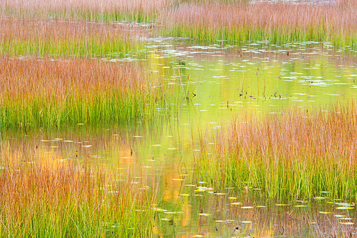
The morning sun illuminates the mountain to the west and the colors are reflected in this glacial pond. Last year when my brother and I shot here, the dominate color was yellow. This year there was a lot of green.
Acadia National Park, ME

Comments

23 comments
Comment posted by Ronald Murphy on October 18, 2016 at 10:52 AM
Very pleasing colors and nicely composed!
Registered on March 13, 2012, 279 Posts, 975 Comments
Comment posted by Harley Goldman on October 18, 2016 at 11:06 AM
Real nice, Michael. It has a very high key painterly look to my eye and works very well. I might consider cropping the top a bit to eliminate the water upper right, but minor stuff. 
Registered on November 19, 2003, 586 Posts, 11271 Comments
Comment posted by Igor Doncov on October 18, 2016 at 5:46 PM
Beautiful work. Especially the nearer reflections that are more varied in color and pattern. A light, almost pastel like image. Nice composition and I really like those dark reeds sprinkled here and there for variety. Nice job.
Registered on November 22, 2014, 189 Posts, 2733 Comments
Comment posted by Marylynne Diggs on October 18, 2016 at 11:35 PM
I love this, Michael.  The washes of yellow, green, and red along with the contrasting textures (fine grass and glassy water) make this a fun image to explore.  I agree with Harley on the upper right.  The tips of grass there are not worth saving if you catch that band of white in the process.  Easy fix for a fabulous image.
Registered on December 14, 2010, 122 Posts, 1034 Comments
Comment posted by Bill Chambers on October 19, 2016 at 1:55 AM
Gorgeous Michael.  You've really captured a beautiful scene here.  Excellent composition and the color actually jumps out at you, but without being overdone.  Love the color variations too.  I only have one very slight nit.  In the large view you can see the water in the upper right hand corner and that detracts from the overall scene slightly.  Well done.
Registered on April 10, 2005, 753 Posts, 21216 Comments
Comment posted by scott lanz on October 19, 2016 at 8:24 AM
Beautiful image, Michael. Terrific color and pattern. 
Registered on November 14, 2003, 840 Posts, 12902 Comments
Comment posted by Nick Bristol on October 19, 2016 at 9:45 AM
Michael, I really like how you set up this composition with such a nice flow to it. The colors and reflections here are wonderful. Very pleasing to view this. Nice work! 

Nick Bristol
Lone Rock, WI.
Registered on February 1, 2004, 752 Posts, 14140 Comments
Comment posted by Kathy Barnhart on October 19, 2016 at 1:58 PM
Beautiful abstract, with such wonderful colors. The lines of the grasses and the dots of reflected light add lots of interest. Well done!
Registered on November 11, 2011, 404 Posts, 1639 Comments
Comment posted by Peter Richter on October 19, 2016 at 3:04 PM
Michael, I really enjoy and appreciate your composition. The diverse layers, complementing colors as well as the juxtaposition of vertical and horizontal patterns are very appealing to me.

As already mentioned by others, cropping the small area with water at the top would help me to keep my attention within the frame. But this is only a minor matter for me, otherwise the image is spot on to my eye.

Peter
Registered on November 10, 2010, 218 Posts, 2723 Comments
Comment posted by Craig Moreau on October 19, 2016 at 3:15 PM
Great, colorful photo Michael!
I agree with the others about cropping the upper right, but that's minor. I was in Acadia in June, and this is much better than any composition I was able to come up with. I didn't find this to be an easy location, but it is fun!
Registered on April 21, 2015, 64 Posts, 584 Comments
Comment posted by Ian Wolfenden on October 19, 2016 at 5:34 PM
Beautiful colouring, Michael, and a fine composition, with the water zig-zagging through the frame and taking your eye into the distance.  I like the textures of the reeds and the soft glow in the centre.  Lovely image !
Registered on May 18, 2007, 1108 Posts, 7647 Comments
Comment posted by Ed Lowe on October 19, 2016 at 6:43 PM
Gorgeous image, Mike. I love the combination of greens and reds in this lovely abstract. I hope I have a couple of images this nice from the Tarn.

Ed
Registered on February 7, 2004, 414 Posts, 7115 Comments
Comment posted by Richard Teller on October 19, 2016 at 7:20 PM
This looks like something Monet would paint. Nice colors, lines and the eye is drawn right through the image. 
Registered on August 23, 2010, 1162 Posts, 6692 Comments
Comment posted by Vance Gese on October 19, 2016 at 8:18 PM
Love those layers of grasses receding back, left to right to left and on.  The warm colors mixed with the luminous greens are outstanding.  Excellent image.
Registered on November 13, 2008, 298 Posts, 6629 Comments
Comment posted by Tony Kuyper on October 19, 2016 at 11:41 PM
The colors and comp are really working well here.  Beautiful light all around.
Registered on November 1, 2003, 364 Posts, 22328 Comments
Comment posted by Bill Fach on October 20, 2016 at 12:54 PM
Michael: Wonderful color palette and a very well seen comp IMO. The larger version is a delight. >=))>
Registered on November 1, 2003, 1805 Posts, 26981 Comments
Comment posted by Albert Darmo on October 20, 2016 at 4:26 PM
Hi  Michael crying  Agree  with   the others,  this is inspired   photography.  frownblushfrown    love  the  delightful  form.  color &  lightdevil

Albert Darmo
Canada
Registered on November 25, 2008, 1386 Posts, 11978 Comments
Comment posted by Harry Lichtman on October 21, 2016 at 8:36 AM
I really need to spend some time up there - your images are inspiring me!  The water weaving through the reeds is very zen.  Seems quite bright - not sure if darkening the image as a whole would be of any benefit.  Wonderful as is.
Registered on September 17, 2010, 304 Posts, 3507 Comments
Comment posted by Michael Lowe on October 22, 2016 at 8:18 AM
Thanks to all for the comments. Here is a repost with the suggested crop and reduction in brightness.
Registered on February 11, 2004, 777 Posts, 5252 Comments
Comment posted by Igor Doncov on October 22, 2016 at 12:34 PM
The crop did improve it but I'm not sure about the brightness. For me this was a light subject that needed to have bright unsaturated colors. This is a very different image with its own positives. I guess it depends on what you're trying to say. So, I prefer the original. On second thought, I like them both. 

PS. You should probably alter the title to "+ alt" to alert people to the changes you wish them to look at. 
Registered on November 22, 2014, 189 Posts, 2733 Comments
Comment posted by Igor Doncov on October 22, 2016 at 4:07 PM
A square crop of the right half of this image is a very nice composition. You might look at that as well. 
Registered on November 22, 2014, 189 Posts, 2733 Comments
Comment posted by Michael Lowe on October 22, 2016 at 7:05 PM
Thanks Igor. I probably do have some similar crops in my files. I worked the scene pretty good.
Registered on February 11, 2004, 777 Posts, 5252 Comments
Comment posted by Navin Sarma on October 24, 2016 at 10:09 AM
Love the repost. Spot on!
Registered on July 17, 2011, 233 Posts, 1373 Comments