
Nature Photographers Network
This is the preserved archive of the original Nature Photographers Network. The community continues at naturephotographers.network.
Aspen Boles
‹ PreviousLandscape GalleryNext ›

Aspen Boles

by Vance Gese

Gallery: LandscapePosted October 21, 20161,288 views13 comments

Thank you very much for the comments on the last image.  Really appreciate all feedback.

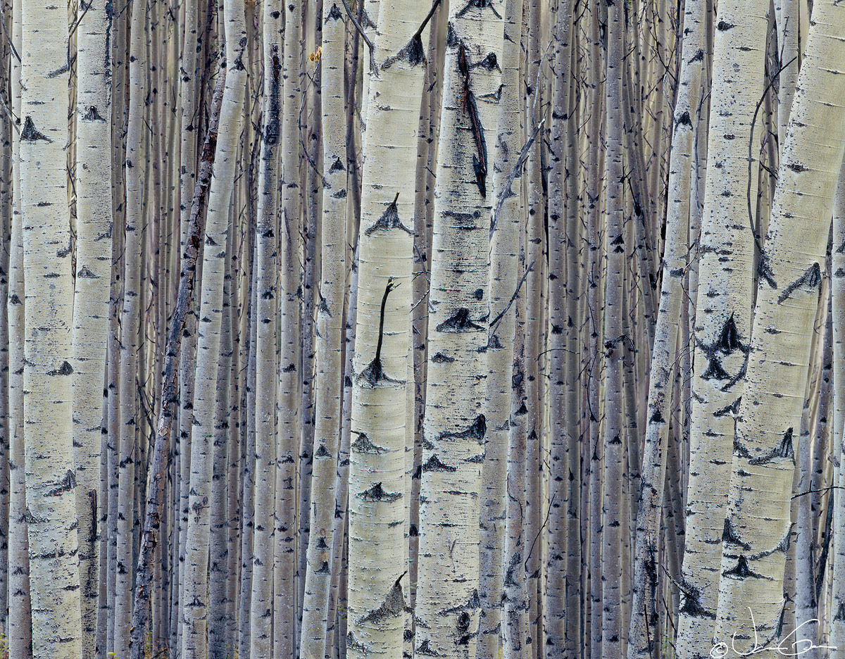
These aspens were found near Ester, Alaska one chilly autumn morning, back in the 1990's.  The strong vertical lines really appealed to me at the time and so tried to accentuate that aspect with the use of a long lens, which ended up being quite a challenge within the contraints of this forest and the use of the 4x5.  The background ended up being a little soft.  Would really appreciate your thoughts and suggestions on this image.

4x5, 600mm, Ektachrome 64 (that'll date me), f64, many seconds.  Flat bed (M1) scan, Tony Kuyper's masks and such.

Large image attached.

Thanks.

Comments

13 comments
Comment posted by Harley Goldman on October 21, 2016 at 8:41 PM
I definitely like this, Vance. Really minor but I am seeing a very subtle color cast of cyan. It won't make much of a difference, but seems to make the trees more neutral and natural looking to my eye. Maybe it is just my synapses misfiring.  Cool image!!

A 600? Telephoto version or an absolute monster of a lens?
Registered on November 19, 2003, 586 Posts, 11271 Comments
Comment posted by Igor Doncov on October 21, 2016 at 9:03 PM
This is a nice graphic sense to it. This abstract is visually confusing to me at times in that the far trees seem to be closer at times and at other times farther. The loss of perspective plays with your mind. I like the fact that you didn't go b&w on this because the subtle colors do add to it. The tonal difference between the fg and bg trees also work well here.  
Registered on November 22, 2014, 189 Posts, 2733 Comments
Comment posted by gary phillips on October 21, 2016 at 9:16 PM
This is sweet, Vance.  I'm a sucker for Aspen bole images and have tried many times to do one myself, with little success.  Not an easy image to pull off. I do agree with Harley that there is a slight cyan color cast.  Not a big deal at all.  I love the little patch of golden leaves top center.  I also disagree with Igor, in that I think it would make a stunning b/w.(of course that's what I see most times).  Regardless of how you present it, it is very, very nice.
Registered on October 24, 2013, 185 Posts, 4136 Comments
Comment posted by Tom Falley on October 21, 2016 at 10:08 PM
Vance:

This looks a whole lot like the view out my Kitchen Window.  Healthy big Aspen and Birch forest with the here and there large White Spruce. I live about 10 miles away from Ester, to the North and West.  Getting our first snow!

Large format images are not at their best in this format where fine detail can let the eye rove. Depth of field is always a large format issue in an image like thins, long before the idea of image stacking was even imagined.

Softly enjoyable and catches the peaceful mood of the Northern Forest!
Registered on November 21, 2014, 189 Posts, 454 Comments
Comment posted by Tony Kuyper on October 21, 2016 at 10:57 PM
Exquisite, Vance.  I like how there are three dominant vertical arrangements amidst all the verticalness.  Nice strong colors and contrast too.  Very nice.
 
Registered on November 1, 2003, 364 Posts, 22328 Comments
Comment posted by Bill Fach on October 22, 2016 at 8:29 AM
Vance: Frame filling fantastic. The larger version is a visual treat. I like the color as well and the textures are marvelous. Most excellent.>=))>
Registered on November 1, 2003, 1805 Posts, 26981 Comments
Comment posted by Nick Bristol on October 22, 2016 at 10:14 AM
Vance, I love this shot! The large version is just amazing for me to look at. My eye goes in and out between the foreground and background trees and it is very cool. I like the color this has and the perfect composition. Fantastic image!
I shot a lot of that E-64 a few years back now. 

Nick Bristol
Lone Rock, WI.
Registered on February 1, 2004, 752 Posts, 14140 Comments
Comment posted by Peter Richter on October 23, 2016 at 6:24 AM
Vance, these repetitive patterns and delightful details are fascinating to me. The almost monochromatic character with only slight hints at colors works very well in my opinion. Regarding the composition, the one trunk at the right tends to lead me out of the frame, while the strong verticals at the left anchor the image well for me and pull me back again. Great work to my eye.

Peter
Registered on November 10, 2010, 218 Posts, 2723 Comments
Comment posted by Doug Koepsel on October 23, 2016 at 11:39 AM
I like how the greener cast of the closer boles helps with their size to separate them from the bluer distant boles. It is often difficult to get a view with just boles filling the scene with no spaces.  I could see maybe reducing the blues just a little, but not getting rid of the blue. If you have some pixels, maybe add back to the far left.  A consideration may be to try a pano crop also.
Registered on April 1, 2010, 196 Posts, 1592 Comments
Comment posted by Dan Kearl on October 23, 2016 at 4:09 PM
We all look for these kind of aspen comps and not many succeed. This is about perfect....
Registered on September 2, 2013, 209 Posts, 1514 Comments
Comment posted by Mattia Oliviero on October 24, 2016 at 3:01 AM
I like this a lot, Vance. I love birches' trunks. Agreed with a slightly cyan dominant. Large image is stunning. 
Registered on August 24, 2016, 43 Posts, 254 Comments
Comment posted by Mark Seaver on October 24, 2016 at 5:19 PM
The combination of details and strong sense of abstraction are terrific, Vance.  Your choice to emphasize the 3 groups of larger, foreground trunks with the smaller ones providing a backdrop with great depth works very well.  I didn't notice the slight softness.  If anything, it adds to the sense of depth.
Registered on January 23, 2011, 1103 Posts, 17270 Comments
Comment posted by Bill Chambers on October 25, 2016 at 1:02 PM
Beautiful Vance.  That's one thick stand of trees!  I love the texture you captured and the balanced composition.  It seems a bit bluish on my uncalibrated work monitor, but I'll recheck it tonight on a photo monitor.  Nice work.
Registered on April 10, 2005, 753 Posts, 21216 Comments