Gallery: Photo ArtPosted October 24, 2016295 views6 comments
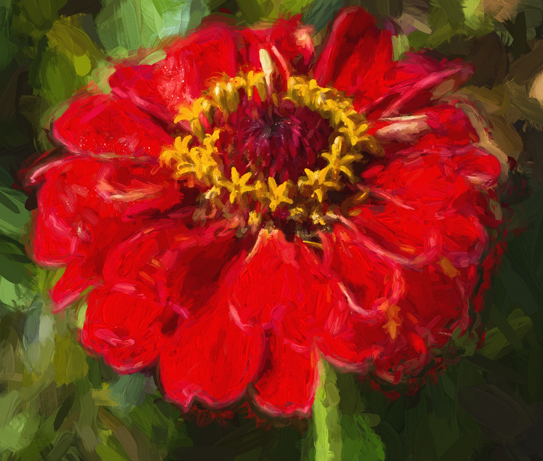
Topaz Impression Impasto treatment with other adjustments made.
Any feedback would be greatly appreciated.
Thank you!
Comments
6 comments
Comment posted by Allen Brooks on October 25, 2016 at 12:19 AM
For what it's worth, this doesn't quite work for me. I like how the center turned out, but I'd like to see what it looks like with a tad less saturation in the greens and even more desaturation in the reds, which currently overpower the scene. When I think of impressionism, I think of more muted colors.
Registered on July 27, 2011, 262 Posts, 2597 Comments
Comment posted by Barbara Graham on October 25, 2016 at 12:26 AM
Thanks, Allen. Here is a redo with a lot of desaturation. For myself, I like it bright, so I'm not sure I got what you were suggesting here, but if you see this can you let me know?
Registered on July 27, 2010, 1310 Posts, 5035 Comments
Comment posted by Allen Brooks on October 25, 2016 at 12:35 AM
Burning the midnight oil out in Florida! I enjoy seeing what people do in this gallery and, of course, it is more subjective than the other galleries and whatever the artist comes up with is right for them. For me, I like the re-post better as it has more of an impressionistic feel. I think the center is the star of the show and the second post shows this better. Maybe even bring back more of the yellow color and see how that looks.
Registered on July 27, 2011, 262 Posts, 2597 Comments
Comment posted by Barbara Graham on October 25, 2016 at 1:12 AM
Okay, to me this is better than the second image. What do you think?
Registered on July 27, 2010, 1310 Posts, 5035 Comments
Comment posted by Allen Brooks on October 25, 2016 at 10:22 AM
Yes, I like the third one as well. It's too bad this gallery doesn't get more comments, as I'm sure others would have a totally different opinion about this photo.
Registered on July 27, 2011, 262 Posts, 2597 Comments
Comment posted by Mike Ramy on October 27, 2016 at 12:47 PM
Barbara,
Very interesting to see these three versions of this image and it is so nice to be able to click on the large version and instantly, using the side arrows, go from one to the other. I appreciate Allen's comments and he makes some good points especially regarding the 'Subjective Aspect' of this gallery.
My vote however is for the original image, the vibrant color pops and evokes a mood of happiness that fits the image well. The brush strokes and textures in the 2nd and 3rd versions do stand out a bit better and that would lead me to suggest just a small amount of de-saturation in the reds but just enough to help bring out more the texture. When I think of digital art, I envision how it will look framed and mounted on the wall and to my eye the original post would better brighten a room.
Registered on June 16, 2012, 567 Posts, 2809 Comments

Comments
6 commentsVery interesting to see these three versions of this image and it is so nice to be able to click on the large version and instantly, using the side arrows, go from one to the other. I appreciate Allen's comments and he makes some good points especially regarding the 'Subjective Aspect' of this gallery.
My vote however is for the original image, the vibrant color pops and evokes a mood of happiness that fits the image well. The brush strokes and textures in the 2nd and 3rd versions do stand out a bit better and that would lead me to suggest just a small amount of de-saturation in the reds but just enough to help bring out more the texture. When I think of digital art, I envision how it will look framed and mounted on the wall and to my eye the original post would better brighten a room.