Gallery: Macro & Close-upPosted November 13, 2016178 views10 comments
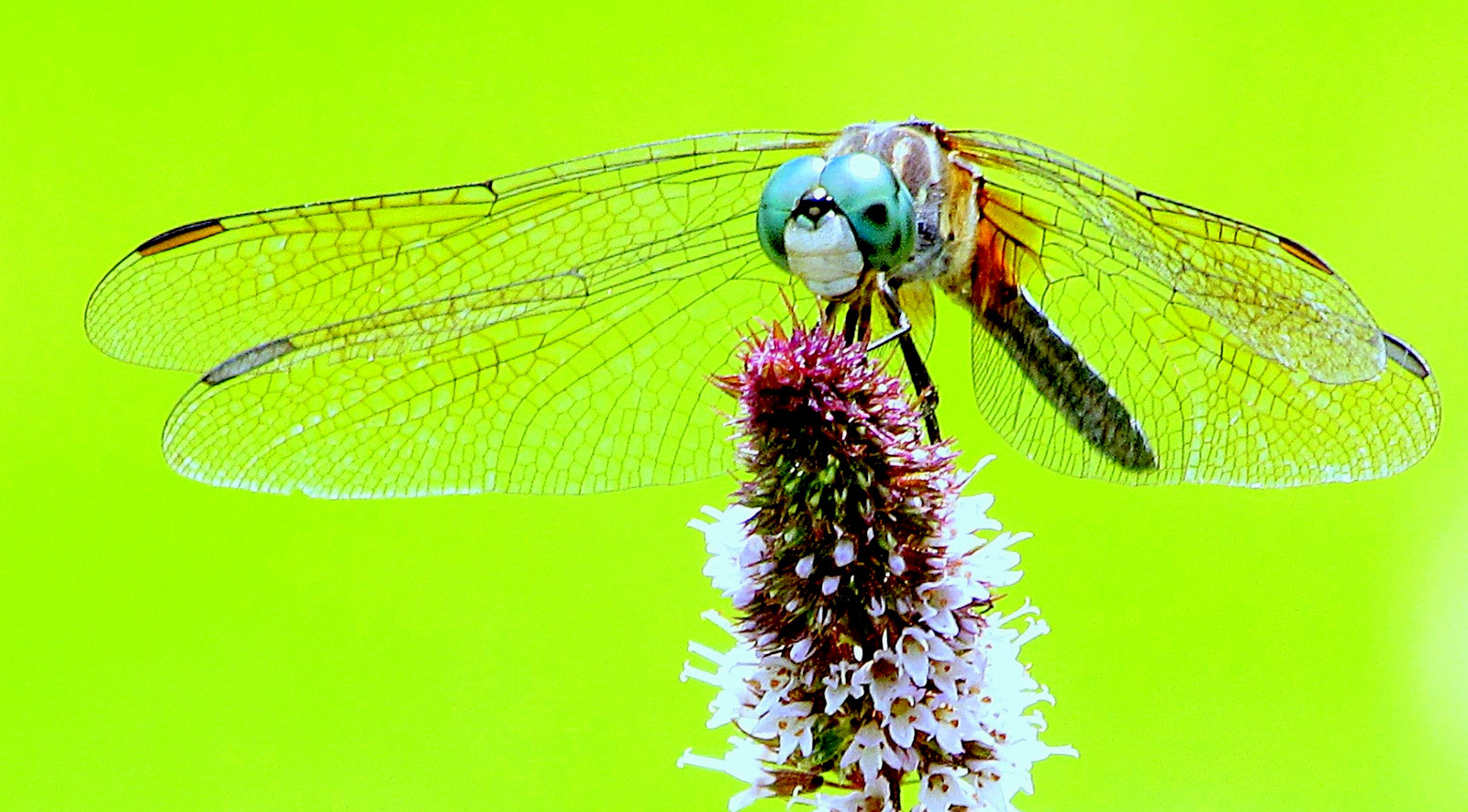
The master of all dragonflies sits atop a wildflower in the grasses run amok behind an old, fallen greenhouse.
Canon sx 30 is, HH (accounts for some noise), shot on auto.
Comments
10 comments
Comment posted by SandyRichardsBrown on November 13, 2016 at 10:12 PM
Beautiful dragonfly and flower!
The bright yellow BG, however, is pretty distracting. Maybe tone it down to a pale yellow?
there IS some noise - a good round or two of a noice-reducer program like Topaz De-Noise or even the one in photoshop would do the trick.
Sandy
Registered on November 24, 2003, 3937 Posts, 12909 Comments
Comment posted by Lori Lafargue on November 13, 2016 at 10:42 PM
Thanks. I took your advice and desaturated this photo quite a bit. Honestly though, I took this in mid Summer, high noon and the grasses and trees were this combined greenish yellow. Please let me know which you like better. Thanks so much!
Registered on September 30, 2016, 54 Posts, 59 Comments
Comment posted by Balan Vinod on November 14, 2016 at 12:36 AM
Lori ...the second version is better, and the df really stands out from the bg. I like the comp here..nice work
Balan Vinod
Registered on March 20, 2006, 889 Posts, 2312 Comments
Comment posted by SandyRichardsBrown on November 14, 2016 at 3:18 AM
Lori, I believe the second version is much improved, and more "believable." (even if those were the exact slightly - raucous colours). they just didn't seem to compliment each well, and overshadowed the dragonfly.
The paler yellow is perfect.
Very, very nice work !
Sandy
Registered on November 24, 2003, 3937 Posts, 12909 Comments
Comment posted by Lori Lafargue on November 14, 2016 at 3:26 AM
Sandy, Thank you for suggesting that change. I can see how it makes a big difference. Perhaps "raucous" is a good description of that color!! Sometimes you can't see the forest for the trees! (no matter what colors they are!!)
Balan, I appreciate your input and kind support. I am a huge fan of your work!
~Lori~
Registered on September 30, 2016, 54 Posts, 59 Comments
Comment posted by Mark Seaver on November 14, 2016 at 2:05 PM
Lori, this is a fine look at this df and the repost is a good improvement colorwise. The head on pose is looks great and you got decent detail in the wings as well as the perch. One of the challenges in using Adobe products is how much extra saturation they build in. Watching and correcting for that can be a challenge. It's clear from seeing lots of web posts on multiple sites that most folks don't bother. In fact, there's a benefit as gaudy images grab attention more easily.
Registered on January 23, 2011, 1103 Posts, 17270 Comments
Comment posted by Jim Zablotny on November 15, 2016 at 6:42 PM
Hi Lori,
I like the composition a lot. Head is placed perfectly in the frame. You may want to experiment more with the BG color if you so desire. Grass does funny things to BG color and have run into this problem many times. I believe that your repost is much more improved over the original post and this is an image that will be fun for you to play around with on a rainy day. Well done and good eye for capturing this composition...........................................Jim
Registered on January 17, 2004, 705 Posts, 3594 Comments
Comment posted by Skip Layman on November 16, 2016 at 1:24 PM
I agree toning down the BG helped this picture. Good detail and use of available DOF.
Registered on November 1, 2003, 558 Posts, 1704 Comments
Comment posted by Dennis Plank on November 17, 2016 at 12:45 PM
Nice composition, Lori. The toned down version does seem to work a bit better. Excellent detail in the dragonfly and I like the pov.
Registered on January 28, 2008, 1767 Posts, 23192 Comments
Comment posted by Swathiraj G on November 18, 2016 at 9:46 AM
Hi Lori,
You managed to get a nice image with your point and shoot, good placement of the subject...Yes, Background image of second image is much comfortable to the eyes.
Registered on April 26, 2014, 71 Posts, 153 Comments

Comments
10 commentsThe bright yellow BG, however, is pretty distracting. Maybe tone it down to a pale yellow?
there IS some noise - a good round or two of a noice-reducer program like Topaz De-Noise or even the one in photoshop would do the trick.
Sandy
Thanks. I took your advice and desaturated this photo quite a bit. Honestly though, I took this in mid Summer, high noon and the grasses and trees were this combined greenish yellow. Please let me know which you like better. Thanks so much!
Balan Vinod
The paler yellow is perfect.
Very, very nice work !
Sandy
Balan, I appreciate your input and kind support. I am a huge fan of your work!
~Lori~
I like the composition a lot. Head is placed perfectly in the frame. You may want to experiment more with the BG color if you so desire. Grass does funny things to BG color and have run into this problem many times. I believe that your repost is much more improved over the original post and this is an image that will be fun for you to play around with on a rainy day. Well done and good eye for capturing this composition
You managed to get a nice image with your point and shoot, good placement of the subject...Yes, Background image of second image is much comfortable to the eyes.