Nature Photographers Network
This is the preserved archive of the original Nature Photographers Network. The community continues at naturephotographers.network.
Maple Tree and Boulder + rp
‹ PreviousLandscape GalleryNext ›

Maple Tree and Boulder + rp

by Preston Birdwell

Gallery: LandscapePosted November 16, 2016299 views22 comments
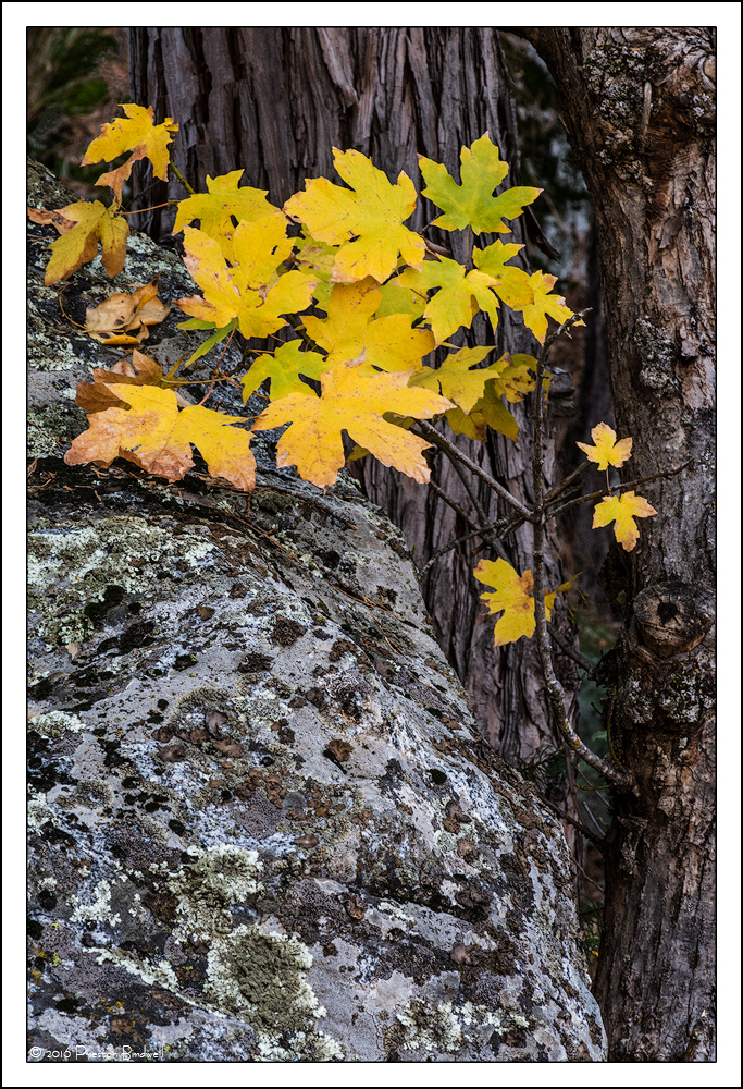
I found this intimate tree and boulder portrait near the chapel in Yosemite. I liked the lichens and the small maple tree branch hanging over the rock.

Nikon D-7100
18-140mm Nikkor
TK's Masks

Please see the large version. Thanks!

Your thoughts are always appreciated. cool
--P

Comments

22 comments
Comment posted by Peter Richter on November 16, 2016 at 3:15 PM
A most interesting and appealing mixture of elements and textures to me, Preston. There is a wonderful dynamic balance to your composition for me, and the crispness of your processing makes for nice tangible details.

Peter
Registered on November 10, 2010, 218 Posts, 2723 Comments
Comment posted by Ana on November 16, 2016 at 3:53 PM
Really nice arrangement; the different textures of the stone and the two kinds of bark are very interesting.  The little hole in the righthand trunk adds a lot as a place for my eye to return to.  As much as I like the texture in the lichens my eye doesn't linger in that area and so I find myself wishing for more of the righthand trunk to balance it out.
Registered on February 10, 2004, 191 Posts, 1446 Comments
Comment posted by Nick Bristol on November 16, 2016 at 4:31 PM
Preston, I like the composition you set up here. A wonderful mix of color, textures and detail that work very well.

Nick Bristol
Lone Rock, WI.
Registered on February 1, 2004, 752 Posts, 14140 Comments
Comment posted by Harley Goldman on November 16, 2016 at 5:35 PM
Nice one, Preston. A fine intimate scene. No suggestions here. 
Registered on November 19, 2003, 586 Posts, 11271 Comments
Comment posted by Lon Overacker on November 16, 2016 at 9:36 PM
I like this a lot Preston.  the combination of elements work wonderfully in this intimate little scene.  Hard to offer this suggestion since it's completely subjective, but what about a crop off the bottom?  Reminiscing back to the 4:5 ratio days... I think that format would work well with this image.  Kinda goes with Ana's comment that there's plenty of lichen, but not all of it necessarily adds to the image.  Regardless, good eye on this one.

Lon
Registered on November 24, 2006, 521 Posts, 19147 Comments
Comment posted by Jim Zablotny on November 16, 2016 at 9:38 PM
Hi Preston,

Yellow on gray works every time.  Nice color combination and you nailed the compdevil........................Jim
Registered on January 17, 2004, 705 Posts, 3594 Comments
Comment posted by scott lanz on November 16, 2016 at 9:51 PM
Very nice intimate scene, Preston. I like the combination of elements. I think Lon's crop suggestion has merit for balance, but I like the detail in the rock bottom. Sorry, but I always wanted to say "rock bottom" in a comnent, and this was my first opportunity. enlightened
Registered on November 14, 2003, 840 Posts, 12902 Comments
Comment posted by gary phillips on November 16, 2016 at 11:09 PM
Beautiful little scene, Preston.  Love the color combo and detail.  I could also go with Lon"s suggestion, but either way, very nice.
Registered on October 24, 2013, 185 Posts, 4136 Comments
Comment posted by Ed Lowe on November 16, 2016 at 11:43 PM
The details and textures work very nicely in this scene, Preston. The yellow leaves complete the image for me as they the perfect compliment to the darker tones. This is nice as is, but I like the crop suggestion.

Ed
Registered on February 7, 2004, 414 Posts, 7115 Comments
Comment posted by Ronald Murphy on November 17, 2016 at 8:37 AM
Excellent composition of a forest detail. I wonder what a little less rock and a little more trunk would look like.
Registered on March 13, 2012, 279 Posts, 975 Comments
Comment posted by Paul Breitkreuz on November 17, 2016 at 9:04 AM
Preston, for me it was the placement of the leaves in the scene that works so well. The rock or boulder is a good base for the hanging leaf arrangement and simply adds to the visual pleasure.
Registered on February 25, 2006, 525 Posts, 8448 Comments
Comment posted by John Williams on November 17, 2016 at 9:30 AM
Excellent combination of elements Preston; well seen. I agree that a slight crop off the bottom would be a better balance. (At the risk of being heretical, you could also use Transform to compress the bottom so you don't lose that cooler patch of lichen at the bottom edge.)
Registered on September 6, 2007, 221 Posts, 5985 Comments
Comment posted by Preston Birdwell on November 17, 2016 at 2:14 PM
Thank you for your comments, everyone!

I made some changes to the image. I looked at a 4x5 crop, but it made the image seem to tight, so I compromised and took some off the bottom. I also warmed the image up a bit and brightened it somewhat because I felt that the original post was too dark and too cool. I would appreciate your comments, as always.
--P
Registered on November 1, 2003, 471 Posts, 5188 Comments
Comment posted by Prashant Khapane on November 17, 2016 at 3:33 PM
wonderful balance of elements. Have you guys (Yosemite trip trio) moved away from LF?
Registered on November 1, 2003, 492 Posts, 4580 Comments
Comment posted by Harley Goldman on November 17, 2016 at 4:00 PM
I like the crop. I might add back a little of the coolness to the rock. 
Registered on November 19, 2003, 586 Posts, 11271 Comments
Comment posted by Mark Seaver on November 17, 2016 at 5:11 PM
Those golden leaves sure do pop against the subtle colors of the stone and tree, Preston.  There's a wonderfully inviting gentleness to this intimate scene.  While there considerably more pop to the repost, I really like the subtleness of the original.  While it's only noticeable in a direct comparison, I also like the cooler colors in the rock of the original.
Registered on January 23, 2011, 1103 Posts, 17270 Comments
Comment posted by Vance Gese on November 17, 2016 at 6:51 PM
Outstanding composition, Preston.  The placement of the maple leaves against the lichen covered rock and tree trunks works very well.  Not a big deal, but the out of focus distant background is a bit distracting to my eye; I almost wish it were more blurry or tack sharp.  Just me in my box.  I prefer the original post over the repost as I like the yellow leaves with the cooler tones.  Nice.
Registered on November 13, 2008, 298 Posts, 6629 Comments
Comment posted by Lon Overacker on November 17, 2016 at 7:44 PM
PB, I like your compromise on the crop - works well for me.  Overall I like the warming, but agree with Harley on perhaps bringing some coolness back to the rock and lichen.  My recollection of that area, espsecially deeper in to the boulder field, that the rocks were of varying tones of blue/cyan, so I think bringing back some of that would be appropriate.  Then again, it's all subjective and how you feel best represents your desires.

Lon
Registered on November 24, 2006, 521 Posts, 19147 Comments
Comment posted by David Schoen on November 17, 2016 at 8:00 PM
A nice study in contrast between shape, form, and texture.  A lot going on but each part of the image stands out well on its own and cohesively creates a pleasing image.  Well seen.
Registered on November 6, 2006, 1213 Posts, 4587 Comments
Comment posted by Gary Minish on November 19, 2016 at 1:41 AM
Good eye to see the opportunity and an excellent composition that amplifies the contrast between leaves, rock and tree bark.  I definitely prefer the original version.  It has more contrast that gives it a more 3D appearance and I think the colors are richer and more natural.  Very nicely done! devil
Registered on February 4, 2006, 625 Posts, 3583 Comments
Comment posted by Albert Darmo on November 19, 2016 at 12:23 PM
Hi  Preston crying       Everyone    enjoys  your combination  of  elements  in  this  fine image.    i   too    enjoy  the  cooler original  more.   excellent work   
Albert   Darmo
Registered on November 25, 2008, 1386 Posts, 11978 Comments
Comment posted by Reno DiTullio on November 20, 2016 at 11:43 AM
Very nice comp and processing, Preston.  I like the crop in the reworked image but seems too warm for my tastes, prefer it a little cooler.
Registered on November 14, 2003, 130 Posts, 1644 Comments