Gallery: LandscapePosted November 15, 2016117 views10 comments
Comments
10 comments
Comment posted by Lon Overacker on November 16, 2016 at 12:14 AM
Ana,
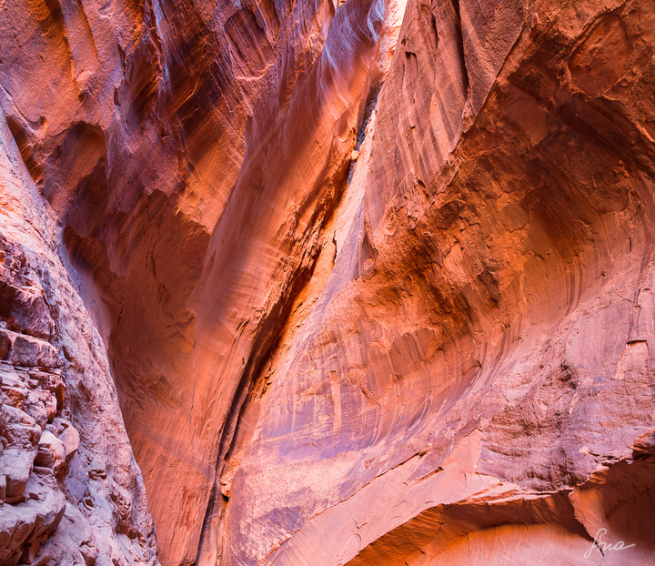
The crack splitting the frame and the lack of any scale here really makes this successful image. Colors look good and natural. My only suggestion would be to selectively burn some areas; not to create even tones throughout, but just to use to help guide the eye through the image; hard to explain and of course just a personal choice and not really to say that this needs any improvement at all. A well seen and captured image.
Lon
Registered on November 24, 2006, 521 Posts, 19147 Comments
Comment posted by Harley Goldman on November 16, 2016 at 9:59 AM
This is a real nice mind bender. I really like the abstract composition using lines, depth and color. Very enjoyable.
Registered on November 19, 2003, 586 Posts, 11271 Comments
Comment posted by Richard Teller on November 16, 2016 at 10:13 AM
I like how the hollow in the rock moves the eye from the right side of the image to the crack in the center, then the crack moves the eye up through the image,also nice color. If I had any nit it would be the lower left. The way the rock sticks our seems to be a little out of sync with the rest of the image. But a minor nit.
Registered on August 23, 2010, 1162 Posts, 6692 Comments
Comment posted by Ana on November 16, 2016 at 2:01 PM
Thanks for the comments, everyone! Much appreciated.
Yes that lower left side bothers me a bit, though I am not sure how to tackle it.
I think a lot this image is about circulating the eye around the frame; have definitely given some thought to how to subtly encourage that with a bit of dodging and burning but need to experiment a bit.
Registered on February 10, 2004, 191 Posts, 1446 Comments
Comment posted by Preston Birdwell on November 16, 2016 at 2:36 PM
This works for me, ana. I agree that the lack of scale and the perspective make this quite abstract. I do agree with Lon about doing some judicious burning. This would be fun to experiment with in that regard.
--P
Registered on November 1, 2003, 471 Posts, 5188 Comments
Comment posted by Nick Bristol on November 16, 2016 at 2:54 PM
Ana, What an interesting view this is. I agree with others that the lack of scale really makes this work so well. Very cool shot and if you do any more work on it I think it would be interesting to see. I like it!
Nick Bristol
Lone Rock, WI.
Registered on February 1, 2004, 752 Posts, 14140 Comments
Comment posted by Igor Doncov on November 16, 2016 at 3:32 PM
Much better. Your previous image of sandstone subject may have been more realistic but the increased contrast and color saturation conveys the feel of these this substrate far better. I do agree that lrc area is a bit out of sorts but overall this is really good.
Registered on November 22, 2014, 189 Posts, 2733 Comments
Comment posted by John Williams on November 17, 2016 at 9:42 AM
I love your composition Ana, and the color looks great. I think Lon's suggestion is the ticket; subtly emphasizing the crack would really center the eye here.
Registered on September 6, 2007, 221 Posts, 5985 Comments
Comment posted by Vance Gese on November 17, 2016 at 7:26 PM
Really like the ambiguity of scale in your image, Ana. All kinds of creative possibilties with an image like this, if you were so inclined. Lon's suggestions of trying to emphasize the crack are spot on. Burning to highlights on the left hand side might help as that area seems to grab the eye. You might even try to darken some of the shadows as well to add to the graphic feel of this. Just a few thoughts.
Registered on November 13, 2008, 298 Posts, 6629 Comments
Comment posted by Ed Lowe on November 18, 2016 at 1:08 PM
I love the mix of colors and the perspective in this image, Ana. This is already a gorgeous abstract, but I think the suggestions you have for those subtle adjustments would make this sing. I really like this.
Ed
Registered on February 7, 2004, 414 Posts, 7115 Comments

Comments
10 commentsThe crack splitting the frame and the lack of any scale here really makes this successful image. Colors look good and natural. My only suggestion would be to selectively burn some areas; not to create even tones throughout, but just to use to help guide the eye through the image; hard to explain and of course just a personal choice and not really to say that this needs any improvement at all. A well seen and captured image.
Lon
Yes that lower left side bothers me a bit, though I am not sure how to tackle it.
I think a lot this image is about circulating the eye around the frame; have definitely given some thought to how to subtly encourage that with a bit of dodging and burning but need to experiment a bit.
--P
Nick Bristol
Lone Rock, WI.
Ed