Nature Photographers Network
This is the preserved archive of the original Nature Photographers Network. The community continues at naturephotographers.network.
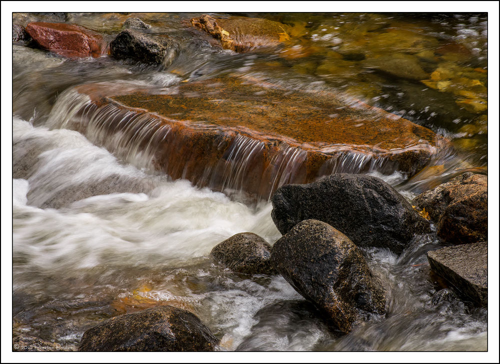
Bridalveil Creek #2
‹ PreviousLandscape GalleryNext ›

Bridalveil Creek #2

by Preston Birdwell

Gallery: LandscapePosted December 2, 2016253 views9 comments
Here is another from Bridalveil Creek. I liked the diagonal cascade and the color variation in the stones.

Nikon D7100
DX Nikkor 18-140mm @ 85mm
1/15 second @f-16, ISO 800
Neat Image NR and TK's Masks

Please see the large version. Thank you!

Your thoughts on this one, as well as your comments on my previous image, are always appreciated. cool
--P

Comments

9 comments
Comment posted by John Tobias on December 2, 2016 at 11:19 PM
I like both of the images of this falls, but this one just appeals to me most.  To me it is a bit more of an intimate scene.  I like the flow of the water.  Thanks for sharing,.
Registered on September 12, 2009, 2120 Posts, 6455 Comments
Comment posted by Lon Overacker on December 3, 2016 at 2:35 PM
Preston,

Another lovely, intimate creek scene. The processing is excellent and I find it interesting how this one favors the warmer side of things and your previous Bridal Veil creek scene was cooler.  Just an observation, nothing wrong or needs correcting in either. :-)

I really like the water cascading over the reddish rock. The little falls almost have a metallic look; and the shutter speeds works nicely allowing the texture in the white water.  Compositionally, this feels a little out of balance with the water flowing out of the frame and squeezed a little on the left, along with some basically empty space in the UR. Having said that, I do like the submerged rock and warm tones in that area too, so it's still important to your comp.

The more I've looked at this, the more I like it.

Lon
Registered on November 24, 2006, 521 Posts, 19147 Comments
Comment posted by Brian Schrayer on December 3, 2016 at 3:50 PM
The first thing that I noticed was the diagonal line not only of the cascade, but also carried into the corners by the way you placed the rocks in the frame. I also like the contrasting textures between the water and the rocks.
Registered on May 28, 2004, 114 Posts, 2890 Comments
Comment posted by Ed Lowe on December 3, 2016 at 4:20 PM
This is a lovely little intimate cascade, Preston. I like your SS choice along with the diagonals you created with your placement of the rocks and the large version shows off all the textures and details rather nicely. This is beautifully done.

Ed
Registered on February 7, 2004, 414 Posts, 7115 Comments
Comment posted by Harley Goldman on December 3, 2016 at 4:23 PM
This is real nice, PB. The front boulders stop my visual flow through just a bit, but not all an image killer. I like the warm tones. No suggestions from me. 
Registered on November 19, 2003, 586 Posts, 11271 Comments
Comment posted by Paul Breitkreuz on December 3, 2016 at 5:52 PM
Preston, really liking the rock colors in this one. I think the cascading water flow look is perfect for my tastes. Nice work there.
I can buy in a bit on Harley's point. But I have a thought that might knock some of that perspective down a little. A crop from the right to almost where the big cascade rock is at. The two rocks in the FG right might have a tiny bit of poking in on the edge that could be cloned or CA'd. Just a thought.......laugh 
Registered on February 25, 2006, 525 Posts, 8448 Comments
Comment posted by Nick Bristol on December 3, 2016 at 7:01 PM
Packed full of wonderful shapes, colors, textures and then add the flow to top it off. The large version of this works very well for me as it is here. This is one of those images that gets better and better as you view it. You get drawn in and then start exploring all the wonderful things within the image. Cool work, Preston!

Nick Bristol
Lone Rock, WI.
Registered on February 1, 2004, 752 Posts, 14140 Comments
Comment posted by scott lanz on December 4, 2016 at 8:08 AM
Well seen and good use of the diagonal cascade, Preston. I like this plus the warm and cool colored rocks. Very nice overall. I do agree with Lon's observation about the balance. This may be mitigated by cropping from the right as suggested by Paul, but I think I prefer this as is.  
Registered on November 14, 2003, 840 Posts, 12902 Comments
Comment posted by Bill Chambers on December 5, 2016 at 9:24 AM
Absolutely beautiful Preston.  The overall flavor of this image is so pleasing.  So crisp and clean.
Registered on April 10, 2005, 753 Posts, 21216 Comments