Nature Photographers Network
This is the preserved archive of the original Nature Photographers Network. The community continues at naturephotographers.network.
Autumn Vibrance
‹ PreviousLandscape GalleryNext ›

Autumn Vibrance

by Brian Schrayer

Gallery: LandscapePosted December 3, 20163,383 views8 comments
Please View Large

Thank you all for your comments on my previous posts.  They have all been very helpful!  crying

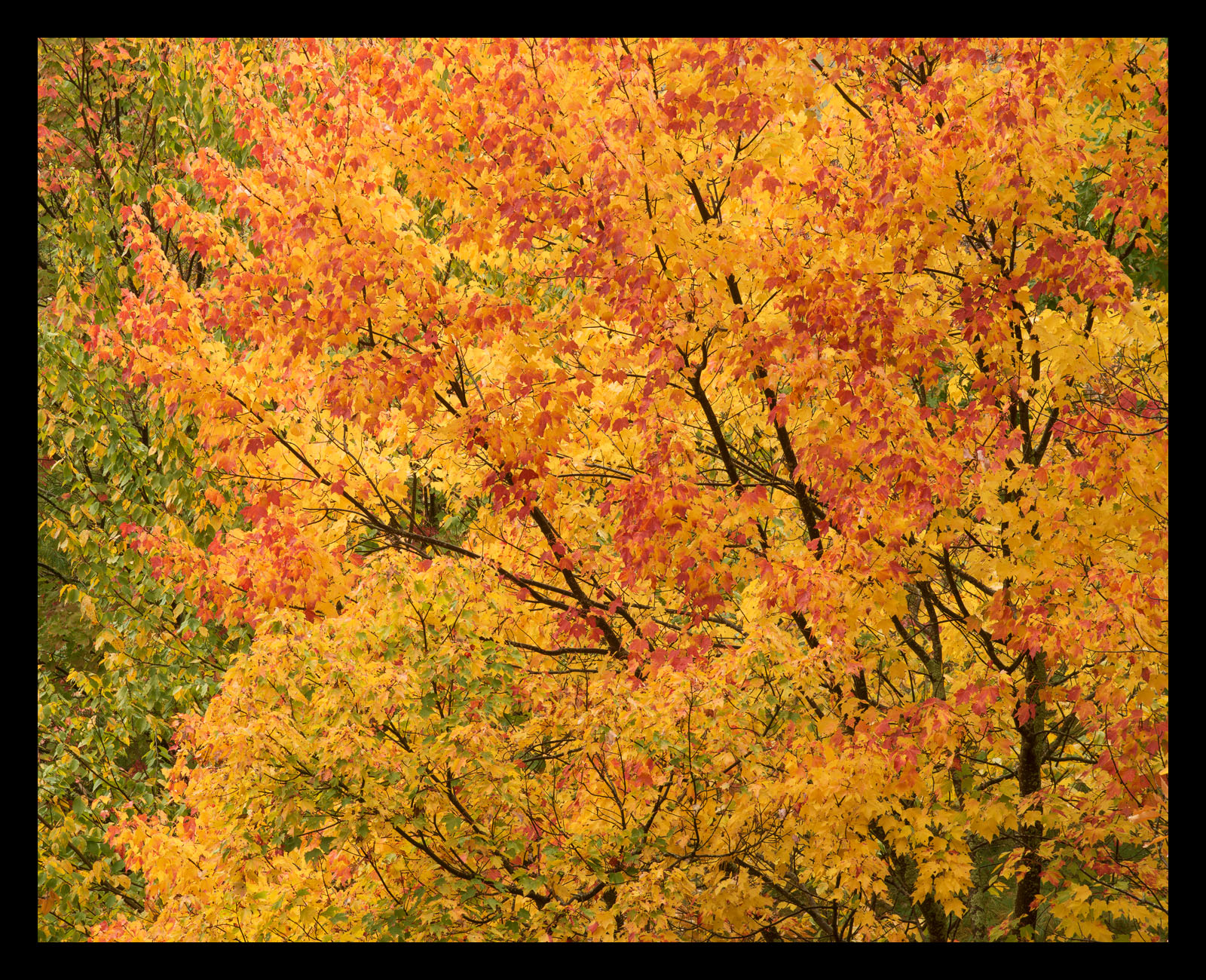
I captured this image off of a road leading outside of Cades Cove in GSMNP last fall.  The color was very intense and was amplified by the diffused light and wet conditions.  This particular maple caught my eye as it contrasted with the green trees beside it.  At the time the intense reds and golds reminded me of flames.  I could not have imagined the devastation that would come just over a year later as fires would spread from the Chimney Tops area of the park and into Gatlinburg last week.

This image has been challenging to process.  It seems like it should be fairly straight forward, but the first time I processed it I pushed the saturation too far.  I later re-processed it and under saturated the image.  After setting it aside for a while I picked it back up last week and I'm hoping that this one is just right.

Capture Info
200 mm
f/16 @ 1/8 sec
ISO 100

Processing Info:
TK's Luminosity masks and focused vibrance masks.
Cropped to 4X5 format to refine the composition and place more emphasis on the red tree.

Comments

8 comments
Comment posted by Paul Breitkreuz on December 4, 2016 at 10:48 AM
Brian, to say this has some "pop" to it would be an understatement. It truly has a WOW factor of intensity here. I can understand your processing challenges too. Compression alone on a detailed scene such as this can make ones eyes get weary.
Only thought for possible change for me is a slight dampening on the yellow. But only slightly IMO. I like the crop idea, seems to fit the scene well.  
Registered on February 25, 2006, 525 Posts, 8448 Comments
Comment posted by Lon Overacker on December 4, 2016 at 1:43 PM
Brian,  This is fabulous!  I love that you've filled the frame with color, yet there is still some structure to hold it all together.  I like the inclusion of still green leaves on the left - they provide some nice framing.  As do the branches on the right.

Although I don't see your "too much" and "not enough" versions, I think you've nailed this, color and saturation.  I often just saturation levels not on the primary color (yellow and red in your case,) but the greens of this image. For me, the greens look perfectly natural, which gives me a hint the saturation level is pretty good, globally.  I have an image of dogwood from the Yosemite trip I may post in coming days that's similar in concept, and I had the same trouble getting the color/sat/exposure levels to be realistic and presentable. We shall see.

Love this, and love that you've filled the frame with autumn color.  Well done.

Lon
Registered on November 24, 2006, 521 Posts, 19147 Comments
Comment posted by Preston Birdwell on December 4, 2016 at 1:43 PM
I agree with Paul about "pop" factor: This certainly has it! The 4x5 crop works well. The saturation looks fine to me and I think you did a fine job with the sharpening.

One suggestion I have is to create a Selective Color layer and add a bit of black to the greens (be sure to 'tick' Absolute)
You could also use a TK mask to brighten the yellows a bit and then reduce their saturation a tad. These a re minor tweaks because the image works fine as it is.
--P
Registered on November 1, 2003, 471 Posts, 5188 Comments
Comment posted by Sairam Sundaresan on December 4, 2016 at 2:27 PM
This is a great catch, Brian. I love the varied coloration on the leaves. I would consider cropping in from the left, as the greens catch and hold my eye. I also would try and get some more color separation between the reds, yellows and oranges. Images like these are never easy to process, but you've done an amazing job here. 
Registered on March 14, 2013, 100 Posts, 643 Comments
Comment posted by Nick Bristol on December 4, 2016 at 2:52 PM
Brian, A frame full of wonderful autumn color. I think the saturation is right on so your extra work paid off here I think. I like this crop and the green leaves on the left work for me. I also like the contrast of the dark branches as they reach out through the frame. Very nice processing on this!

Nick Bristol
Lone Rock, WI.
 
Registered on February 1, 2004, 752 Posts, 14140 Comments
Comment posted by Ed Lowe on December 4, 2016 at 7:11 PM
The saturation in this version looks just fine to me, Brian. I really like the range of colors in the image along with the way you filled the frame with all that eye popping color. Nicely done.

Ed
Registered on February 7, 2004, 414 Posts, 7115 Comments
Comment posted by Ian Wolfenden on December 5, 2016 at 10:46 AM
The saturation works fine for me, Brian, and I love the frame-filling, in your face effect.  A very subjective judgment as to whether it  needs the greenery at the L side - my guess is it works either way but could take the pure warm colouring, with the dark branches giving structure.
 
Registered on May 18, 2007, 1108 Posts, 7647 Comments
Comment posted by Harley Goldman on December 5, 2016 at 5:51 PM
Yeah, this one looks like the ticket (even though we can't compare). Real nice to my eye. It is a great blast of color. 
Registered on November 19, 2003, 586 Posts, 11271 Comments