Nature Photographers Network
This is the preserved archive of the original Nature Photographers Network. The community continues at naturephotographers.network.
Repost + Arrangement of the Gods
‹ PreviousLandscape GalleryNext ›

Repost + Arrangement of the Gods

by Sairam Sundaresan

Gallery: LandscapePosted December 4, 2016109 views12 comments
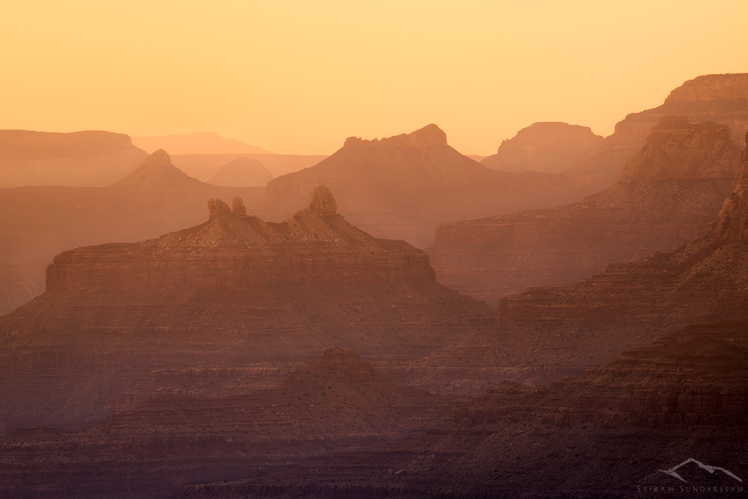
I was backing up my images the other day and found this one hidden amongst the others. While this is nothing groundbreaking, I was pretty fascinated by the receding layers of rock illuminated by the setting sun. The dust and hazy conditions certainly helped with the composition. Appreciate any thoughts you may have on this one. 

Happy Holidays!

Comments

12 comments
Comment posted by Marylynne Diggs on December 4, 2016 at 2:30 PM
I like this Sairam.  It's amazing what we find going back through the "rejects" of an older project. I like the subtlety in this, but I can also imagine it with some creative color temp shifts, a contrast boost, or a black and white conversion.  It's worth playing with, for sure.
ML
Registered on December 14, 2010, 122 Posts, 1034 Comments
Comment posted by Preston Birdwell on December 4, 2016 at 2:45 PM
This is a nice image, Sairam. I love the light and the layers fading away in the distance. You might consider a crop from the top so that the layers are more accentuated.
--P
Registered on November 1, 2003, 471 Posts, 5188 Comments
Comment posted by Lon Overacker on December 4, 2016 at 11:01 PM
Sairam,

Great thing you found this hiding on the old hard drive.  The layers of rock/canyon walls separated by the hazy atmosphere have created that classic look - one that we all hope to capture (I never have.)  Hazy conditions are often not desirable, but are a plus here with the late (early?) light.  

I agree with Marylynne that you've got lots of latitude for experimentation, but as presented I like this quite a lot.  I think the amount of sky is proportional to the other elements - although I suppose you could crop a skosh, or two.  No nits as presented, but as mentioned, you've got room to play with color, contrast, etc.

thanks for sharing.

Lon
Registered on November 24, 2006, 521 Posts, 19147 Comments
Comment posted by scott lanz on December 5, 2016 at 9:43 AM
Very nice image, Sairam. Definately worth processing and keeping. I like this as presented, but could also see a bit more contrast.
Registered on November 14, 2003, 840 Posts, 12902 Comments
Comment posted by Ian Wolfenden on December 5, 2016 at 12:03 PM
I like the somewhat abstract feel of the layered effect, Sairam, and the variation in tones throughout the image.  Glad you have dug it out !!
Registered on May 18, 2007, 1108 Posts, 7647 Comments
Comment posted by Sairam Sundaresan on December 5, 2016 at 12:28 PM
Here's an updated version with more contrast as suggested by a lot of folks. Thoughts?
Registered on March 14, 2013, 100 Posts, 643 Comments
Comment posted by Genny K. on December 5, 2016 at 4:30 PM
I like both versions, but I am leaning towards the original as far as color and saturation. I am on my little Notepad, so I am having a hard time doing a good comparison, but there is something like a "dusty" feel to the first one that feels appropriate, and I like the sublety. I think the 2nd version would be too bright if you printed this big, too. I do agree with cropping it.
Registered on June 5, 2006, 132 Posts, 2001 Comments
Comment posted by Marylynne Diggs on December 5, 2016 at 5:36 PM
I think I like the original better as well, Sairam.  Keep playing though.  it's a wonderful frame for creativity.
ML
Registered on December 14, 2010, 122 Posts, 1034 Comments
Comment posted by Harley Goldman on December 5, 2016 at 5:50 PM
Lovely hazy scene!  I prefer the first, but you might take it just slightly in the direction of the second?
Registered on November 19, 2003, 586 Posts, 11271 Comments
Comment posted by Brian Schrayer on December 5, 2016 at 6:39 PM
I like the layers in the composition.  The hazy conditions and warm light really add to the mood of this image.  I like the added contrast in the repost, but feel like it saturated the color a bit too much.  You might consider changing the blending mode from normal to luminosity so that it doesn't affect the saturation.  Alternatively, you could dial back on the opacity of the adjustment.
Registered on May 28, 2004, 114 Posts, 2890 Comments
Comment posted by Dave Dillemuth on December 5, 2016 at 8:06 PM
This is very beautiful, Sairam. Personally, I prefer the first rendering which is a bit more delicate. I would just suggest cropping a bit off the top to place a bit more weighting on the land.
Registered on December 10, 2015, 104 Posts, 1112 Comments
Comment posted by Harry Lichtman on December 6, 2016 at 11:42 AM
From a compositional standpoint, I wouldn't change anything up. I might try playing with the shadow tones and bringing them into more of the cyan range and see if creates more depth / definition in the image. Nice intimate view,  The canyon can be so overwhelming to photograph unless move in tight like this.
Registered on September 17, 2010, 304 Posts, 3507 Comments