Over the Merced +B&W+RP
by Lon Overacker
Edit: Added reworked image
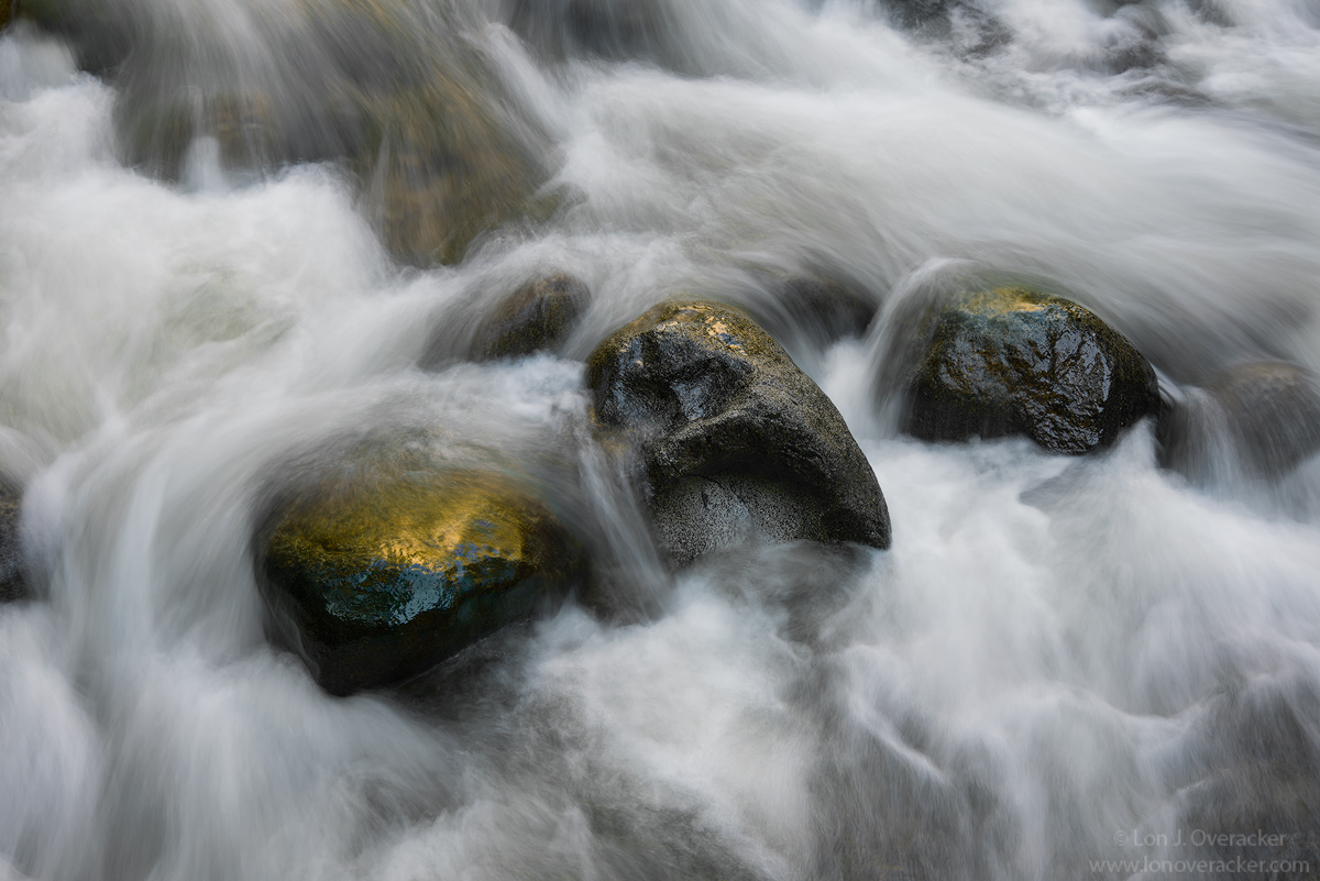
Ran out of text, but wanted to title this, "The Bridge Over the River Merced." Title homage to the great 1957 flick, "The Bridge Over the River Kwai." Over course the image has nothing what so ever to do with the movie.... the only connection I have is that this image was captured from a foot bridge over the Merced in the Happy Isles Nature area. I like to think of this area as the headwaters of the Merced, although technically the Merced river begins many, many miles further back in the Sierra, well above Nevada and Vernal Falls. However, this is where the Merced meets Yosemite Valley proper.
I thought this image would be a good time to express my thoughts on "silky" water, long exposures, etc. I totally understand those who don't care for this treatment of moving water (perhaps more so with ocean wave scenes that get flattened out and become "ghosting" of water.) I get that; it's true, our eyes don't see that. Conversely, it's also true we do not "see" in 1/1000th shutter speed stops. What we see and what our brains see are instantaneous snippets that we view that are essentially instantaneous video. We are unable to produce that in still images. The bottom line is that no matter what we capture with our cameras, whether it's a 30sec ocean wave image, a 1/2 raging river image, or a 1/1000th frozen waterfall image - none of those are reflective of what our brain records. For me, I love all of it. I love the flowing texture in an image like this one, I love the mystical ocean images and I love the heart-stopping frozen action of a mallard landing on a pond. end-o-rant.
For this one, I would love your thoughts, critique and suggestions. I had great difficulty with this one in processing. I wanted to retain/enhance the reflected, golden color on the main rock, but getting that right proved to be difficult. Also, providing a b&w version, which seems to do well with these type images.
thanks in advance for your thoughts!
Lon
Nikon D800E
Tamron 24-135mm
f/16 .5s 200 iso

Comments
15 comments--P
Nick Bristol
Lone Rock, WI.
thanks for the feedback! Agree on the b&w - in this case, the color is much more important element. I guess I could work more on the b&w version. I gotta admit though, I'm not real comfortable with these conversions. I started using Nik's Silver Efex Pro and honestly, one can't learn much just by going through and picking the best template... ;-(
Here's a version with color/sat toned down on the rocks and hopefully have not lost the general color. I hope this works a little better.
Thanks for the comments and observations!
Yeah, so the question sometimes is: do I capture what it looks like, or do I capture what it feels like? This one has the feeling of the rushing water.
Ed
The only thing about the original is I would crop out that rock sticking into the left edge. I want to see more of it, or none at all. This also would crop out that bit of whitewater in the LLC, which distracted me a tiny bit.
I like the BW too, just not as much. On the BW though, I'd recommend a touch more contrast. In addition, I think this would look good with just a dash of coolness added. (I like just a tiny bit of cyan and and blue added.)