Nature Photographers Network
This is the preserved archive of the original Nature Photographers Network. The community continues at naturephotographers.network.
Jefferson Birch - RePost
‹ PreviousLandscape GalleryNext ›

Jefferson Birch - RePost

by Harry Lichtman

Gallery: LandscapePosted December 7, 2016340 views21 comments
Large View Included

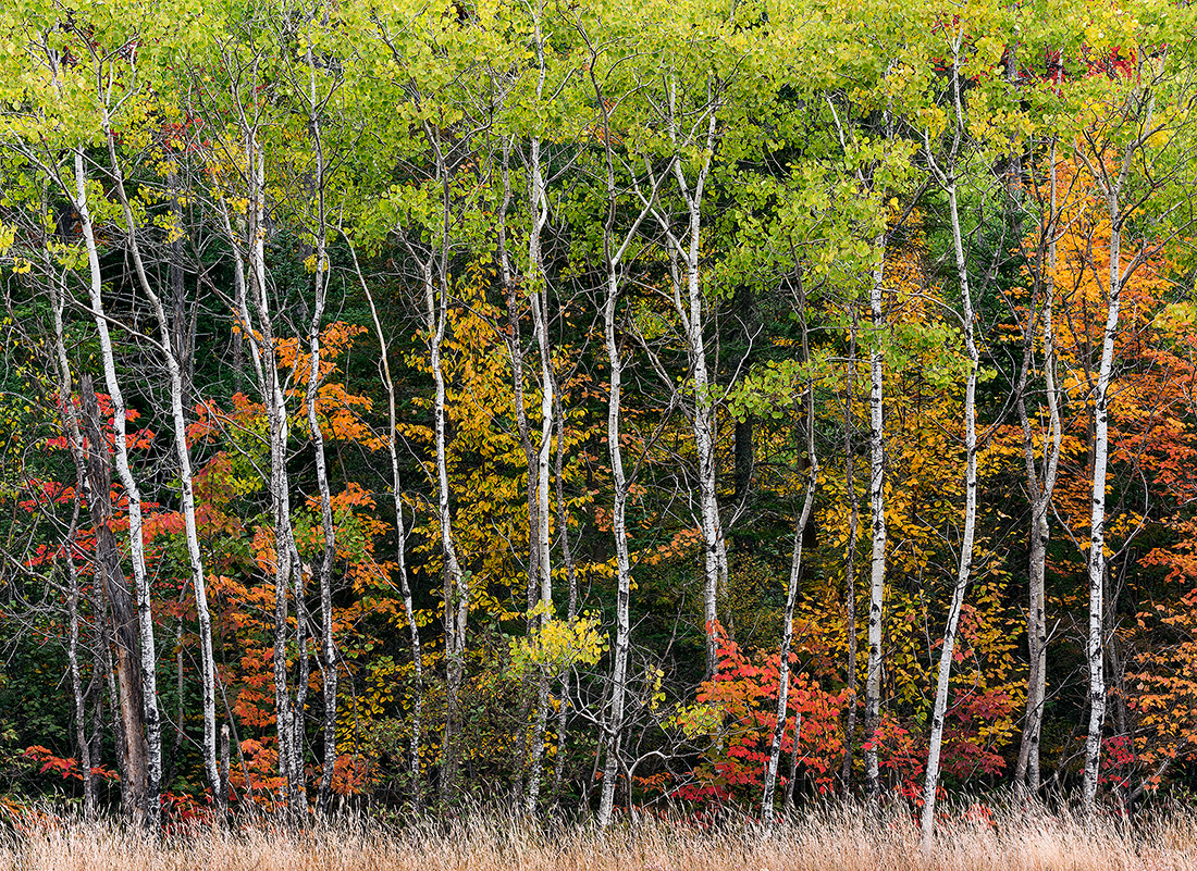
This image came about through a client request which needed to be 30 ft. x 30 ft. at 250 dpi.  Ultimately the image wasn't used as it didn't have an intimate feel one might have if standing within a forest grove, but I figured it might make a nice print for some other application.  It consists of 6 images horizontally by 5 rows in the vertical direction.  Each image was focus stacked at f16 using a 80-400mm lens at 125mm.  The grasses and portions of the trees were a considerable distance apart, so I decided to stack for sharpness throughout.  I shot standing atop my subaru so that I wouldn't be shooting up toward the tree tops, and would be able to include more of the tree tops and lower portions where there was some nice foliage.  Still  conditions and even lighting made the shoot easier than I expected.  Finding the right scene for a large tree image in a square-ish format was the real challenge.

I originally included the grasses to create more useable view in the vertical distance and a base for an image.  Wondering if I should tone them down, or maybe crop them altogether.  Any thought or comments appreciated.

Nikon D810, ISO 64

The web versions seem crunchier than i would have expected, not exactly sure why. Very Minimal web sharpening was applied.

Comments

21 comments
Comment posted by Mark Seaver on December 7, 2016 at 9:20 PM
A lovely collection of colors, Harry and shapes.  I'm thoroughly enjoying the "bars" aspect of the aspen trunks.  I don't think you can crop the grass without having the trees feel cut off, in fact, I'm wondering how a bit more grass at the bottom would look (if you have it).
Registered on January 23, 2011, 1103 Posts, 17270 Comments
Comment posted by scott lanz on December 7, 2016 at 11:10 PM
I like the wide variety of color and the fairly evenly spaced birch tree trunks creating the vertical lines, Harry. I am inclined to go the other way and suggest cropping off the bottom grass totally and going with a more abstract look. I do agree with Mark that if you include the grass, you should have a bit more if available. It's also excellent just as is, IMO
Registered on November 14, 2003, 840 Posts, 12902 Comments
Comment posted by Stephen Stanton on December 8, 2016 at 12:26 AM
I vote for cropping the grass, there is just too  little of it.. I'd rather enjoy the gangly structure of the birches and chaotic colors interspersed...the green canopy plays well with the rest of it., not so much the grass. There is an animated/cartoonish quality  to the image. Very kool photo, Harry. Wonder if as a 30x30 anyone could use it as backdrop  for children's theater performance. 
Registered on March 1, 2015, 54 Posts, 453 Comments
Comment posted by SandyRichardsBrown on December 8, 2016 at 4:58 AM
I'm going back and forth about cropping the grass - literally, I have a black piece of paper I'm holding up over the grass and then removing - again and again.
I think I would remove the grass, and possibly a sliver of the green on top as well.
In any event - terrific image!
Sandy
Registered on November 24, 2003, 3937 Posts, 12909 Comments
Comment posted by Preston Birdwell on December 8, 2016 at 10:33 AM
Harry, put me in the 'crop the grass' camp, too. As was stated, the trees themselves gain an abstract look without the grass. I also like Sandy's suggestion to crop a smidge off the top, too. The colors and the lines of the trunks are the stars, here. Nice effort on the blend!
--P
Registered on November 1, 2003, 471 Posts, 5188 Comments
Comment posted by Dan Kearl on December 8, 2016 at 12:13 PM
I would leave the grass...
It works for me as a FG/base element for the trees.
Registered on September 2, 2013, 209 Posts, 1514 Comments
Comment posted by Dave Dillemuth on December 8, 2016 at 1:12 PM
This is a very nice, well crafted image. The repeating pattern of the white birches set against the colorful foliage is visually very strong. Personally I think the comp. would seem cut-off without the fringe of grass at the bottom. However, I would burn the grass down - the bright section in the lower right is a bit of an eye grabber.
Registered on December 10, 2015, 104 Posts, 1112 Comments
Comment posted by Craig Moreau on December 8, 2016 at 2:26 PM
Harry, this is a great arrangement of trees in various stages of autumn. It's a shame that the image wasn't used, after all the capture and process work involved, but at least you have a great image to show for it! I prefer it with the grass, but a crop is also nice.
Registered on April 21, 2015, 64 Posts, 584 Comments
Comment posted by Harry Lichtman on December 8, 2016 at 2:45 PM
Thanks for all of the input and suggestions.  I suppose I could "create" more grass from the portion that is available, but unfortunately there was no additional grass as the edge of a road is below the grasses.  No wilderness shot here!  Just transports you there.  Fortunately I was just keeping these scenes in mind an not out specifically capture one.  The client did end up using another image of birch trees that was more in line with their vision, but just not interesting enough IMO to post here.  It suited their needs, just didn't have the array of colors and variety of details that this one had.  So, it all worked out.  I pictured this covering a section off hall way in some corporate office spacesadsad
Registered on September 17, 2010, 304 Posts, 3507 Comments
Comment posted by Igor Doncov on December 8, 2016 at 4:27 PM
Have you tried darkening the grass? I did a screen dump just for fun and tried it. To my mind it helped considerably. The grass improves the composition but draws too much attention due to it brightness. I took a bit off the top as well. 
Registered on November 22, 2014, 189 Posts, 2733 Comments
Comment posted by Harry Lichtman on December 8, 2016 at 4:29 PM
Thanks Igor - I burned it down a little but I can go further and see how it looks.
Registered on September 17, 2010, 304 Posts, 3507 Comments
Comment posted by Lon Overacker on December 8, 2016 at 5:02 PM
Harry,

Kudos for pulling this off.  Not only creating something that could go that big, but also recognizing the scene that really fit the bill.  This is a terrific autumn image and would have been awesome with just a single frame (ok, maybe a 2-image focus stack...) ;-)

I'm also torn on the grass, but leaning more to leaving it.  Removing it changes the scene too much.  I just wish there was a skosh more at the bottom. But I like the notion of a foundation for the scene.  Perhaps burning some as you've tried would help too.

I just love the makeup of this scene with the white trunks surrounded by the varying colors and phases of autumn. Great stuff, love it.

Lon
Registered on November 24, 2006, 521 Posts, 19147 Comments
Comment posted by Harley Goldman on December 8, 2016 at 5:07 PM
Beauty Harry. I would leave the grass, but would burn it down a bit. I like the layering it provides. 
Registered on November 19, 2003, 586 Posts, 11271 Comments
Comment posted by David Schoen on December 8, 2016 at 6:09 PM
I looked at this a while before reading the comments and my conclusion was leave the grass, add more of it and make it 1 1/2 stops darker.  I'm glad to see other people agreed with me.  It never occurred to me to completely remove the grass as it seemed an integral part of the layering of the image.  And it also seemed that it was part of your intent.  I suppose you could have also done this with a perspective correcting lens rather than standing on the top of your Subaru.
Registered on November 6, 2006, 1213 Posts, 4587 Comments
Comment posted by Brian Schrayer on December 8, 2016 at 8:11 PM
This is beautiful, Harry!  I like the layers of color and the repeated vertical lines in the composition.  Nicely done!
Registered on May 28, 2004, 114 Posts, 2890 Comments
Comment posted by Harry Lichtman on December 8, 2016 at 9:33 PM
Lon - I did take some  single images as insurance in case my master plan didn't  work . 

David - While standing on top of my car did allow me to shoot the scene with less distortion,  the primary reason was to allow me to photograph low portions of the trees that would have been obscured by the grasses had I shot from ground level. This higher vantage point also allowed less sky, more tree top in the comp. The base of the trees were lower, in a gully compared to the grasses. I will try darkening and adding more grass and repost.

Thanks
Registered on September 17, 2010, 304 Posts, 3507 Comments
Comment posted by Harry Lichtman on December 9, 2016 at 3:02 PM
Here is a version with more grass and darkened. Right Click Image to Enlarge.
Registered on September 17, 2010, 304 Posts, 3507 Comments
Comment posted by Igor Doncov on December 9, 2016 at 3:55 PM
Here's what I was suggesting. Grass darkening was done 'half ass'. Whoops, grass may be too dark. Something between the two. The crop seems to be a good idea.

 
Registered on November 22, 2014, 189 Posts, 2733 Comments
Comment posted by Harry Lichtman on December 9, 2016 at 4:52 PM
Igor - Maybe this is more what you were thinking of.  Instead of darkening the grasses, I reduced the reds and yellows to more cyan.
Registered on September 17, 2010, 304 Posts, 3507 Comments
Comment posted by Tony Kuyper on December 11, 2016 at 7:54 PM
I like the colors and comp just fine.  I agree that this looks a bit crunchy, but I don't think it's a sharpening issue.  It seems more of a contrast issue.  This seems overly contrasty given the even lighting.  If some of the lighter colors were less light, I think this might have a softer, easier-to-view appearance.
Registered on November 1, 2003, 364 Posts, 22328 Comments
Comment posted by Harry Lichtman on December 12, 2016 at 5:55 PM
Thanks Tony for the processing thoughts.  I will try and reprocess with less contrast adn see how it goes.  Thew full size file doesn't seem to have any of the crunchy issues, must be when resized down?
Registered on September 17, 2010, 304 Posts, 3507 Comments