Nature Photographers Network
This is the preserved archive of the original Nature Photographers Network. The community continues at naturephotographers.network.
Golden Tundra
‹ PreviousLandscape GalleryNext ›

Golden Tundra

by Brian Schrayer

Gallery: LandscapePosted December 8, 20163,264 views8 comments
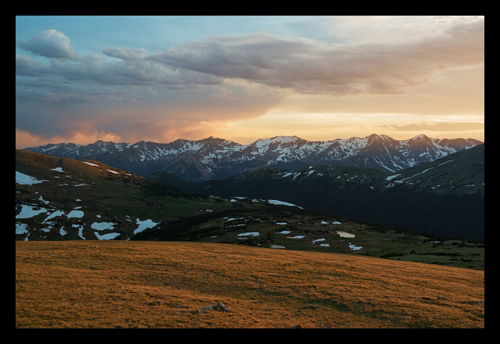
Thank you for commenting on my previous post.  This is taken from the same spot just moments before, but it has a completely different mood with the warm light bathing the tundra.

I agree that the foreground in the previous version that I posted was not very strong.  Unfortunately, while there was previously a trail leading out onto the tundra it has since been closed so getting closer to the foreground was not an option from this location.  It's kind of a bummer because there were some nice tundra wildflowers that would have made the foreground more compelling.  I think the foreground works with this version because of the golden light that is hitting it.

As always all comments and critiques are welcome.

Capture Info:
44 mm
f/11 @ 1/6 sec
ISO 100

Processing:
TK's luminosity masks, focused vibrance masks, cloud sharpening and make it glow

Comments

8 comments
Comment posted by Lon Overacker on December 9, 2016 at 2:07 AM
Brian,

I agree that the foreground works much nicer here with the soft, golden light hitting the foreground.  The snow patches and ponds in the midground aren't as important in this one, which I think helps in the sense that I see three distinct layers here, all playing an equal role to the success of this composition and image.  I liked the sky and colors in your previous image, but I think this one is more balanced.

Both are excellent mountain landscapes.

Lon
Registered on November 24, 2006, 521 Posts, 19147 Comments
Comment posted by Peter Richter on December 9, 2016 at 6:45 AM
Bryan, the repetition of similar lighting in the foreground, midground and sky makes your composition very appealing and interesting to me. Definitely an improvement to my eye.

Peter
Registered on November 10, 2010, 218 Posts, 2723 Comments
Comment posted by Harley Goldman on December 9, 2016 at 8:58 AM
Beautiful! I love the warm foreground and it is a great lead in to a sweet mountain scene. This should make a gorgeous print!
Registered on November 19, 2003, 586 Posts, 11271 Comments
Comment posted by scott lanz on December 9, 2016 at 9:02 AM
Beautiful, Brian. I like the sky/clouds better in the previous version, but I agree that this one would make a better print due to the better light overall, including the added light and color in the foreground, and the sky/clouds in this one are still very nice. 
Registered on November 14, 2003, 840 Posts, 12902 Comments
Comment posted by Harry Lichtman on December 9, 2016 at 9:33 AM
Based upon your description, I would process the FG much brighter to really give the feel that the tundra is bathed in light. Looks too dark to me for that feel.  Maybe brighten the ridge on the far left that looks to be receiving similar lighting.  Great view, lots of drama in the clouds.
Registered on September 17, 2010, 304 Posts, 3507 Comments
Comment posted by Preston Birdwell on December 9, 2016 at 11:49 AM
Bryan, this is really nice. The golden foreground gives this much more depth, and the light is gorgeous. My only minor nit is the cyan cast in the snow on the left side. Well done!
--P
Registered on November 1, 2003, 471 Posts, 5188 Comments
Comment posted by Nick Bristol on December 9, 2016 at 7:04 PM
Brian, This one works much better for me and especially in the foreground which has some very nice light. That light really helps draw one into the scene and for me that makes it feel much more inviting. 

Nick Bristol
Lone Rock, WI.
Registered on February 1, 2004, 752 Posts, 14140 Comments
Comment posted by Igor Doncov on December 9, 2016 at 9:31 PM
What impresses me most in this image are the clouds. They actually look like clouds. Most processed images end up with clouds that are too contrasty, the under side of the clouds too dark. But these have the airiness of real clouds.

For me, the third layer, the wooded mountain, is too dark and indistinct. That's a sizeable amount of space given to a shape that's almost black and lacking information. Somehow it needs more texture IMO. I think the image holds up well overall. Nice job.
Registered on November 22, 2014, 189 Posts, 2733 Comments