Nature Photographers Network
This is the preserved archive of the original Nature Photographers Network. The community continues at naturephotographers.network.
2 + reposts and some thoughts
‹ PreviousLandscape GalleryNext ›

2 + reposts and some thoughts

by Ryan Shain

Gallery: LandscapePosted January 25, 2017273 views17 comments
Please see larger image

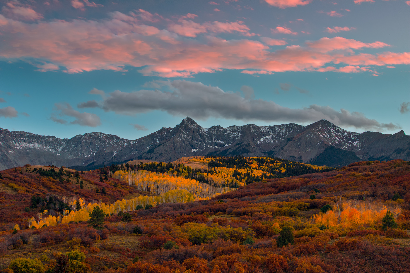
This image was captured outside of Telluride, Colorado on a cool Autumn evening. I had the pleasure of enjoying some amazing Autumn color along with some sweet clouds up top, and I also enjoyed a nice conversation with a fellow photographer. This is image is from a famous location called the Dallas Divide, and I have not seen many images of this area here on NPN, but wow Telluride, Colorado is a photographers dream com true. It is one of those places on earth that must have been created with pure beauty in mind. However it can also be darn right treacherous art times as well. I love how the beauty and dangerous thing can go hand in hand at times in the journey through life.

Canon 70d, 24-105,  3 and 2 stop soft gnd filter,tripod, wireless shutter remote, ans processing in Adobe CC PHOTOSHOP AND LIGHTROOM

What do y'all think? Any thoughts are very much appreciated.

Comments

17 comments
Comment posted by Brian Schrayer on January 25, 2017 at 10:21 PM
I love me some CO as well, and especially Dallas Divide.  I would like to make it back out there this coming fall.  You had some beautiful light and color and the centered comp works here as it strikes a nice balance between the two primary areas of interest, namely the golden aspen and the pink clouds.
Registered on May 28, 2004, 114 Posts, 2890 Comments
Comment posted by Mattia Oliviero on January 26, 2017 at 5:17 AM
The colors are simply gorgeous, Ryan. In particular, I like the depth of your image given by the trees.

Mattia
Registered on August 24, 2016, 43 Posts, 254 Comments
Comment posted by Harley Goldman on January 26, 2017 at 12:11 PM
Real nice scene, but looks way over-saturated for my tastes. 
Registered on November 19, 2003, 586 Posts, 11271 Comments
Comment posted by Julia Flanagan on January 26, 2017 at 1:35 PM
Well composed Ryan.  The clouds really add.  I like the line of aspens running up the low line of the valley leading to the grove of aspens, and the repetitive colors from the aspens at the lower right.  I do agree with Harley that this is saturated beyond anything I would ever expect to see should I visit the site and I think you would lose nothing by scaling it back.
Registered on November 13, 2003, 59 Posts, 986 Comments
Comment posted by Ryan Shain on January 26, 2017 at 2:04 PM
Here is an image a bit less saturated, thanks for the thoughts. It was hard for me not to push this one a bit as it was one of the most beautiful view's I have seen.
 
Registered on February 20, 2007, 226 Posts, 4571 Comments
Comment posted by Dave Dillemuth on January 26, 2017 at 2:07 PM
Wow, gorgeous, Ryan. Well balanced composition. Looks like your timing was perfect to catch peak foliage colors. I love the warm saturated colors but I might reduce the blue a tad. Of course this is personal taste.
Registered on December 10, 2015, 104 Posts, 1112 Comments
Comment posted by Igor Doncov on January 26, 2017 at 3:08 PM
The repost is better IMO. The blue in the sky is still a bit unrealistic. The other issue is that the bottom lit clouds indicate sunrise or sunset yet the land is much too bright for that time of day. To me this gives this image an unrealistic look. It's all shot in shadow yet has these bright richly saturated colors. I think you should shoot what the light gives you rather than add it in postprocessing. Just my opinion.
Registered on November 22, 2014, 189 Posts, 2733 Comments
Comment posted by Mark Seaver on January 26, 2017 at 3:48 PM
This is great, a fine mountain scene Ryan with the scattered sunlight on the fall Aspens and the fine pink glow of the clouds.  I too think the original post looks oversaturated, while the repost looks much more natural.
Registered on January 23, 2011, 1103 Posts, 17270 Comments
Comment posted by Richard Teller on January 26, 2017 at 4:00 PM
Great composition and beautiful colors. I agree the second image looks much better. 
Registered on August 23, 2010, 1162 Posts, 6692 Comments
Comment posted by Ryan Shain on January 26, 2017 at 8:43 PM
I would really like to show everyone where I stated from in my raw file and processing of this image. The image below is very raw in my opinion, and it looks nothing like the colors I saw on this night. It is very washed out and blah imho. I just wanted to show y'all where i started from.

Igor, The overall scene was pretty bright and I try to stay true to my vision, and thank you for your thoughts on my work. Your input always challenges me to go back and really evaluate my work flow, it is a good thing.
Registered on February 20, 2007, 226 Posts, 4571 Comments
Comment posted by Keith Bauer on January 27, 2017 at 10:13 AM
Hi Ryan:

I think this is very nice.  Yes, a touch oversaturated in the original post, but I know what it looks like there (I grew up in Southwest Colorado).  Your colors are probably pretty true to the real scene.  It can be a magical place.  I might work the foreground tones a bit to bring out more light in the darker tones without disturbing the rest.  I saw your screen capture of the original and think you've done a nice job working the image.
Registered on November 20, 2003, 458 Posts, 4836 Comments
Comment posted by Igor Doncov on January 27, 2017 at 5:49 PM
I guess I'm more conservative, less aggressive, in the post processing. I've been searching the internet and am more drawn to these types of photographers. This is the sort of thing I go for:

https://www.flickr.com/photos/77468056@N07/30741096913/in/photostream/lightbox/


I've taken the liberty to work on a screen shot of your image a bit. I probably should add some of the pink back to the clouds but I didn't want to spend too much time. 

I guess it's a question of preference.
Registered on November 22, 2014, 189 Posts, 2733 Comments
Comment posted by Igor Doncov on January 27, 2017 at 5:57 PM
This may be my favorite Marc Elliott image that shows the restraint of color.

https://www.flickr.com/photos/77468056@N07/29340741995/in/photostream/lightbox/
Registered on November 22, 2014, 189 Posts, 2733 Comments
Comment posted by Brian Schrayer on January 27, 2017 at 7:29 PM
I think that the repost looks good.  Based on what I remember, the color in the repost is certainly believable.  I strive for a naturally vibrant look when processing my images, and if this were mine I would certainly be comfortable with the saturation level in the repost.

In a good year the color at this location in the willows is a vibrant reddish - orange and the aspen are also quite vibrant tending more toward orange than gold.  I have been there a few times in the fall - the best I have seen was in 2011 when those willows were especially vibrant.  The color was also very impressive this year as well based on photos that I have seen.  
Registered on May 28, 2004, 114 Posts, 2890 Comments
Comment posted by Ryan Shain on January 27, 2017 at 8:55 PM
A big Thank you to everyone who has left some thoughts for me on this image.


Keith and Brian,

Yeah the colors were awesome this year, and the underbrush was as vibrant as ever. I appreciate the thoughts as it helps to have been to this area and to have experienced the magic of the color in this amazing location of the world.

Igor,

I hope one day you venture over towards Colorado and this area. It is really something else towards the end of September. I have not seen such vibrant colors in my life in the Mountains. Also, it seems to be my experience that our experiences in life are created in part by our own unique self. I mean that maybe you and I perceive the world of color in slightly different ways. I have met and talked with Many of photographers, and most of the time the personality of the person tends to come out in the photography.

Do you feel this is at all on point? I love the links you posted of the photographer Marc Elliot. He is so very talented, and I think his work is on point and so very beautiful.

I may start to paint as well, and  have been enjoying Bob Ross's work very much lately, and I love his style.

The image you re-worked would be more accurate if the underbrush was in post fall, those colors were sick this year Igor!!!

Take care, and I will be posting more soon.
Registered on February 20, 2007, 226 Posts, 4571 Comments
Comment posted by Doug Koepsel on January 28, 2017 at 10:06 AM
Ryan, It looks like you caught the peak of the aspen and oak colors together.  It was real nice this year before the wind came.  Preference goes to the saturation of your repost.  You might try selecting the land and adding a few points of brightness as a suggestion.
Registered on April 1, 2010, 196 Posts, 1592 Comments
Comment posted by Lon Overacker on January 29, 2017 at 1:21 PM
Ryan,

A little late to the party, but just had to chime in and tell you this is gorgeous.  It's not very often that the sky and clouds will trump (sorry) the landscape, especially in CO in the fall.  But I think the color in the sky is wonderful and combining with the autumn yellows, oranges and reds, make for one awesome landscape.

For me, I think the first repost is a little more realistic. But honestly, the original wasn't all that agressive, except maybe the yellows in the trees central to the image. the pinks in the clouds I think are very realistic.

The large view is just awesome.

Lon
Registered on November 24, 2006, 521 Posts, 19147 Comments