Nature Photographers Network
This is the preserved archive of the original Nature Photographers Network. The community continues at naturephotographers.network.
Striding
‹ PreviousLandscape GalleryNext ›

Striding

by Mark Seaver

Gallery: LandscapePosted February 22, 2017484 views18 comments
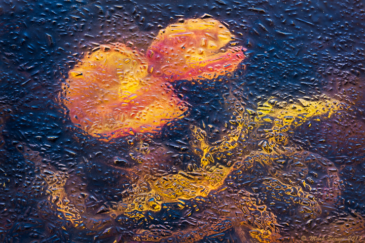
or for those who remember the 60's..."Truckin".

Another iced over pond view, taken a couple of days after my previous post.  These are the same lily pads, just having grown slightly and from a different angle.  In this case, I didn't get the top completely sharp (needed a couple more shots in this 6 shot stack), but I'm thinking that it still works reasonably well because it's an abstract.  This version had the polarizer rotated to let most (but not all) of the sky reflected off the ice come through.  The next view is with the polarizer rotated to minimize reflections.  (5D3, 70-200 f2.8 @ 160mm, f/13, 1/15s, iso 200, tripod and polarizer)

larger view posted below...

Comments

18 comments
Comment posted by Mark Seaver on February 22, 2017 at 8:37 AM
Here's the reflections minimized using the polarizer version.
Registered on January 23, 2011, 1103 Posts, 17270 Comments
Comment posted by Navin Sarma on February 22, 2017 at 9:56 AM
Ice... hmm I can't recall when we would have had this! Love the texture and color Mark. I prefer V1 with the contrast of the blue reflections and the orange leaf
Registered on July 17, 2011, 233 Posts, 1373 Comments
Comment posted by Lon Overacker on February 22, 2017 at 12:01 PM
Mark,

What's with all these alien ice formations lately?  These, and this one are awesome.  Aliens riding scooters, who woulda though?  sad

Both versions are wonderful.  I wish they could somehow be combined.  Like Navin, I kinda like the contrasting blues in the original, but then I like the non-glare of the polarize in the second.  Either way, these are both fascinating.  Actually kinda leaning towards the 2nd version; although after seeing the larger view, I might be inclined to clone out the blue bubble on the right of the smaller alien's head. but that's minor.

I hope you have more!  Love 'em.

Lon
Registered on November 24, 2006, 521 Posts, 19147 Comments
Comment posted by Paul Breitkreuz on February 22, 2017 at 12:49 PM
Mark, another addition to this fine series. Should make a neat mini-gallery collection with them all together. I think I like the brighter look here over the other post(s), but that is not a nit, just a preference of the look......laugh
 
Registered on February 25, 2006, 525 Posts, 8448 Comments
Comment posted by gary phillips on February 22, 2017 at 1:42 PM
Fascinating Mark.  I am thoroughly enjoying your ice and what's below them images.  I prefer the original, because of the color combo.  There are a couple of spots on the heads of these critters that I would clone. One on each head that sort of grab my attention.  Other than that, another masterful ice stack.
Registered on October 24, 2013, 185 Posts, 4136 Comments
Comment posted by Sairam Sundaresan on February 22, 2017 at 2:47 PM
Wow this looks like a painting on glass. Such a fresh comp, Mark. Really like it a lot!
Registered on March 14, 2013, 100 Posts, 643 Comments
Comment posted by Nick Bristol on February 22, 2017 at 2:58 PM
Mark, These are very cool looking. Both are really nice but I'm leaning towards the second version as my favorite. Nice stuff!!

Nick Bristol
Lone Rock, WI.
Registered on February 1, 2004, 752 Posts, 14140 Comments
Comment posted by Bill Leggett on February 22, 2017 at 2:58 PM
Mark, this is another excellent addition to your gallery.  Interesting that the plants continue clinging to life in frigid conditions.  As an impressionistic abstract the softer upper portion isn't a factor for me.  I tend to agree with Navin and Lon that the cooler blue combined with a bit less glare would provide a nice presentation.  This illustrates that paint and canvas aren't necessary when you have natural occurrences like this.
Registered on July 21, 2004, 706 Posts, 3233 Comments
Comment posted by Mark Seaver on February 22, 2017 at 3:27 PM
Here's the "larger view" of the original post.  Seems like somebody (and we won't mention the initials MS) posted the 720 px version twice.  Aaarrrggghhhh!
Registered on January 23, 2011, 1103 Posts, 17270 Comments
Comment posted by Harley Goldman on February 22, 2017 at 3:57 PM
Tough call between the two, as I really like both. So different!  Excellent abstract, both.  Fine pond work. 
Registered on November 19, 2003, 586 Posts, 11271 Comments
Comment posted by scott lanz on February 22, 2017 at 5:13 PM
Another fine take, Mark. I prefer the the max PL version of this comp, but I prefer the previous comp, by a little.    
Registered on November 14, 2003, 840 Posts, 12902 Comments
Comment posted by Preston Birdwell on February 22, 2017 at 5:47 PM
Another cool abstract, Mark. The textures and color are very interesting. It always amazes me that we can find nice images in our own back yards.
--P
Registered on November 1, 2003, 471 Posts, 5188 Comments
Comment posted by Bill Fach on February 24, 2017 at 9:18 AM
Mark: Since my opportunities to shoot ice come around here once every five or six years I especially appreciate and envy your opportunities. I do like the blue highlights in the original and how well they look in the larger version. Good vision and good photography.>=))>
Registered on November 1, 2003, 1805 Posts, 26981 Comments
Comment posted by Alberto Patiño on February 24, 2017 at 11:58 PM
The first version for me, with all the reflections - no doubt!
Registered on December 2, 2014, 278 Posts, 1736 Comments
Comment posted by Harry Lichtman on February 25, 2017 at 9:39 AM
You've had some great images out of those ponds in your backyard. I still remember the raindrop image.  The reflected sky improves the image for me - I like the blue with the yellows. Wonderful abstract.
Registered on September 17, 2010, 304 Posts, 3507 Comments
Comment posted by Brian Schrayer on February 25, 2017 at 4:05 PM
These are fascinating abstracts, Mark.  My preference is for the version with the reflected light which not only adds interesting color contrast, but enhances the texture in the ice.  I think that I prefer Bespectacled, but these are both excellent abstracts!devil
Registered on May 28, 2004, 114 Posts, 2890 Comments
Comment posted by Ryan Shain on February 25, 2017 at 6:23 PM
Hi Mark,

Definitely version 1 with the cool blue and warm color combination. The textures and overall warm color really make this image standout. It is one of those images that just fascinate me to what is possible, an dit is so close to home. :)

Beautiful work
Registered on February 20, 2007, 226 Posts, 4571 Comments
Comment posted by Steve Gettle on February 28, 2017 at 3:43 PM
Very cool idea, well seen and well executed! 
Registered on November 29, 2016, 36 Posts, 111 Comments