Gallery: LandscapePosted February 22, 2017139 views9 comments
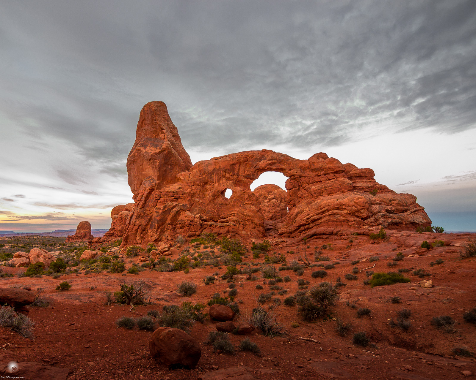
From March of 2014 (cleaning up the hard drive). The colors are a bit strong.
Zuiko Digital 7-14mm, Olympus E-5
Comments
9 comments
Comment posted by Mark Seaver on February 22, 2017 at 8:41 AM
The colors look about right to me, Alberto. Most of the formations in Archers are very red. I like the sense of motion from the cloudy sky. I do think that cropping to let the arches occupy more of the frame would be good.
Registered on January 23, 2011, 1103 Posts, 17270 Comments
Comment posted by Lon Overacker on February 22, 2017 at 11:56 AM
Alberto,
Agree with Mark. The colors don't look to strong at all. I also agree that cropping from the bottom might give the formation more attention. As presented I think the foreground/land competes too much with the rest of the scene, including the sky/clouds.
Lon
Registered on November 24, 2006, 521 Posts, 19147 Comments
Comment posted by gary phillips on February 22, 2017 at 1:33 PM
The colors don't look too strong at all to me, Alberto. My first thought was a little less foreground would help to isolate the arch. I see that Mark and Lon have the same idea. I think because the fore is in shadow, it really tries to dominate an otherwise very nice image.
Registered on October 24, 2013, 185 Posts, 4136 Comments
Comment posted by Harley Goldman on February 22, 2017 at 3:59 PM
The colors look good to me and so does the image. I might do a gradient mask and brighten the foreground a bit, but I like it as composed (no crop). Real nice take on a classic spot.
Registered on November 19, 2003, 586 Posts, 11271 Comments
Comment posted by Alberto Patiño on February 22, 2017 at 6:04 PM
Thank you guys! I tend to agree with Harley - I like the boulder in the foreground. More light is in order, though.
Registered on December 2, 2014, 278 Posts, 1736 Comments
Comment posted by Preston Birdwell on February 22, 2017 at 6:17 PM
The color looks fine to me, and the overall processing looks very nice. I am on the fence with a crop of the foreground. On the one hand, I like the balance as it is. Secondly, a crop would enhance the looming formation.
--P
Registered on November 1, 2003, 471 Posts, 5188 Comments
Comment posted by Marylynne Diggs on February 22, 2017 at 9:48 PM
Very nice, Alberto. I love the arch and the processing. In my mind, the sky is just not dramatic enough, and it detracts from the rest. Not sure there is anything to be done about that. Perhaps doing some creative color toning of the sky would make it pop.
ML
Registered on December 14, 2010, 122 Posts, 1034 Comments
Comment posted by Ryan Shain on February 23, 2017 at 9:07 PM
Hi Alberto,
I like what you have done in the repost to bring up the darks in the foreground. I think the balance feels right to me in the fg, and I have experimented with crops, and feel the one you have presented works best for me. Colors seems fine to me, not strong at all.
I think it is a very nice representation of this area, nice work
Registered on February 20, 2007, 226 Posts, 4571 Comments
Comment posted by Igor Doncov on February 23, 2017 at 10:18 PM
What strikes me about this image is that it's half in color and half in b&w. Perhaps that's why the thought comes to desaturate the colored portion? I think the sky could use just a bit of color to make this stronger. The sky in the holes in the rocks looks clipped to me. I do like the repost slightly more than the original. I do find the rocks intriguing.
Registered on November 22, 2014, 189 Posts, 2733 Comments

Comments
9 commentsAgree with Mark. The colors don't look to strong at all. I also agree that cropping from the bottom might give the formation more attention. As presented I think the foreground/land competes too much with the rest of the scene, including the sky/clouds.
Lon
--P
ML
I like what you have done in the repost to bring up the darks in the foreground. I think the balance feels right to me in the fg, and I have experimented with crops, and feel the one you have presented works best for me. Colors seems fine to me, not strong at all.
I think it is a very nice representation of this area, nice work