OMG, more than 30 consecutive posts from Yosemite Valley.... does this guy go anywhere else?

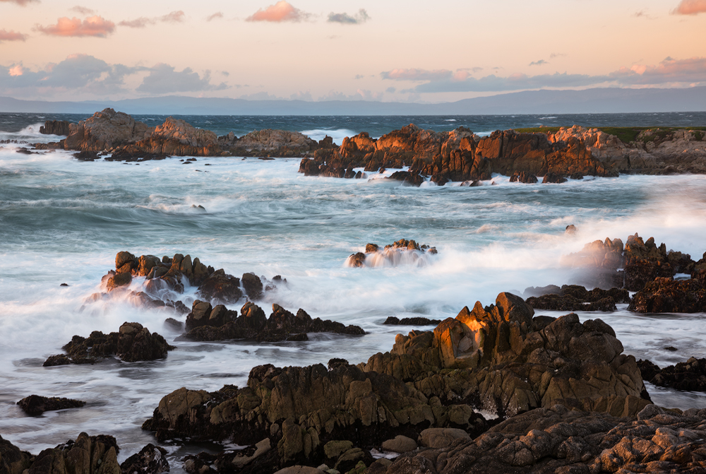
Well, my wife and I took advantage of the small break in all the California storms and rain and spent the night in Pacific Grove. Weather was clear, but it was crisp and WINDY! It was so windy I had no business attempting to photograph, even with a tripod. I think gusts were at or near 30mph; I put myself between the wind and the trip and tried to put my weight on the tripod, but at 1/2 sec and longer exposures, the wind gusts.... well, needless to say all the images are quite soft. ;-) Only super PS processing and small web presentation allow me to even show this. So yes, this is not a tack sharp image.
So I just wanted to take a break from the Yosemite images and that I'm not adverse to taking landscape images that include sky and clouds!
I suppose I could have jacked up the iso, opened up and shot with a much higher shutter speed, but I was specifically looking for the effect in the water from the somewhat slower shutter speed. Trade offs, now I don't have a sharp image. taken at iso 50, f/22 at .8sec
Just because I'm not going to post this one in it's own thread, I'm posting the same scene (tighter zoom) captured exactly 20min later, f/22 @5sec. I also took liberties in processing and might even be considered PA. I boosted the colors a bit using a LAB color processed layer, then laid a b&w layer on top, and painted back in some hints of color in the water and rocks. I kinda like the results and would love to hear your responses.
Thank you for your continued comments and responses to my posts.
Lon

Comments
11 commentsI like the light and wave action in the OP, and there is enough color in the sky to make make the overall comp work nicely. Overall, a very beautiful and well composed/executed seascape. Really sharpness, the foreground rocks look nice and sharp, but I agree with you about the distant rocks. Kind of odd that the far rocks don't look as sharp.
Re the tighter comp, I like the color and effect of the slow ss giving this an ethereal quality. I like the tighter comp except that I am a bit bothered by the cut-off rocks in the upper left. Althoguh I like the rocks and water action in the upper right, I think I prefer the image overall with the top cropped to just below the upper rocks.
Although I like both images I prefer the 2nd one because it leaves more for the imagination. With that in mind I think the composition would be stronger with more 'reality' cropped out so that the 'fantasy' plays a more prominent role. That would require quite a bit of removal so I don't know how you would feel about that. The ideal composition would contain all the 'misty' rocks in the water and the sharp dark rocks directly in front of the large 'misty' rock. Some of the fg would use up the lrc.
I think this is an idea with a lot of potential that needs to be worked over and experimented with. To be honest I've never really liked these misty shoreline subjects, but you've shown that when all the elements come together optimally they can be made to look really good.
Nick Bristol
Lone Rock, WI.
I like the re-post, too for its attention to the details. I would like to see a bit more of the rocks at the top. I like the wave mist in both images, and the drama is very evident.
--P