Misty Pine Forest + final
by Nick Bristol
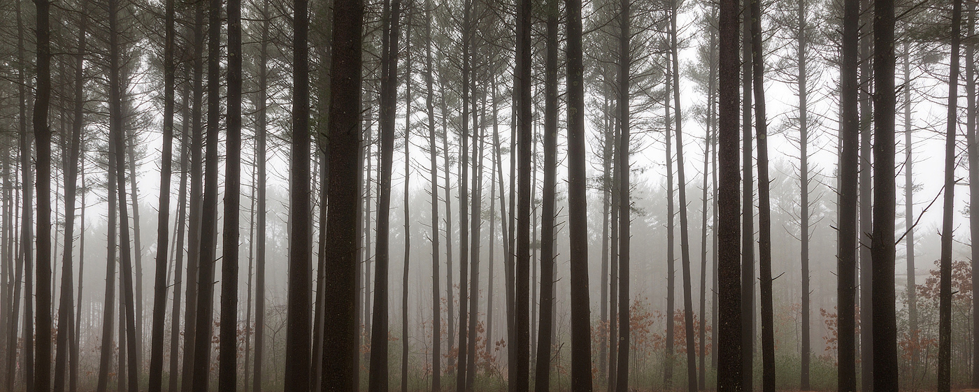
A picture I made in the pine forest near my home this past week. It was a rainy, misty and foggy morning and I love those conditions for shooting in the pine forest. Thanks for looking and any thoughts.
Have another one I like too but going with this pano shot first.
Canon 5D3, 16-35 F/4 L, ISO 100, F/20, 0.3 sec. Larger version for much better view.

Comments
18 comments--P
Ed
Ed, Thanks, I planned on doing that and just forgot!
I would want to see the bottom of the image - the tree roots. Kind of feel it's a cropped version, isn't it?
Bo, Thanks! I did shoot this with some ground below the trees and do have one I kind of liked that way (below) but this is what I really wanted and cropped some off to get where I wanted to be with it. Nick
I see where you're going with the crop and I think it works beautifully. Having seen your original now, I think that works on it's on as well - quite beautifully as well.
As with most all of your posted images, I can't offer any critical comments - only teeny little suggestions. If it were mine, I might complete the bottom crop by coming up just a tad more to completely remove any reference to the ground. There's a tiny bit on the lower right. Also, consider cropping in from the right just past the two trees, but not quite all the way to the third, and clone out the remaining horizontal branch. Again, very, very minor, a tweak.. but the open space on the right has more vertical bright area than the rest of the scene. Again, we're talking real tiny nitpickin'....
Wonderful work Nick!
Lon
Here is the final version with the bit of ground removed, the one branch removed and cropping a little of the right side off. I like it and think it will make a very nice print. I'm going to print the canvas one first as I do that here and see how I like it. I like the looks of mounted canvas (on gator board) and then a frame around it, of course no mats or glass. Getting away from the gallery wraps for awhile because the framed canvas seems to sell better for me and I prefer the look...at least for now. May have a metal print done later as they do look pretty awesome with certain images. Thanks for all the help. Nick
Had to come back and say that I think you've nailed it with the final rework. One thing to point out that is much more prevalent now, is the line of brightness, the high-key line that goes from left to right... is much more defined and accentuated and I think has elevated this even more.
Can't speak to my experience on canvas prints, but I'm guessing this one will look great no matter what medium you print it on.
Peter