Gallery: LandscapePosted March 7, 2017260 views20 comments
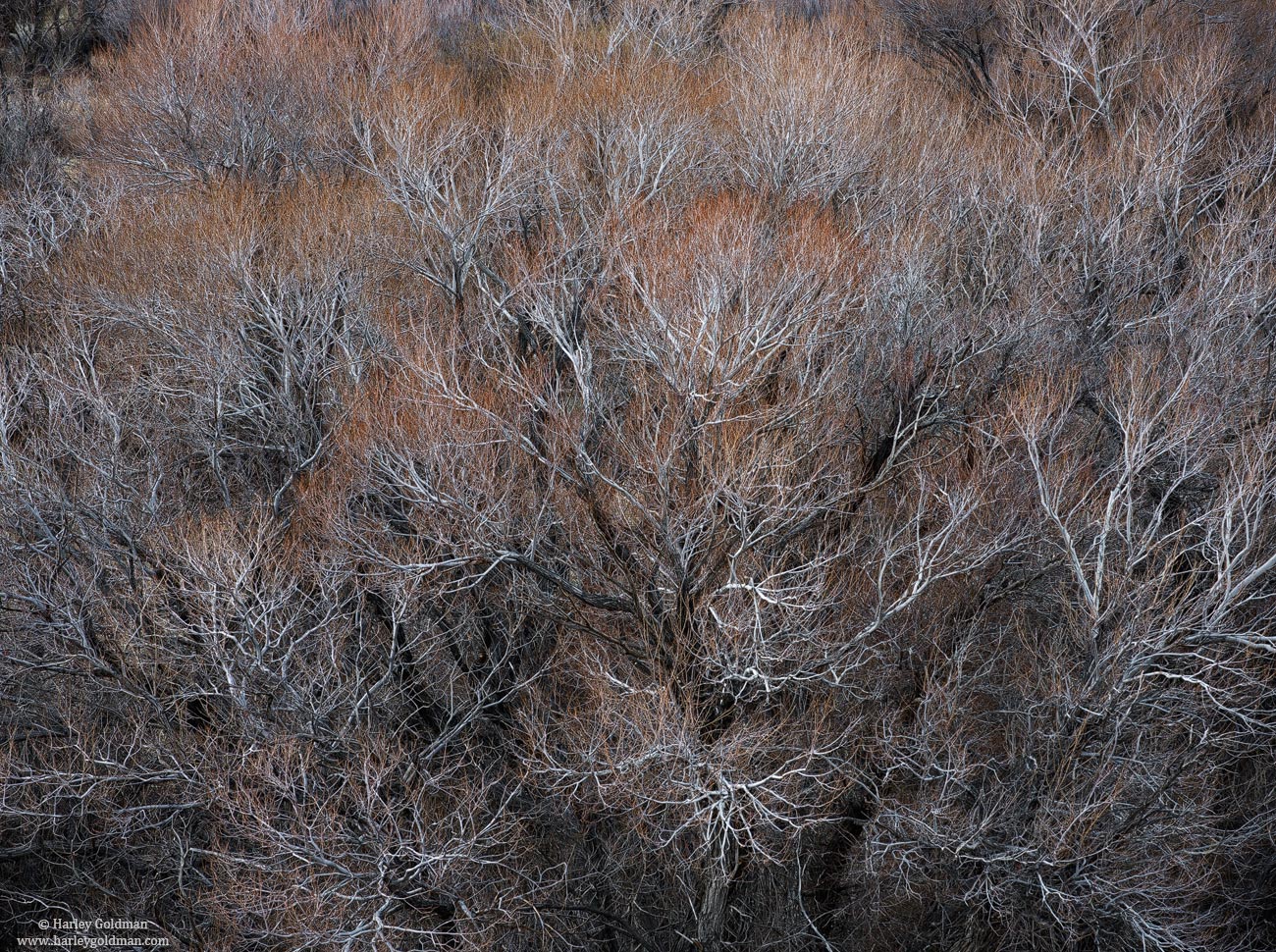
Dave Dillemuth and I did some wandering around the Owens Valley last week. I got fascinated by this tree and made a couple of images of it.
The large view makes a difference with this one.
D810, 70-200mm
Comments
20 comments
Comment posted by Mattia Oliviero on March 7, 2017 at 8:56 AM
Like a lot this branches' twist. In the larger version the mix of white, orange, and brown is really gorgeous.Very well composed and seen.
Mattia
Registered on August 24, 2016, 43 Posts, 254 Comments
Comment posted by Preston Birdwell on March 7, 2017 at 10:54 AM
This looks real nice, Mr. H.. I really like all the twisty-curvy branches and the soft reds. The light-toned branches really pop in the large version. No nits, here.
Given our e-mail discussion, I think this is the type of image where a focus stack would work nicely--as long as there was no wind.
I am looking forward to seeing more from your recent East Side trip.
--P
Registered on November 1, 2003, 471 Posts, 5188 Comments
Comment posted by gary phillips on March 7, 2017 at 1:08 PM
Really enjoying this Harley. This tree must have been at the junction of busy and chaotic. Love that you made sense of it. My only suggestion would be to fill in the very top left corner with a bit of cloning. Nicely seen.
Registered on October 24, 2013, 185 Posts, 4136 Comments
Comment posted by Bill Chambers on March 7, 2017 at 3:38 PM
WOW!! I love this Harley. Great symmetry and detail. I really love the combination of colors (Silver & Gold, kinda). Superb capture and processing, along with an excellent eye to see this.
Registered on April 10, 2005, 753 Posts, 21216 Comments
Comment posted by Nick Bristol on March 7, 2017 at 5:37 PM
What a cool shot this is and a great job setting up this comp, Harley. The large version just looks wonderful with all the fine branches and fantastic colors. Excellent work on this!
Nick Bristol
Lone Rock, WI.
Registered on February 1, 2004, 752 Posts, 14140 Comments
Comment posted by Igor Doncov on March 7, 2017 at 7:50 PM
This is my kind of image. Wonderful work, Harley. Those branches are very expressive and the browns form nice arcs above them. The weakest part of the image in the upper left corner (the urc is perfect). I think the image can be slightly improved by cropping out the left to just cover the dark area. What do you think? This probably looks good in b&w as well.
Registered on November 22, 2014, 189 Posts, 2733 Comments
Comment posted by John Williams on March 7, 2017 at 9:02 PM
An image that gets so much better as it gets larger. Unimpressive at thumbnail size, but wonderful as it opens. I like Igor's crop idea.
Registered on September 6, 2007, 221 Posts, 5985 Comments
Comment posted by Dave Dillemuth on March 7, 2017 at 9:30 PM
Nice one, Harley. I know you were working these trees hard but somehow I missed this comp. The graceful white branches contrasted against the rust tones are just beautiful. I would agree on cropping to eliminate the ULC.
Registered on December 10, 2015, 104 Posts, 1112 Comments
Comment posted by Lon Overacker on March 7, 2017 at 10:31 PM
Love this Mr. H.!!! Right up my alley, and an image where I get to use the term "order from chaos" again - it's been a while.
The colors are wonderful, but there is so much more to this. Not sure if I can explain, but I love the progression of the outer white branches progressing to gray, then even dark and black... all the while being bathed in orange... You could also reverse and start your view from inside out. Then, let the imagination kick in... I see capillaries... little vessels, a study of the nervous system, etc., etc. I'm loving and enjoying this one a lot. No Harley daze on this day....
If I was to suggest anything, it would be along with Igor's comment about cropping the UL. As is, nothing wrong with that corner, but for me it brings context and reality in to play and the image is less of an abstract. I think by cropping the ULC you really leave everything to the imagination. There's room on the left to do that, all the important patterns and chaos are nearer center. Like so many tweaks, a seemingly minor adjustment can take an image to the next level.
Love this one!
Lon
Registered on November 24, 2006, 521 Posts, 19147 Comments
Comment posted by Harley Goldman on March 7, 2017 at 10:41 PM
Thanks for the comments and suggestions. I did a little of both, cropped a bit and clone in just a bit. Good ideas.
(click on image for large version)
Registered on November 19, 2003, 586 Posts, 11271 Comments
Comment posted by Lon Overacker on March 7, 2017 at 11:27 PM
That's the ticket! thanks for taking the time to rework and repost. Love this one.
Registered on November 24, 2006, 521 Posts, 19147 Comments
Comment posted by Igor Doncov on March 8, 2017 at 12:05 AM
I like the repost better, Harley. Let's see what others think.
Registered on November 22, 2014, 189 Posts, 2733 Comments
Comment posted by gary phillips on March 8, 2017 at 12:42 AM
Yep, that's all it needed. Sweet.
Registered on October 24, 2013, 185 Posts, 4136 Comments
Comment posted by Mattia Oliviero on March 8, 2017 at 3:10 AM
The repost is even better. Great.
Registered on August 24, 2016, 43 Posts, 254 Comments
Comment posted by scott lanz on March 8, 2017 at 10:05 AM
The repost is just terrific, Harley. Love the way you filled the frame.
Registered on November 14, 2003, 840 Posts, 12902 Comments
Comment posted by Mark Seaver on March 8, 2017 at 10:35 AM
The early buds on trees and shrubs always attracts my attention, but makes for challenging photography. In this case, your emphasis on the contrast between the budding branch tips and the white branches works very well, Harley. I really like the big inverted triangle of the brightest buds and how they're off center. I do find myself wishing to see what's above the top of the frame, a bit of extra burning up there might stop that. The corner cloning in the repost is a good fix, but I prefer where the big triangle sits in the original. Those are subtle effects on a fine catch of a challenging subject.
Registered on January 23, 2011, 1103 Posts, 17270 Comments
Comment posted by Dave Dillemuth on March 8, 2017 at 10:35 AM
Yeah, repost hits the mark!
Registered on December 10, 2015, 104 Posts, 1112 Comments
Comment posted by Wayne Jones on March 8, 2017 at 12:43 PM
Excellent for all the reasons stated by other, and the repost is even better. I admire your vision and skill in arranging this composition. The lines seem to radiate from just below center, like an explosion, while at the same time, when I look at it, I feel drawn in to that low-center area. On the surface, it might seem like an uninviting environment, but when I look at it, I keep leaning in to it. Outstanding work!
Registered on April 18, 2007, 953 Posts, 6435 Comments
Comment posted by Preston Birdwell on March 8, 2017 at 2:34 PM
The re-post looks great, Mr. H.!
--P
Registered on November 1, 2003, 471 Posts, 5188 Comments
Comment posted by Rudy Ruberti on March 8, 2017 at 11:22 PM
This certainly has the distinctive look of the Owens Valley vegetation. Great combination of colors and textures. Very nice.
Registered on October 28, 2008, 179 Posts, 1875 Comments

Comments
20 commentsMattia
Given our e-mail discussion, I think this is the type of image where a focus stack would work nicely--as long as there was no wind.
I am looking forward to seeing more from your recent East Side trip.
--P
Nick Bristol
Lone Rock, WI.
The colors are wonderful, but there is so much more to this. Not sure if I can explain, but I love the progression of the outer white branches progressing to gray, then even dark and black... all the while being bathed in orange... You could also reverse and start your view from inside out. Then, let the imagination kick in... I see capillaries... little vessels, a study of the nervous system, etc., etc. I'm loving and enjoying this one a lot. No Harley daze on this day....
If I was to suggest anything, it would be along with Igor's comment about cropping the UL. As is, nothing wrong with that corner, but for me it brings context and reality in to play and the image is less of an abstract. I think by cropping the ULC you really leave everything to the imagination. There's room on the left to do that, all the important patterns and chaos are nearer center. Like so many tweaks, a seemingly minor adjustment can take an image to the next level.
Love this one!
Lon
(click on image for large version)
--P