Nature Photographers Network
This is the preserved archive of the original Nature Photographers Network. The community continues at naturephotographers.network.
Savage River +2rp
‹ PreviousLandscape GalleryNext ›

Savage River +2rp

by Igor Doncov

Gallery: LandscapePosted March 7, 201710,007 views19 comments
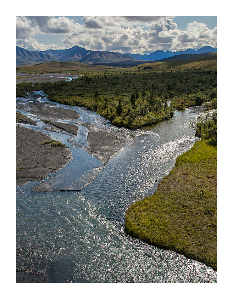
I waited for my son on the bridge at Denali Park while he scampered in the hills behind me. Taken 2 years ago, I remember looking directly into the sun and enjoying the light dancing on the water below. I rarely shoot into the sun but this time I decided to try it. I had no tripod so I pinned the camera to the rail to steady it and waited for the shadows to move so that the light arranged itself in the way I wanted it. 

Canon 6D, 24-105mm@35mm, f/18, ISO 2000, 1/1250 sec

These are peculiar camera settings. Early on I was under the impression that the 6D had such great ISO capability that it mattered little what ISO you shot until 3200. Tests later revealed that this was not true. Also, I was not aware that the aperture setting affected image sharpness back then.

Comments

19 comments
Comment posted by Bill Chambers on March 7, 2017 at 3:51 PM
As much as I admire your work, I have to admit this one just isn't working for me.  It seems off balanced due to the landmass on the right imposing into the scene, and the object that most attracted you (the dancing light) is lost on me because it's such a small part of the entire scene.
Registered on April 10, 2005, 753 Posts, 21216 Comments
Comment posted by Preston Birdwell on March 7, 2017 at 6:47 PM
This is a nice scene, but I have to agree with Bill regarding the big land mass on the right--it overwhelms the good things going on in the river. Also, there is a dark area in the LLC that I am unsure what caused it--light angle, perhaps? Secondly, the blue/cyan in the mountains top right is too heavy. I like the curves of the rivers.
--P
Registered on November 1, 2003, 471 Posts, 5188 Comments
Comment posted by John Williams on March 7, 2017 at 9:04 PM
I'll take a different road and say the comp works well for me. It looks like a grand vista, and I like the way my eye is led on and in. I do agree about the cyan; it would be worth backing down in those far mountains to keep the eye from sticking there.
Registered on September 6, 2007, 221 Posts, 5985 Comments
Comment posted by Dave Dillemuth on March 7, 2017 at 9:26 PM
Nicely composed scene. However, the central land mass is a bit dark and I find it blocks the flow of my eye moving from front to back through the scene. If it were mine I would dodge this area. Other than that, I find this image very pleasing.
Registered on December 10, 2015, 104 Posts, 1112 Comments
Comment posted by Harley Goldman on March 7, 2017 at 9:30 PM
This one is working for me. I don't have a problem with the land area on the right. or center. I think the image has a nice flow.  
Registered on November 19, 2003, 586 Posts, 11271 Comments
Comment posted by Wayne Jones on March 7, 2017 at 9:39 PM
Sunlight dancing on the water always fascinates me, and often frustrates me in trying to capture it.  I think you did a fine job of it in this image.  As for the overall composition, I do feel that the large size of the shadow in the center interrupts the visual flow.  In general, I enjoy the interplay of light and shadow, but here the shadow seems to be a little too much.  Not a deal breaker, but it does make me wonder if you might have any more images from here with a bit more light in that area, that might allow my eye to flow more freely into the background.
Registered on April 18, 2007, 953 Posts, 6435 Comments
Comment posted by Lon Overacker on March 7, 2017 at 10:35 PM
Igor,

I really like the perspective and viewpoint and I think you did a successful job in capturing that light dancing and the highlighted reflections in the water.  I also like the confluence of the two streams.  The rest of the supporting landscape is beautiful as well.  I think well composed and well scene landscape.

Minor nit, I might back off the blues in the shadow of the mountain, UR, but that's minor.

Lon
Registered on November 24, 2006, 521 Posts, 19147 Comments
Comment posted by Igor Doncov on March 7, 2017 at 11:01 PM
To be honest, that was my thoughts going in - that the distant mountains were too blue. I never thought the green wedge on the right was detrimental to the composition, nor the dappled sunlight. The distant blue got too saturated when I increased the overall saturation in the image. The blue in the sky and mountains got too intense. I readjusted the sky but left the mountains alone. Will change that.

I had some thoughts on this image and critiquing in general. This image is very different than say Harley's most recent image. IMO they should be critiqued not in comparison to one another but within it's 'type' of landscape. This image is the sort that you would find in National Geographic or Sierra Club desk calendar. Harley's is a fine art landscape. The type of image should probably be kept in mind by the person critiquing the image. I think most people tend to become attracted and identify with a style and their work becomes easily recognizable. I haven't done that. I keep bouncing around as the subject moves me and perhaps some prefer some work more than others. Also, the work keeps changing and this is the sort of image I took 3 years ago. I still like it though. Or I wouldn't have posted it here. Nuff said.
Registered on November 22, 2014, 189 Posts, 2733 Comments
Comment posted by gary phillips on March 8, 2017 at 1:43 AM
I like this Igor.  I think I would crop this square from the top.  It seems to balance better for me.  I love the braids of the river and the confluence, but below that that it gets a little off.  
Registered on October 24, 2013, 185 Posts, 4136 Comments
Comment posted by scott lanz on March 8, 2017 at 10:11 AM
Great shot, Igor. Interesting reading all the comments as well. Personally, I like the comp. I also like the play of light and shadow.
Registered on November 14, 2003, 840 Posts, 12902 Comments
Comment posted by Mark Seaver on March 8, 2017 at 10:21 AM
Igor, I like the long view up the river and how my eyes swing back and forth following the glistening river to the mountains in the distance.
Registered on January 23, 2011, 1103 Posts, 17270 Comments
Comment posted by Lucy Aron on March 8, 2017 at 10:29 AM
Stunning Igor.  I agree about that dark area in the top center, but I love the diagonal lines in the foreground as the river forks, and how one can just discern a hint of the river in the upper left hand corner.  Perhaps a slight crop from the right so that land mass in foreground would look more balanced.

lucy
Registered on February 25, 2011, 189 Posts, 1160 Comments
Comment posted by Nick Bristol on March 8, 2017 at 10:43 AM
Igor, I have been looking at this for a little while and I have to say I'm really enjoying it. It is a beautiful grand landscape that is very inviting to me. I love the play of light and shadow here and nothing seems to bright or to dark on my monitor, actually just about perfect I would say. The reflected light on the water really looks good to me and so natural. The blue / cyan on the distant mountain could be lightened a little I guess but I don't think it is all that far off from what one would see in these conditions at that far away. The only thing I might do would be to crop a little of the bottom off so the land on the right comes out right at the corner. This images makes me feel like I'm right there enjoying the view. Wonderfully natural! Nick
Registered on February 1, 2004, 752 Posts, 14140 Comments
Comment posted by Igor Doncov on March 8, 2017 at 12:37 PM
First suggested change was to desaturate the distant blue mountains. I used TK web sharpening in this version.
Registered on November 22, 2014, 189 Posts, 2733 Comments
Comment posted by Igor Doncov on March 8, 2017 at 12:39 PM
The 2nd suggested change included a crop off the bottom to remove much of the lower water. This gives it a very different look.

What say you now?
Registered on November 22, 2014, 189 Posts, 2733 Comments
Comment posted by Lon Overacker on March 8, 2017 at 4:38 PM
Thanks for taking the time and effort on the rework.  Blues much better in the mountains.  And I really like the square crop! In fact I think it nails the scene.  The confluence, the shimmering reflections are still very much the main focus, yet the overall balance of the landscape image just feels better to my eye.  Good call whomever suggested it! ;-)
Registered on November 24, 2006, 521 Posts, 19147 Comments
Comment posted by Igor Doncov on March 8, 2017 at 5:44 PM

Good call whomever suggested it!


One man deserves the credit,
One man deserves the blame,
It's Nikolai Ivanovich
Lobachevsky is his name

 
Registered on November 22, 2014, 189 Posts, 2733 Comments
Comment posted by Bill Chambers on March 9, 2017 at 8:53 PM
The square crop is a completely different look and, for my tastes, a large improvement.  Well done.
Registered on April 10, 2005, 753 Posts, 21216 Comments
Comment posted by Genny K. on March 12, 2017 at 10:26 PM
I like this, Igor, doubly so since I know this spot.  I don't find the image unbalanced at all, and I am kind of sensitive to that sort of thing. The blue in the mountains in the distance does bother me some, but those lovely clouds and the meandering glacial river work for me.
Registered on June 5, 2006, 132 Posts, 2001 Comments